Looking ahead: April, Weeks 1-2
In April, weeks 1-2, we’ll dive deep into data visualization.
How do we make visualizations in Python?
What principles should we keep in mind?
Goals of this exercise
What is data visualization and why is it important?
Introducing
matplotlib.Univariate plot types:
Histograms (univariate).
Scatterplots (bivariate).
Bar plots (bivariate).
Introduction: data visualization
What is data visualization?
Data visualization refers to the process (and result) of representing data graphically.
For our purposes today, we’ll be talking mostly about common methods of plotting data, including:
Histograms
Scatterplots
Line plots
Bar plots
Why is data visualization important?
Exploratory data analysis
Communicating insights
Impacting the world
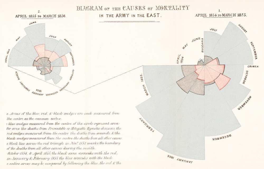
Impacting the world
Florence Nightingale (1820-1910) was a social reformer, statistician, and founder of modern nursing.
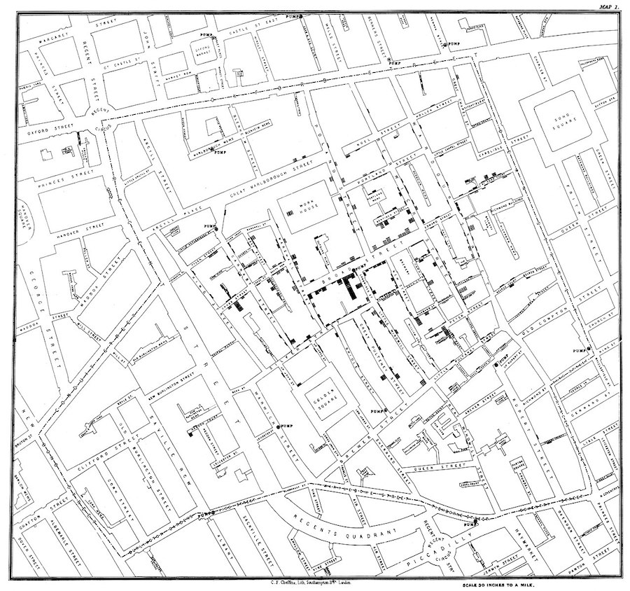
Impacting the world (pt. 2)
John Snow (1813-1858) was a physician whose visualization of cholera outbreaks helped identify the source and spreading mechanism (water supply).
Introducing matplotlib
Loading packages
Here, we load the core packages we’ll be using.
We also add some lines of code that make sure our visualizations will plot “inline” with our code, and that they’ll have nice, crisp quality.
import numpy as np
import pandas as pd
import matplotlib.pyplot as plt
import scipy.stats as ss
%matplotlib inline
%config InlineBackend.figure_format = 'retina'What is matplotlib?
matplotlibis a plotting library for Python.
Note that seaborn (which we’ll cover soon) uses matplotlib “under the hood”.
What is pyplot?
pyplotis a collection of functions withinmatplotlibthat make it really easy to plot data.
With pyplot, we can easily plot things like:
Histograms (
plt.hist)Scatterplots (
plt.scatter)Line plots (
plt.plot)Bar plots (
plt.bar)
Example dataset
Let’s load our familiar Pokemon dataset, which can be found in data/pokemon.csv.
df_pokemon = pd.read_csv("data/pokemon.csv")
df_pokemon.head(10)Histograms
What are histograms?
A histogram is a visualization of a single continuous, quantitative variable (e.g., income or temperature).
Histograms are useful for looking at how a variable distributes.
Can be used to determine whether a distribution is normal, skewed, or bimodal.
A histogram is a univariate plot, i.e., it displays only a single variable.
Histograms in matplotlib
To create a histogram, call plt.hist with a single column of a DataFrame (or a numpy.ndarray).
Check-in: What is this graph telling us?
p = plt.hist(df_pokemon['Attack'])
Changing the number of bins
A histogram puts your continuous data into bins (e.g., 1-10, 11-20, etc.).
The height of each bin reflects the number of observations within that interval.
Increasing or decreasing the number of bins gives you more or less granularity in your distribution.
### This has lots of bins
p = plt.hist(df_pokemon['Attack'], bins = 30)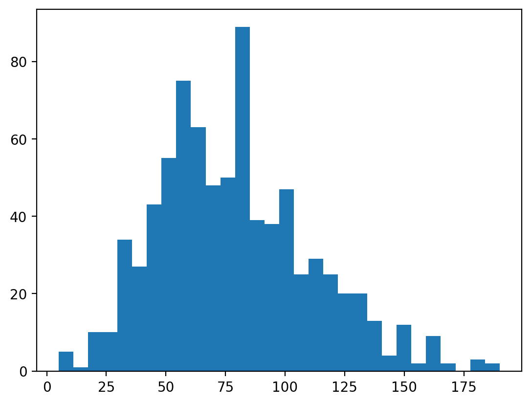
### This has fewer bins
p = plt.hist(df_pokemon['Attack'], bins = 5)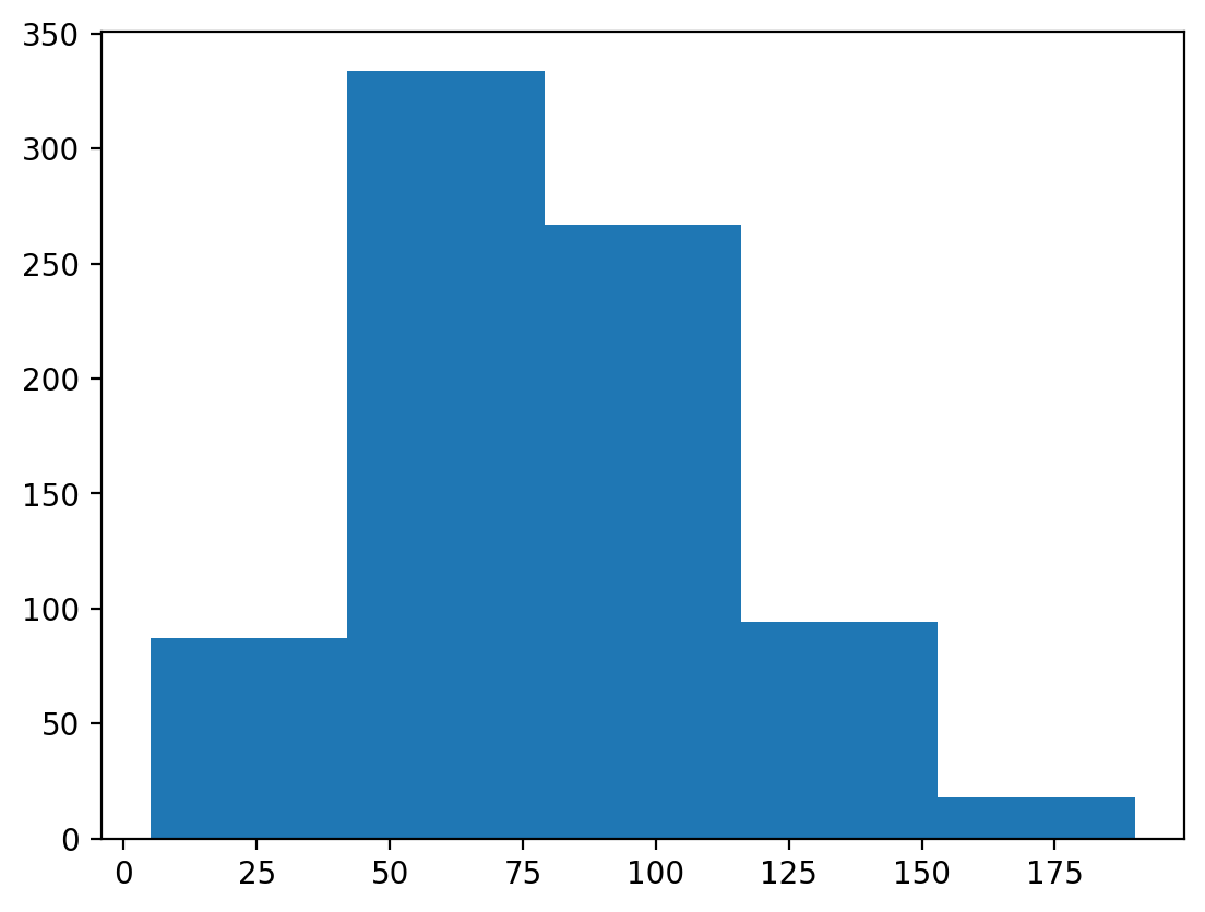
Changing the alpha level
The alpha level changes the transparency of your figure.
### This has fewer bins
p = plt.hist(df_pokemon['Attack'], alpha = .6)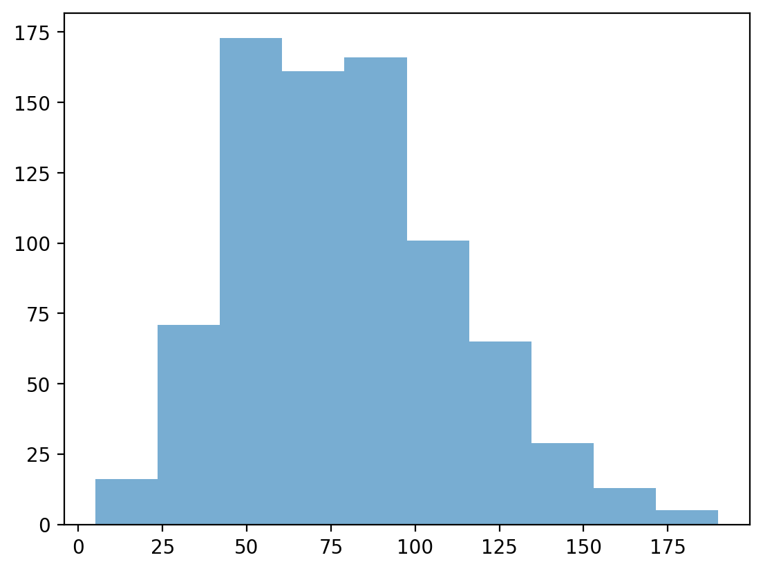
Check-in:
How would you make a histogram of the scores for Defense?
### Your code here
p = plt.hist(df_pokemon['Defense'], alpha = .6)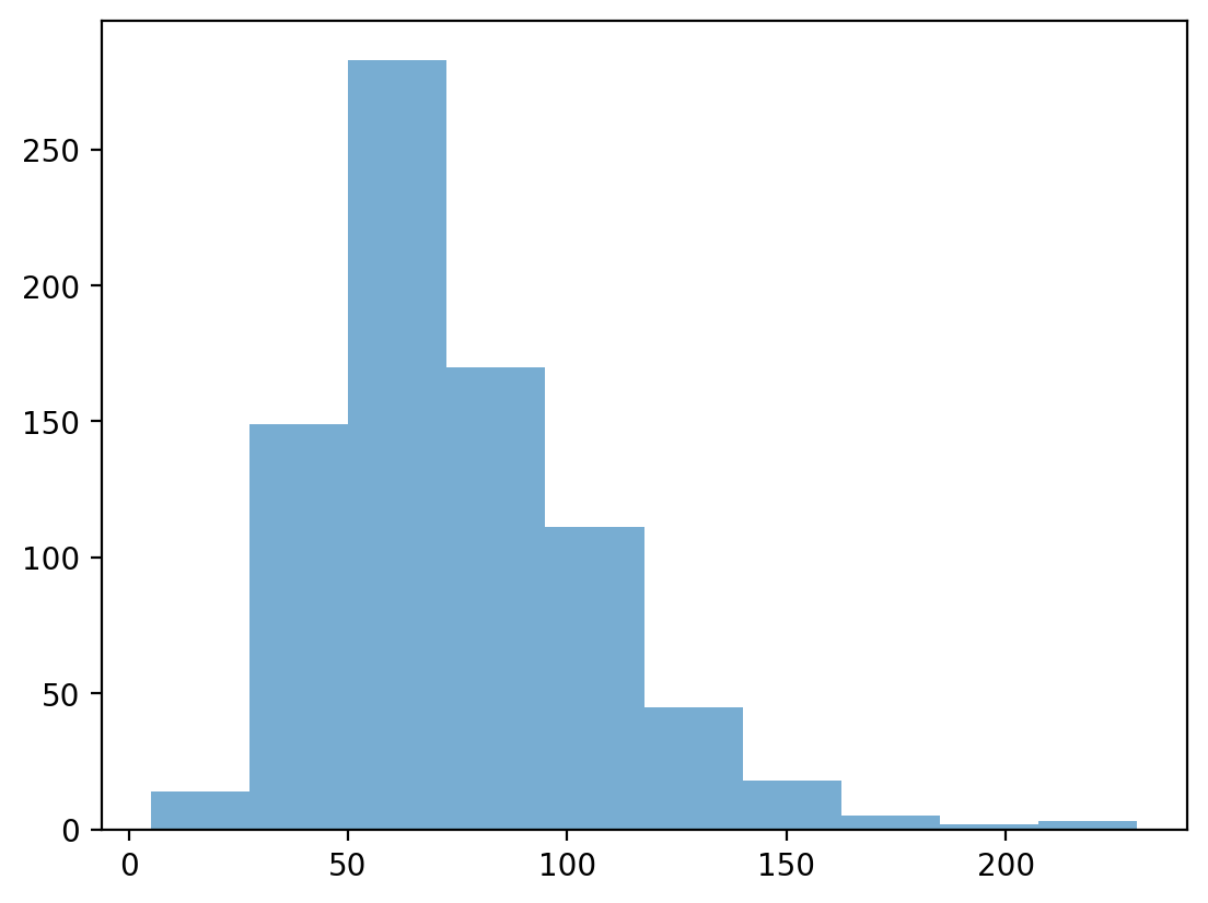
Check-in:
Could you make a histogram of the scores for Type 1?
### Your code hereLearning from histograms
Histograms are incredibly useful for learning about the shape of our distribution. We can ask questions like:
Normally distributed data
We can use the numpy.random.normal function to create a normal distribution, then plot it.
A normal distribution has the following characteristics:
Classic “bell” shape (symmetric).
Mean, median, and mode are all identical.
norm = np.random.normal(loc = 10, scale = 1, size = 1000)
p = plt.hist(norm, alpha = .6)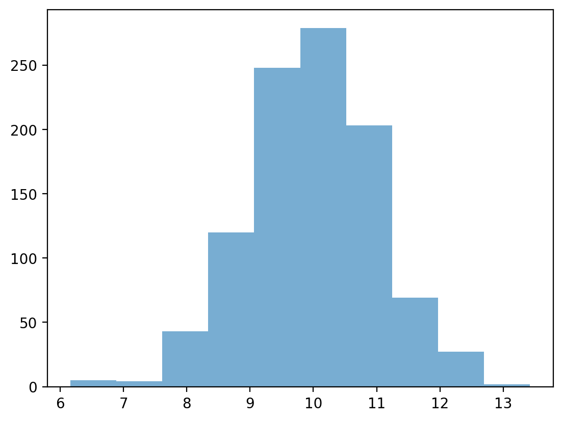
Skewed data
Skew means there are values elongating one of the “tails” of a distribution.
Positive/right skew: the tail is pointing to the right.
Negative/left skew: the tail is pointing to the left.
rskew = ss.skewnorm.rvs(20, size = 1000) # make right-skewed data
lskew = ss.skewnorm.rvs(-20, size = 1000) # make left-skewed data
fig, axes = plt.subplots(1, 2)
axes[0].hist(rskew)
axes[0].set_title("Right-skewed")
axes[1].hist(lskew)
axes[1].set_title("Left-skewed")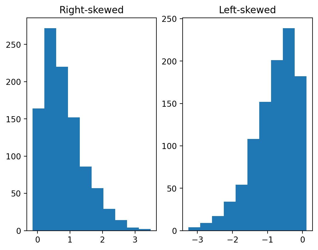
Outliers
Outliers are data points that differ significantly from other points in a distribution.
Unlike skewed data, outliers are generally discontinuous with the rest of the distribution.
Next week, we’ll talk about more ways to identify outliers; for now, we can rely on histograms.
norm = np.random.normal(loc = 10, scale = 1, size = 1000)
upper_outliers = np.array([21, 21, 21, 21]) ## some random outliers
data = np.concatenate((norm, upper_outliers))
p = plt.hist(data, alpha = .6)
plt.arrow(20, 100, dx = 0, dy = -50, width = .3, head_length = 10, facecolor = "red");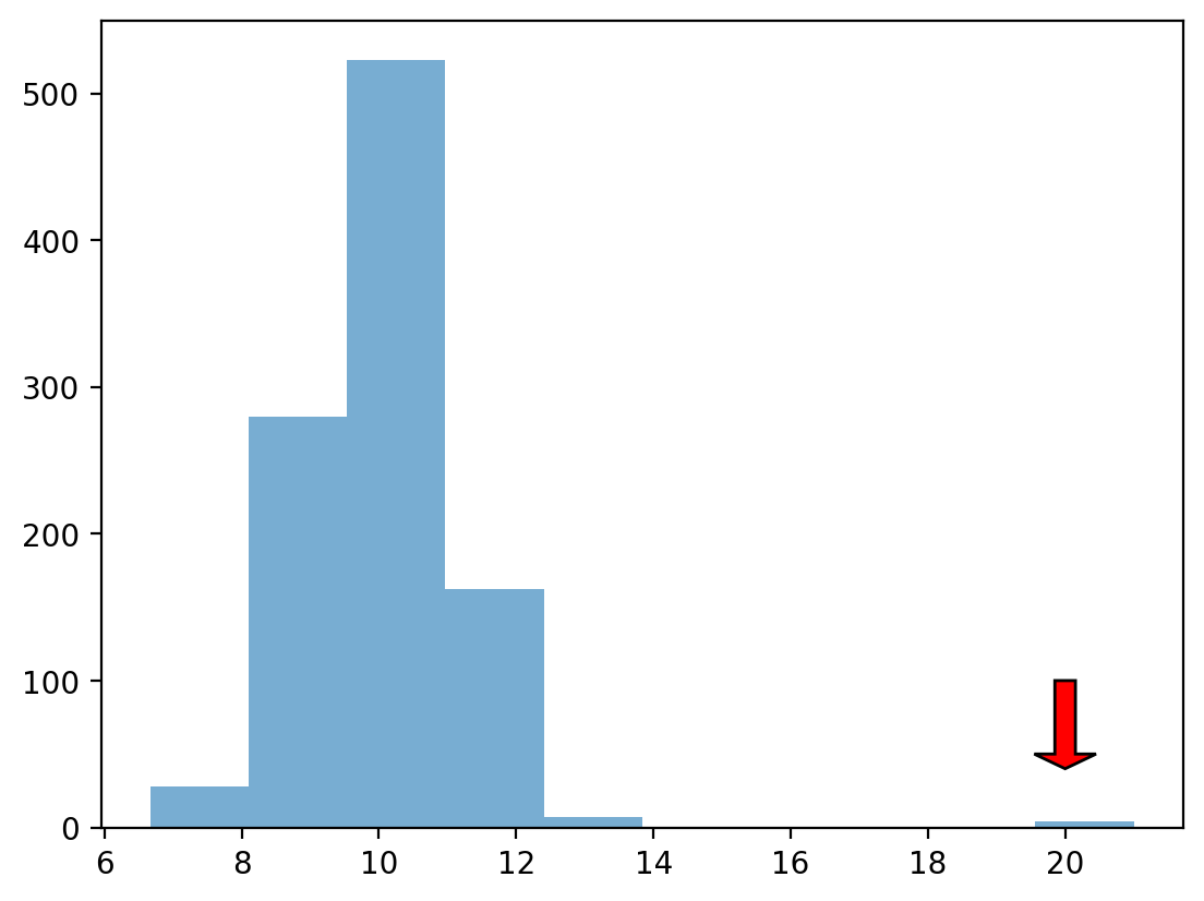
Check-in
How would you describe the following distribution?
Normal vs. skewed?
With or without outliers?
### Your comment hereCheck-in
In a somewhat right-skewed distribution (like below), what’s larger––the mean or the median?
mean1=np.mean(data)
median1=np.median(data)
print(mean1)
print(median1) # 50/50 percent of data = middle point
10.050956026908674
10.036406552683246
Modifying our plot
A good data visualization should also make it clear what’s being plotted.
Clearly labeled
xandyaxes, title.
Sometimes, we may also want to add overlays.
E.g., a dashed vertical line representing the
mean.
Adding axis labels
p = plt.hist(df_pokemon['Attack'], alpha = .6)
plt.xlabel("Attack")
plt.ylabel("Count")
plt.title("Distribution of Attack Scores");
Adding a vertical line
The plt.axvline function allows us to draw a vertical line at a particular position, e.g., the mean of the Attack column.
p = plt.hist(df_pokemon['Attack'], alpha = .6)
plt.xlabel("Attack")
plt.ylabel("Count")
plt.title("Distribution of Attack Scores")
plt.axvline(df_pokemon['Attack'].mean(), linestyle = "dotted");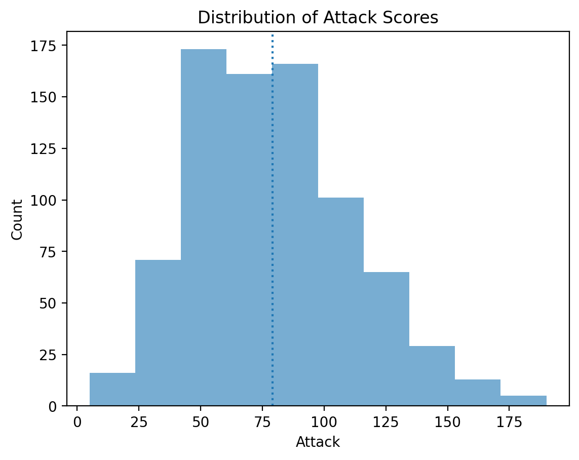
Faceting for histograms
Let’s try to group by our no. of Attacks by Pokemon Types looking at many histograms at a time:
import plotly.express as px
fig = px.histogram(df_pokemon,x='Attack', facet_col='Generation')
fig.show()Scatterplots
What are scatterplots?
A scatterplot is a visualization of how two different continuous distributions relate to each other.
Each individual point represents an observation.
Very useful for exploratory data analysis.
Are these variables positively or negatively correlated?
A scatterplot is a bivariate plot, i.e., it displays at least two variables.
Scatterplots with matplotlib
We can create a scatterplot using plt.scatter(x, y), where x and y are the two variables we want to visualize.
x = np.arange(1, 10)
y = np.arange(11, 20)
p = plt.scatter(x, y)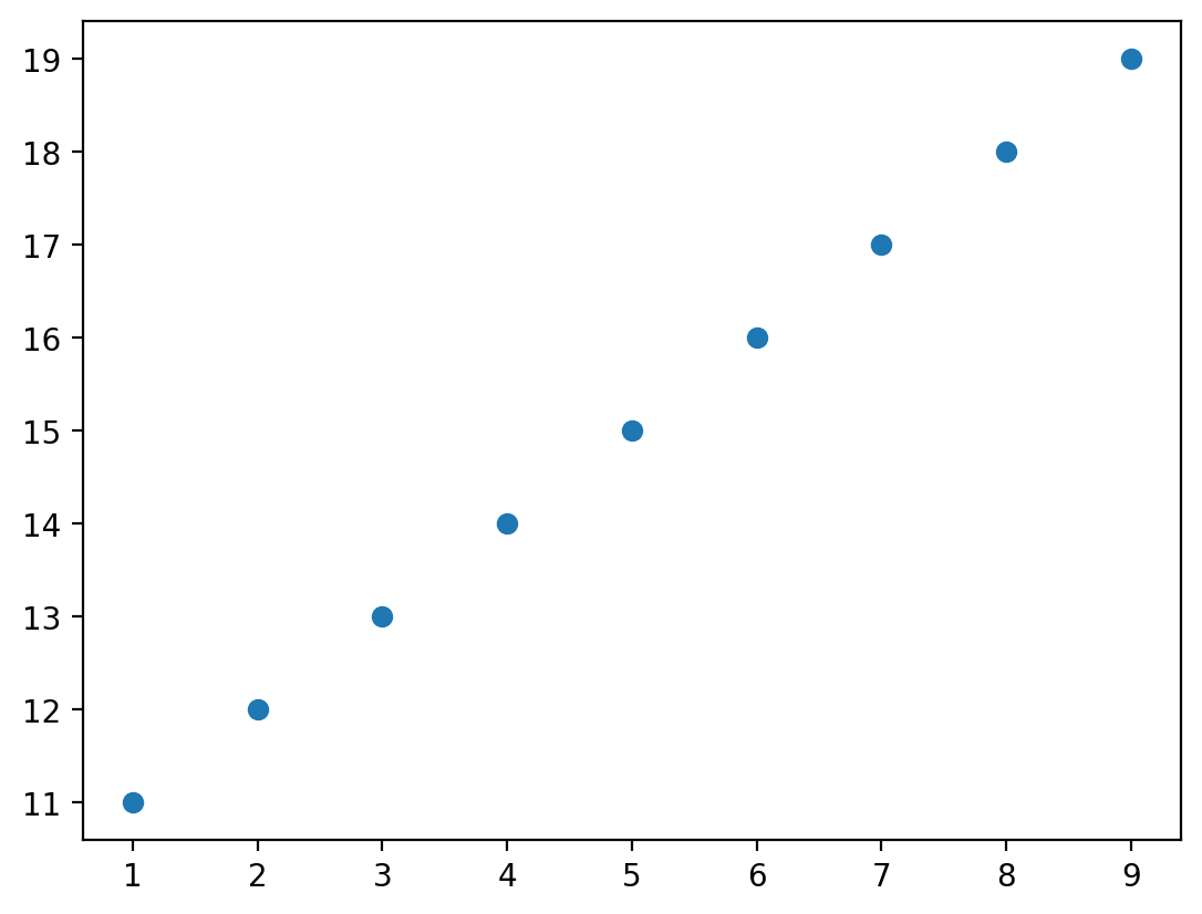
Check-in
Are these variables related? If so, how?
x = np.random.normal(loc = 10, scale = 1, size = 100)
y = x * 2 + np.random.normal(loc = 0, scale = 2, size = 100)
plt.scatter(x, y, alpha = .6);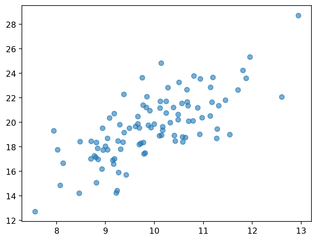
Check-in
Are these variables related? If so, how?
x = np.random.normal(loc = 10, scale = 1, size = 100)
y = -x * 2 + np.random.normal(loc = 0, scale = 2, size = 100)
plt.scatter(x, y, alpha = .6);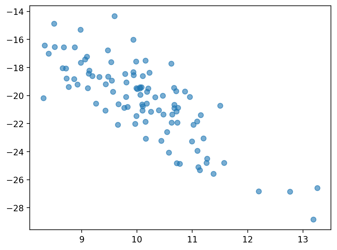
Scatterplots are useful for detecting non-linear relationships
x = np.random.normal(loc = 10, scale = 1, size = 100)
y = np.sin(x)
plt.scatter(x, y, alpha = .6);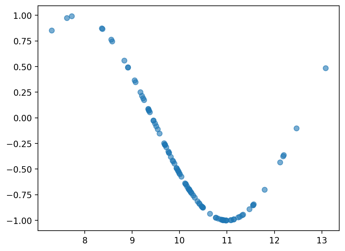
Check-in
How would we visualize the relationship between Attack and Speed in our Pokemon dataset?
x = df_pokemon["Attack"]
y = df_pokemon["Speed"]
plt.xlabel("Attack")
plt.ylabel("Speed")
plt.title("Speed vs Attack Scores")
plt.scatter(x, y, alpha = .6);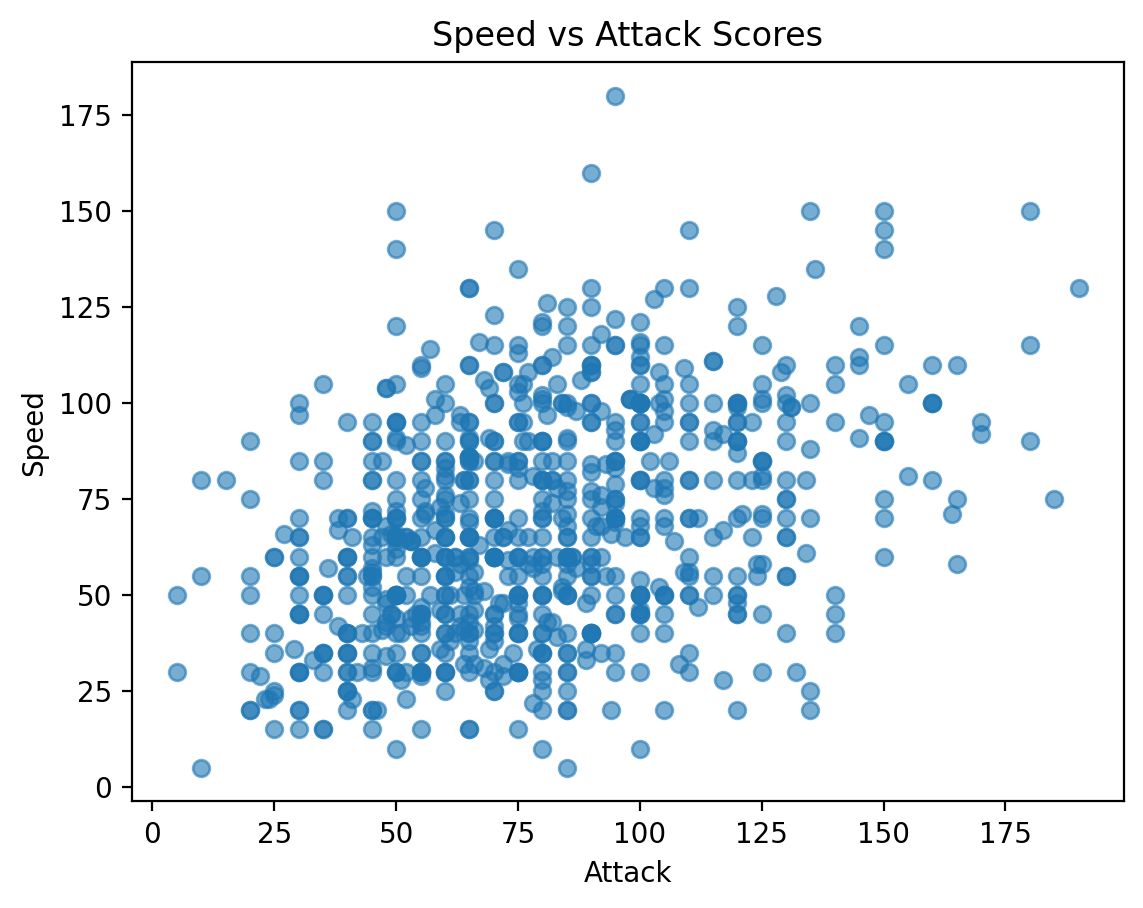
Scatterplots with pyplot express
With pyplot express we can play with scatterplots even further - we can create bubble plots!
import plotly.express as px
bubble=px.scatter(df_pokemon, x='Attack', y='Speed', color='Type 1', size='HP');
bubble.show()Barplots
What is a barplot?
A barplot visualizes the relationship between one continuous variable and a categorical variable.
The height of each bar generally indicates the mean of the continuous variable.
Each bar represents a different level of the categorical variable.
A barplot is a bivariate plot, i.e., it displays at least two variables.
Barplots with matplotlib
plt.bar can be used to create a barplot of our data.
E.g., average
AttackbyLegendarystatus.However, we first need to use
groupbyto calculate the meanAttackper level.
Step 1: Using groupby
summary = df_pokemon[['Legendary', 'Attack']].groupby("Legendary").mean().reset_index()
summary### Turn Legendary into a str
summary['Legendary'] = summary['Legendary'].apply(lambda x: str(x))
summaryStep 2: Pass values into plt.bar
Check-in:
What do we learn from this plot?
What is this plot missing?
plt.bar(x = summary['Legendary'],height = summary['Attack'],alpha = .6);
plt.xlabel("Legendary status");
plt.ylabel("Attack");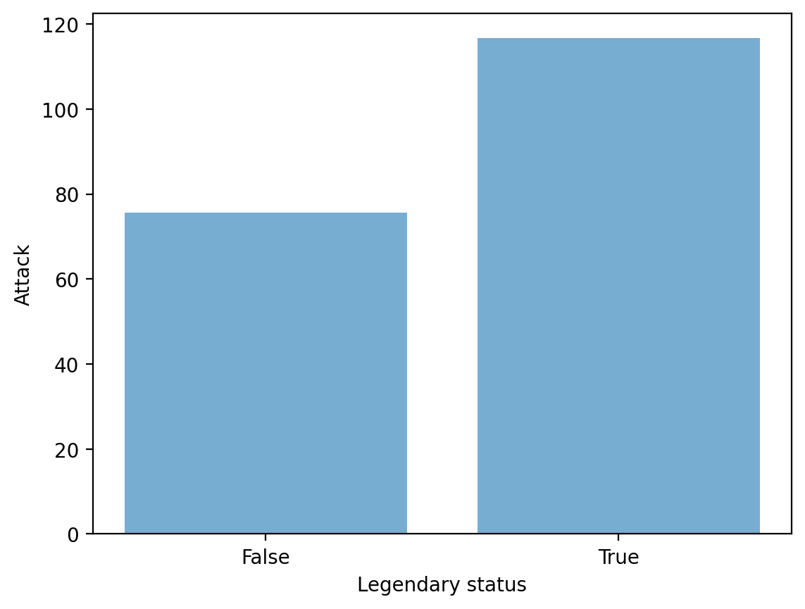
Barplots in plotly.express
import plotly.express as px
data_canada = px.data.gapminder().query("country == 'Canada'")
fig = px.bar(data_canada, x='year', y='pop')
fig.show()data_canada.head(3)long_df = px.data.medals_long()
fig = px.bar(long_df, x="nation", y="count", color="medal", title="Long format of data")
fig.show()
long_df.head(3)wide_df = px.data.medals_wide()
fig = px.bar(wide_df, x="nation", y=["gold", "silver", "bronze"], title="Wide format of data")
fig.show()
wide_df.head(3)Faceting barplots
Please use faceting for the Pokemon data with barplots:
fig = px.bar(df_pokemon, x='Type 1', facet_row='Legendary')
fig.show()
For more information please go to the tutorial Plotly Express Wide-Form Support in Python.
Conclusion
This concludes our first introduction to data visualization:
Working with
matplotlib.pyplot.Working with more convenient version of
pyplot.express.Creating basic plots: histograms, scatterplots, and barplots.
Next time, we’ll move onto discussing seaborn, another very useful package for data visualization.