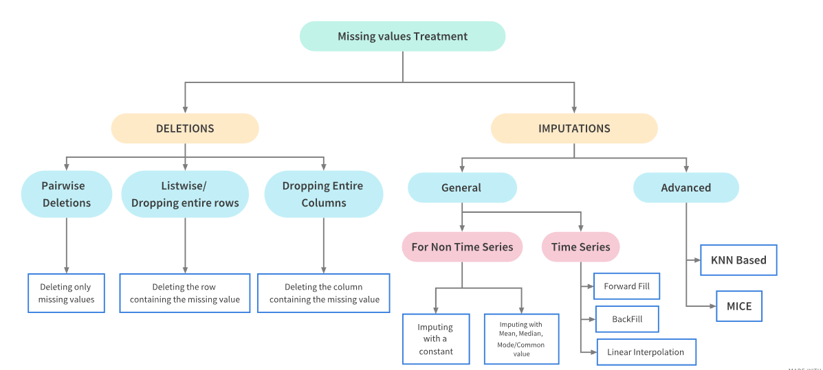
Handling Missing Values in Python
Real world data is messy and often contains a lot of missing values.
There could be multiple reasons for the missing values but primarily the reason for missingness can be attributed to:
| Reason for missing Data |
|---|
| Data doesn’t exist |
| Data not collected due to human error. |
| Data deleted accidently |
A guide to handling missing values
Please read this tutorial on handling missing values first, before working on dirty data this week: TUTORIAL.
Dirty data
import pandas as pd
import numpy as np
from sklearn.ensemble import RandomForestClassifier
import warnings
import ssl
# Suppress warnings
warnings.filterwarnings('ignore')
# Disable SSL verification
ssl._create_default_https_context = ssl._create_unverified_context
import requests
from io import StringIO
Load the dataset from the provided URL using pandas.
url = "https://raw.github.com/edwindj/datacleaning/master/data/dirty_iris.csv"
response = requests.get(url, verify=False)
data = StringIO(response.text)
dirty_iris = pd.read_csv(data, sep=",")
print(dirty_iris.head())
Sepal.Length Sepal.Width Petal.Length Petal.Width Species
0 6.4 3.2 4.5 1.5 versicolor
1 6.3 3.3 6.0 2.5 virginica
2 6.2 NaN 5.4 2.3 virginica
3 5.0 3.4 1.6 0.4 setosa
4 5.7 2.6 3.5 1.0 versicolor
Introduce Missing Values
Randomly introduce missing values into the dataset to mimic the Python code behavior.
# Load additional data
carseats = pd.read_csv("https://raw.githubusercontent.com/selva86/datasets/master/Carseats.csv")

# Set random seed for reproducibility
np.random.seed(123)

# Introduce missing values in 'Income' column
income_missing_indices = np.random.choice(carseats.index, size=20, replace=False)
carseats.loc[income_missing_indices, 'Income'] = np.nan

# Set another random seed for reproducibility
np.random.seed(456)

# Introduce missing values in 'Urban' column
urban_missing_indices = np.random.choice(carseats.index, size=10, replace=False)
carseats.loc[urban_missing_indices, 'Urban'] = np.nan
Introduction
Analysis of data is a process of inspecting, cleaning, transforming, and modeling data with the goal of highlighting useful information, suggesting conclusions and supporting decision making.
Many times in the beginning we spend hours on handling problems with missing values, logical inconsistencies or outliers in our datasets. In this tutorial we will go through the most popular techniques in data cleansing.
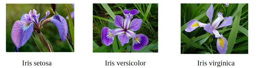
We will be working with the messy dataset iris. Originally published at UCI Machine Learning Repository: Iris Data Set, this small dataset from 1936 is often used for testing out machine learning algorithms and visualizations. Each row of the table represents an iris flower, including its species and dimensions of its botanical parts, sepal and petal, in centimeters.
Take a look at this dataset here:
dirty_irisDetecting NA
A missing value, represented by NaN in Python, is a placeholder for a datum of which the type is known but its value isn’t. Therefore, it is impossible to perform statistical analysis on data where one or more values in the data are missing. One may choose to either omit elements from a dataset that contain missing values or to impute a value, but missingness is something to be dealt with prior to any analysis.
Can you see that many values in our dataset have status NaN = Not Available? Count (or plot), how many (%) of all 150 rows is complete.
# Count the number of complete cases (rows without any missing values)
complete_cases = dirty_iris.dropna().shape[0]

# Calculate the percentage of complete cases
percentage_complete = (complete_cases / dirty_iris.shape[0]) * 100

print(f"Number of complete cases: {complete_cases}")
print(f"Percentage of complete cases: {percentage_complete:.2f}%")
Number of complete cases: 96
Percentage of complete cases: 64.00%
Does the data contain other special values? If it does, replace them with NA.
# Define a function to check for special values
def is_special(x):
    if np.issubdtype(x.dtype, np.number):
        return ~np.isfinite(x)
    else:
        return pd.isna(x)

# Apply the function to each column and replace special values with NaN
for col in dirty_iris.columns:
    dirty_iris[col] = dirty_iris[col].apply(lambda x: np.nan if is_special(pd.Series([x]))[0] else x)

# Display summary of the data
print(dirty_iris.describe(include='all'))
Sepal.Length Sepal.Width Petal.Length Petal.Width Species
count 140.000000 133.000000 131.000000 137.000000 150
unique NaN NaN NaN NaN 3
top NaN NaN NaN NaN versicolor
freq NaN NaN NaN NaN 50
mean 6.559286 3.390977 4.449962 1.207299 NaN
std 6.800940 3.315310 5.769299 0.764722 NaN
min 0.000000 -3.000000 0.000000 0.100000 NaN
25% 5.100000 2.800000 1.600000 0.300000 NaN
50% 5.750000 3.000000 4.500000 1.300000 NaN
75% 6.400000 3.300000 5.100000 1.800000 NaN
max 73.000000 30.000000 63.000000 2.500000 NaN
Checking consistency
Consistent data are technically correct data that are fit for statistical analysis. They are data in which missing values, special values, (obvious) errors and outliers are either removed, corrected or imputed. The data are consistent with constraints based on real-world knowledge about the subject that the data describe.
We have the following background knowledge:
Species should be one of the following values: setosa, versicolor or virginica.
All measured numerical properties of an iris should be positive.
The petal length of an iris is at least 2 times its petal width.
The sepal length of an iris cannot exceed 30 cm.
The sepals of an iris are longer than its petals.
Define these rules in a separate object ‘RULES’ and read them into Python. Print the resulting constraint object.
# Define the rules as functions
def check_rules(df):
    rules = {
        "Sepal.Length <= 30": df["Sepal.Length"] <= 30,
        "Species in ['setosa', 'versicolor', 'virginica']": df["Species"].isin(['setosa', 'versicolor', 'virginica']),
        "Sepal.Length > 0": df["Sepal.Length"] > 0,
        "Sepal.Width > 0": df["Sepal.Width"] > 0,
        "Petal.Length > 0": df["Petal.Length"] > 0,
        "Petal.Width > 0": df["Petal.Width"] > 0,
        "Petal.Length >= 2 * Petal.Width": df["Petal.Length"] >= 2 * df["Petal.Width"],
        "Sepal.Length > Petal.Length": df["Sepal.Length"] > df["Petal.Length"]
    }
    return rules

# Apply the rules to the dataframe
rules = check_rules(dirty_iris)

# Print the rules
for rule, result in rules.items():
    print(f"{rule}: {result.all()}")
Sepal.Length <= 30: False
Species in ['setosa', 'versicolor', 'virginica']: True
Sepal.Length > 0: False
Sepal.Width > 0: False
Petal.Length > 0: False
Petal.Width > 0: False
Petal.Length >= 2 * Petal.Width: False
Sepal.Length > Petal.Length: False
Now we are ready to determine how often each rule is broken (violations). Also we can summarize and plot the result.
# Check for rule violations
violations = {rule: ~result for rule, result in rules.items()}

# Summarize the violations
summary = {rule: result.sum() for rule, result in violations.items()}

# Print the summary of violations
print("Summary of Violations:")
for rule, count in summary.items():
    print(f"{rule}: {count} violations")
Summary of Violations:
Sepal.Length <= 30: 12 violations
Species in ['setosa', 'versicolor', 'virginica']: 0 violations
Sepal.Length > 0: 11 violations
Sepal.Width > 0: 19 violations
Petal.Length > 0: 20 violations
Petal.Width > 0: 13 violations
Petal.Length >= 2 * Petal.Width: 34 violations
Sepal.Length > Petal.Length: 30 violations
What percentage of the data has no errors?
import matplotlib.pyplot as plt
# Plot the violations
violation_counts = pd.Series(summary)
ax = violation_counts.plot(kind='bar', figsize=(10, 6))
plt.title('Summary of Rule Violations')
plt.xlabel('Rules')
plt.ylabel('Number of Violations')

# Add percentage labels above the bars
for p in ax.patches:
    ax.annotate(f'{p.get_height() / len(dirty_iris) * 100:.1f}%',
                (p.get_x() + p.get_width() / 2., p.get_height()),
                ha='center', va='center', xytext=(0, 10),
                textcoords='offset points')

plt.show()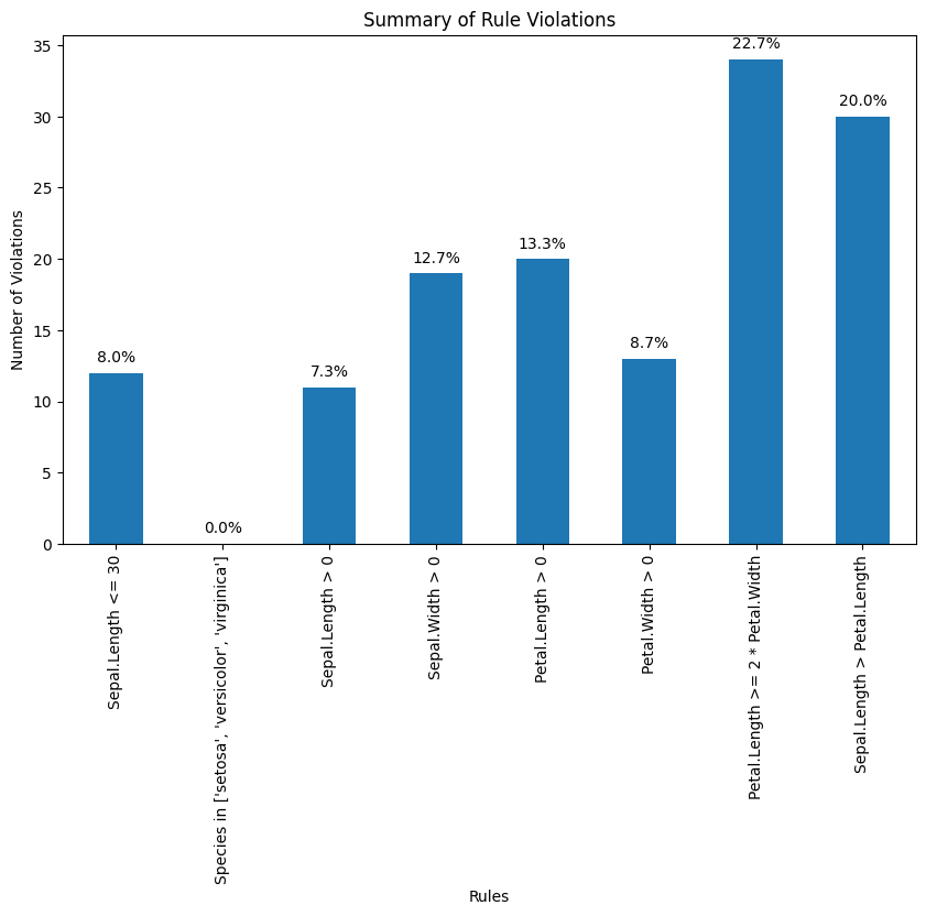
Find out which observations have too long sepals using the result of violations.
# Check for rule violations
violations = {rule: ~result for rule, result in rules.items()}
# Combine violations into a DataFrame
violated_df = pd.DataFrame(violations)
violated_rows = dirty_iris[violated_df["Sepal.Length <= 30"]]
print(violated_rows)
Sepal.Length Sepal.Width Petal.Length Petal.Width Species
14 NaN 3.9 1.70 0.4 setosa
18 NaN 4.0 NaN 0.2 setosa
24 NaN 3.0 5.90 2.1 virginica
27 73.0 29.0 63.00 NaN virginica
29 NaN 2.8 0.82 1.3 versicolor
57 NaN 2.9 4.50 1.5 versicolor
67 NaN 3.2 5.70 2.3 virginica
113 NaN 3.3 5.70 2.1 virginica
118 NaN 3.0 5.50 2.1 virginica
119 NaN 2.8 4.70 1.2 versicolor
124 49.0 30.0 14.00 2.0 setosa
137 NaN 3.0 4.90 1.8 virginica
Find outliers in sepal length using boxplot approach. Retrieve the corresponding observations and look at the other values. Any ideas what might have happened? Set the outliers to NA (or a value that you find more appropiate)
# Boxplot for Sepal.Length
plt.figure(figsize=(10, 6))
plt.boxplot(dirty_iris['Sepal.Length'].dropna())
plt.title('Boxplot of Sepal Length')
plt.ylabel('Sepal Length')
plt.show()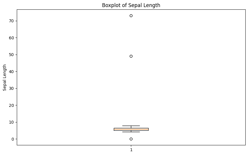
# Find outliers in Sepal.Length
outliers = dirty_iris['Sepal.Length'][np.abs(dirty_iris['Sepal.Length'] - dirty_iris['Sepal.Length'].mean()) > (1.5 * dirty_iris['Sepal.Length'].std())]
outliers_idx = dirty_iris.index[dirty_iris['Sepal.Length'].isin(outliers)]

# Print the rows with outliers
print("Outliers:")
print(dirty_iris.loc[outliers_idx])
Outliers:
Sepal.Length Sepal.Width Petal.Length Petal.Width Species
27 73.0 29.0 63.0 NaN virginica
124 49.0 30.0 14.0 2.0 setosa
They all seem to be too big... may they were measured in mm i.o cm?
# Adjust the outliers (assuming they were measured in mm instead of cm)
dirty_iris.loc[outliers_idx, ['Sepal.Length', 'Sepal.Width', 'Petal.Length', 'Petal.Width']] /= 10

# Summary of the adjusted data
print("Summary of adjusted data:")
print(dirty_iris.describe())
Summary of adjusted data:
Sepal.Length Sepal.Width Petal.Length Petal.Width
count 140.000000 133.000000 131.000000 137.000000
mean 5.775000 2.991729 3.920954 1.194161
std 0.969842 0.708075 2.455417 0.766463
min 0.000000 -3.000000 0.000000 0.100000
25% 5.100000 2.800000 1.600000 0.300000
50% 5.700000 3.000000 4.400000 1.300000
75% 6.400000 3.300000 5.100000 1.800000
max 7.900000 4.200000 23.000000 2.500000
Note that simple boxplot shows an extra outlier!
import seaborn as sns
plt.figure(figsize=(10, 6))
sns.boxplot(x='Species', y='Sepal.Length', data=dirty_iris)
plt.title('Boxplot of Sepal Length by Species')
plt.xlabel('Species')
plt.ylabel('Sepal Length')
plt.show()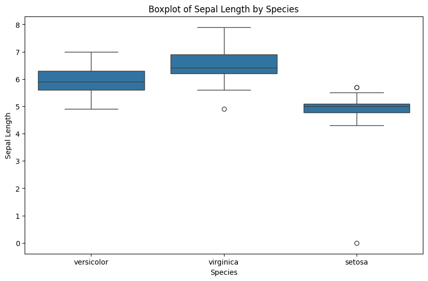
Correcting
Replace non positive values from Sepal.Width with NA:
# Define the correction rule
def correct_sepal_width(df):
    df.loc[(~df['Sepal.Width'].isna()) & (df['Sepal.Width'] <= 0), 'Sepal.Width'] = np.nan
    return df

# Apply the correction rule to the dataframe
mydata_corrected = correct_sepal_width(dirty_iris)

# Print the corrected dataframe
print(mydata_corrected)
Sepal.Length Sepal.Width Petal.Length Petal.Width Species
0 6.4 3.2 4.5 1.5 versicolor
1 6.3 3.3 6.0 2.5 virginica
2 6.2 NaN 5.4 2.3 virginica
3 5.0 3.4 1.6 0.4 setosa
4 5.7 2.6 3.5 1.0 versicolor
.. ... ... ... ... ...
145 6.7 3.1 5.6 2.4 virginica
146 5.6 3.0 4.5 1.5 versicolor
147 5.2 3.5 1.5 0.2 setosa
148 6.4 3.1 NaN 1.8 virginica
149 5.8 2.6 4.0 NaN versicolor
[150 rows x 5 columns]
Replace all erroneous values with NA using (the result of) localizeErrors:
# Apply the rules to the dataframe
rules = check_rules(dirty_iris)
violations = {rule: ~result for rule, result in rules.items()}
violated_df = pd.DataFrame(violations)

# Localize errors and set them to NA
for col in violated_df.columns:
    dirty_iris.loc[violated_df[col], col.split()[0]] = np.nan
NA’s pattern detection
Here we are going to use missingno library to diagnose the missingness pattern for the ‘dirty_iris’ dataset.
import missingno as msnoMatrix Plot (msno.matrix):
This visualization shows which values are missing in each column. Each bar represents a column, and white spaces in the bars indicate missing values.
If you see many white spaces in one column, it means that column has a lot of missing data. If the white spaces are randomly scattered, the missing data might be random. If they are clustered in specific areas, it might indicate a pattern.
msno.matrix(dirty_iris);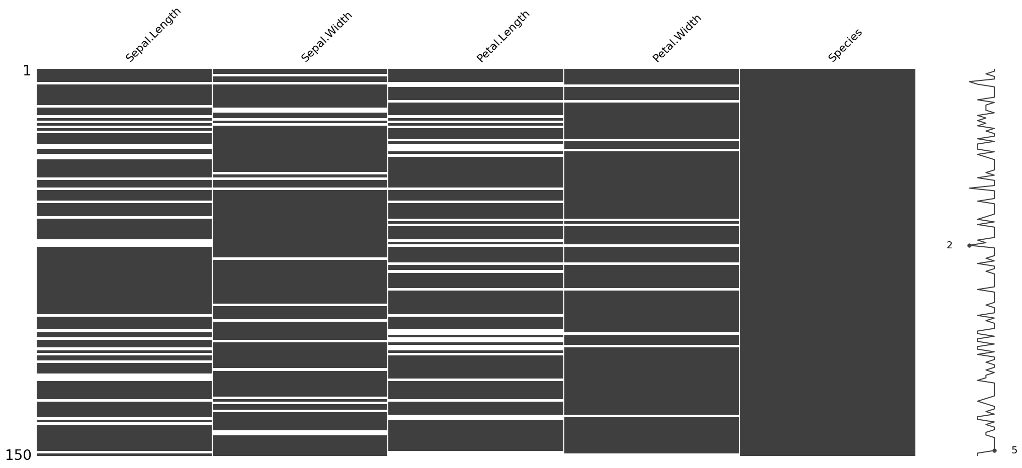
Heatmap Plot (msno.heatmap):
This visualization shows the correlations between missing values in different columns. If two columns have a high correlation (dark colors), it means that if one column has missing values, the other column is also likely to have missing values.
Low correlations (light colors) indicate that missing values in one column are not related to missing values in another column.
msno.heatmap(dirty_iris);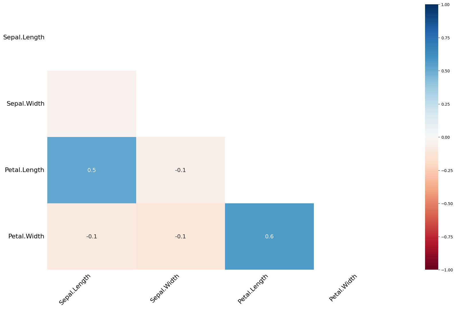
Dendrogram Plot (msno.dendrogram):
This visualization groups columns based on the similarity of their missing data patterns. Columns that are close to each other in the dendrogram have similar patterns of missing data.
This can help identify groups of columns that have similar issues with missing data.
Based on these visualizations, we can identify which columns have the most missing data, whether the missing data is random or patterned, and which columns have similar patterns of missing data.
msno.dendrogram(dirty_iris);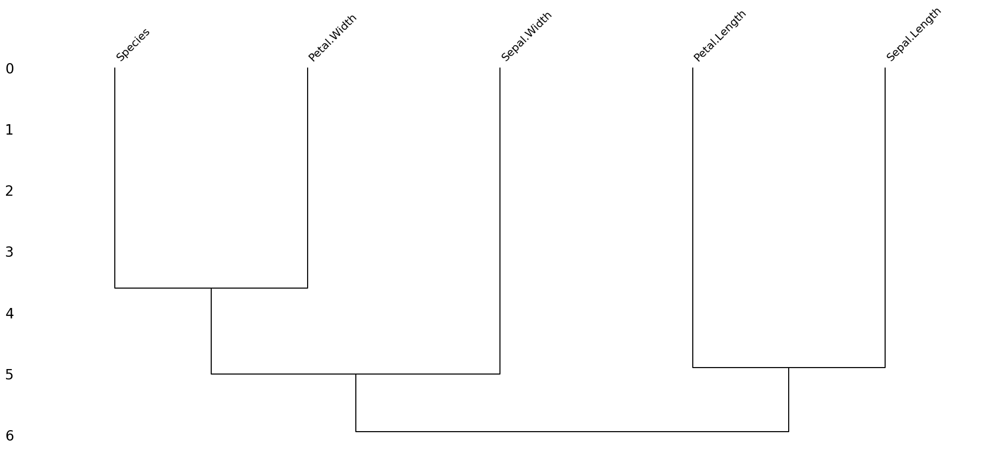
Based on the dendrogram plot, we can interpret the pattern of missing data in the “dirty iris” dataset as follows:
Grouping of Columns:
The dendrogram shows that the columns “Species” and “Petal.Width” are grouped together, indicating that they have similar patterns of missing data.
Similarly, “Sepal.Width” and “Petal.Length” are grouped together, suggesting they also share a similar pattern of missing data.
“Sepal.Length” is somewhat separate from the other groups, indicating it has a different pattern of missing data compared to the other columns.
Pattern of Missing Data:
The grouping suggests that missing data in “Species” is likely to be associated with missing data in “Petal.Width”.
Similarly, missing data in “Sepal.Width” is likely to be associated with missing data in “Petal.Length”.
“Sepal.Length” appears to have a distinct pattern of missing data that is not strongly associated with the other columns.
From this dendrogram, we can infer that the missing data is not completely random. Instead, there are specific patterns where certain columns tend to have missing data together. This indicates a systematic pattern of missing data rather than a purely random one.
Imputing NA’s
Imputation is the process of estimating or deriving values for fields where data is missing. There is a vast body of literature on imputation methods and it goes beyond the scope of this tutorial to discuss all of them.
There is no one single best imputation method that works in all cases. The imputation model of choice depends on what auxiliary information is available and whether there are (multivariate) edit restrictions on the data to be imputed.
The availability of Python software for imputation under edit restrictions is, to our best knowledge, limited. However, a viable strategy for imputing numerical data is to first impute missing values without restrictions, and then minimally adjust the imputed values so that the restrictions are obeyed. Separately, these methods are available in Python.
We can mention several approaches to imputation:
For the quantitative variables:
imputing by mean/median/mode
hotdeck imputation
KNN -- K-nearest-neighbors approach
RPART -- random forests multivariate approach
mice - Multivariate Imputation by Chained Equations approach
For the qualitative variables:
imputing by mode
RPART -- random forests multivariate approach
mice - Multivariate Imputation by Chained Equations approach
... and many others. Please read the theoretical background if you are interested in those techniques.
Exercise 1. Use kNN imputation (‘sklearn’ package) to impute all missing values. The KNNImputer from sklearn requires all data to be numeric. Since our dataset contains categorical data (e.g., the Species column), you need to handle these columns separately. One approach is to use one-hot encoding for categorical variables before applying the imputer.
from sklearn.impute import KNNImputer
from sklearn.preprocessing import OneHotEncoder
# Replace infinite values with NaN
dirty_iris.replace([np.inf, -np.inf], np.nan, inplace=True)

# Separate numeric and categorical columns
numeric_cols = dirty_iris.select_dtypes(include=[np.number]).columns
categorical_cols = dirty_iris.select_dtypes(exclude=[np.number]).columns
# One-hot encode categorical columns
encoder = OneHotEncoder(sparse_output=False, handle_unknown='ignore')

encoded_categorical = pd.DataFrame(encoder.fit_transform(dirty_iris[categorical_cols]), columns=encoder.get_feature_names_out(categorical_cols))

# Combine numeric and encoded categorical columns
combined_data = pd.concat([dirty_iris[numeric_cols], encoded_categorical], axis=1)

# Initialize the KNNImputer
imputer = KNNImputer(n_neighbors=3)

# Perform kNN imputation
imputed_data = imputer.fit_transform(combined_data)

# Convert the imputed data back to a DataFrame
imputed_df = pd.DataFrame(imputed_data, columns=combined_data.columns)

# Decode the one-hot encoded columns back to original categorical columns
decoded_categorical = pd.DataFrame(encoder.inverse_transform(imputed_df[encoded_categorical.columns]), columns=categorical_cols)

# Combine numeric and decoded categorical columns
final_imputed_data = pd.concat([imputed_df[numeric_cols], decoded_categorical], axis=1)

# Print the imputed data
print(final_imputed_data)
Sepal.Length Sepal.Width Petal.Length Petal.Width Species
0 6.400000 3.200000 4.500000 1.500000 versicolor
1 6.300000 3.300000 6.000000 2.500000 virginica
2 6.200000 3.033333 5.400000 2.300000 virginica
3 5.000000 3.400000 1.600000 0.400000 setosa
4 5.700000 2.600000 3.500000 1.000000 versicolor
.. ... ... ... ... ...
145 6.700000 3.100000 5.600000 2.400000 virginica
146 5.600000 3.000000 4.500000 1.500000 versicolor
147 5.200000 3.500000 1.500000 0.200000 setosa
148 6.533333 3.100000 5.166667 1.800000 virginica
149 5.800000 2.600000 3.833333 1.066667 versicolor
[150 rows x 5 columns]
Transformations
Finally, we sometimes encounter the situation where we have problems with skewed distributions or we just want to transform, recode or perform discretization. Let’s review some of the most popular transformation methods.
First, standardization (also known as normalization):
Z-score approach - standardization procedure, using the formula: where = mean and = standard deviation. Z-scores are also known as standardized scores; they are scores (or data values) that have been given a common standard. This standard is a mean of zero and a standard deviation of 1.
minmax approach - An alternative approach to Z-score normalization (or standardization) is the so-called MinMax scaling (often also simply called “normalization” - a common cause for ambiguities). In this approach, the data is scaled to a fixed range - usually 0 to 1. The cost of having this bounded range - in contrast to standardization - is that we will end up with smaller standard deviations, which can suppress the effect of outliers. If you would like to perform MinMax scaling - simply substract minimum value and divide it by range:
In order to solve problems with very skewed distributions we can also use several types of simple transformations:
log
log+1
sqrt
x^2
x^3
Exercise 2. Standardize incomes and present the transformed distribution of incomes on boxplot.
# your code goes hereBinning
Sometimes we just would like to perform so called ‘binning’ procedure to be able to analyze our categorical data, to compare several categorical variables, to construct statistical models etc. Thanks to the ‘binning’ function we can transform quantitative variables into categorical using several methods:
quantile - automatic binning by quantile of its distribution
equal - binning to achieve fixed length of intervals
pretty - a compromise between the 2 mentioned above
kmeans - categorization using the K-Means algorithm
bclust - categorization using the bagged clustering algorithm
Exercise 3. Using quantile approach perform binning of the variable ‘Income’.
# your code goes hereExercise 4. Recode the original distribution of incomes using fixed length of intervals and assign them labels.
# your code goes hereIn case of statistical modeling (i.e. credit scoring purposes) - we need to be aware of the fact, that the optimal discretization of the original distribution must be achieved. The ‘binning_by’ function comes with some help here.
Optimal binning with binary target
Exercise 5. Perform discretization of the variable ‘Advertising’ using optimal binning.
from optbinning import OptimalBinning
from sklearn.datasets import load_breast_cancer

data = load_breast_cancer()
df = pd.DataFrame(data.data, columns=data.feature_names)
We choose a variable to discretize and the binary target.
variable = "mean radius"
x = df[variable].values
y = data.target
Import and instantiate an OptimalBinning object class. We pass the variable name, its data type, and a solver, in this case, we choose the constraint programming solver.
optb = OptimalBinning(name=variable, dtype="numerical", solver="cp")We fit the optimal binning object with arrays x and y.
optb.fit(x, y)You can check if an optimal solution has been found via the status attribute:
optb.status'OPTIMAL'You can also retrieve the optimal split points via the splits attribute:
optb.splitsarray([11.42500019, 12.32999992, 13.09499979, 13.70499992, 15.04500008,
16.92500019])The binning table
The optimal binning algorithms return a binning table; a binning table displays the binned data and several metrics for each bin. Class OptimalBinning returns an object BinningTable via the binning_table attribute.
binning_table = optb.binning_table

type(binning_table)optbinning.binning.binning_statistics.BinningTableThe binning_table is instantiated, but not built. Therefore, the first step is to call the method build, which returns a pandas.DataFrame.
binning_table.build()Let’s describe the columns of this binning table:
Bin: the intervals delimited by the optimal split points.
Count: the number of records for each bin.
Count (%): the percentage of records for each bin.
Non-event: the number of non-event records (𝑦=0) for each bin.
Event: the number of event records (𝑦=1) for each bin.
Event rate: the percentage of event records for each bin.
WoE: the Weight-of-Evidence for each bin.
IV: the Information Value (also known as Jeffrey’s divergence) for each bin.
JS: the Jensen-Shannon divergence for each bin.
The last row shows the total number of records, non-event records, event records, and IV and JS.
You can use the method plot to visualize the histogram and WoE or event rate curve. Note that the Bin ID corresponds to the binning table index.
binning_table.plot(metric="woe")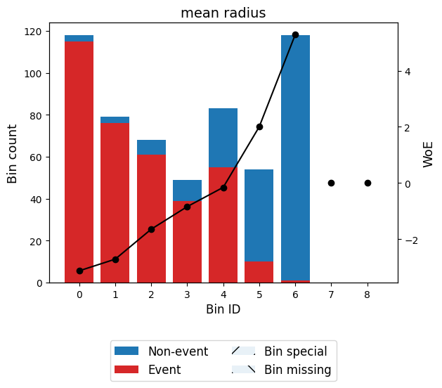
binning_table.plot(metric="event_rate")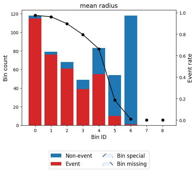
Note that WoE is inversely related to the event rate, i.e., a monotonically ascending event rate ensures a monotonically descending WoE and vice-versa. We will see more monotonic trend options in the advanced tutorial.
Read more here: https://
Working with ‘missingno’ library
Exercise 6. Your turn!
Work with the ‘carseats’ dataset, find the best way to perform full diagnostic (dirty data, outliers, missing values). Fix problems.
# your code goes here
print(carseats.head())
Sales CompPrice Income Advertising Population Price ShelveLoc Age \
0 9.50 138 73.0 11 276 120 Bad 42
1 11.22 111 48.0 16 260 83 Good 65
2 10.06 113 35.0 10 269 80 Medium 59
3 7.40 117 100.0 4 466 97 Medium 55
4 4.15 141 64.0 3 340 128 Bad 38
Education Urban US
0 17 Yes Yes
1 10 Yes Yes
2 12 Yes Yes
3 14 Yes Yes
4 13 Yes No