Looking ahead: April Week 4, May Week 1
In the end of April and early May, we’ll dive deep into statistics finally.
How do we calculate descriptive statistics in Python?
What principles should we keep in mind?
Univariate analysis is a type of statistical analysis that involves examining the distribution and characteristics of a single variable. The prefix “uni-” means “one,” so univariate analysis focuses on one variable at a time, without considering relationships between variables.
Univariate analysis is the foundation of data analysis and is essential for understanding the basic structure of your data before moving on to more complex techniques like bivariate or multivariate analysis.
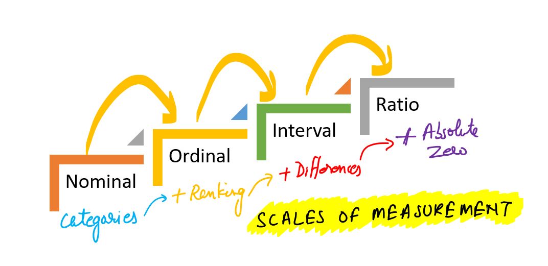
Measurement scales
Measurement scales determine what mathematical and statistical operations can be performed on data. There are four basic types of scales:
Nominal scale
Data is used only for naming or categorizing.
The order between values cannot be determined.
Possible operations: count, mode, frequency analysis.
Examples:
Pokémon type (type_1): “fire”, ‘water’, ‘grass’, etc.
Species, gender, colors, brands etc.
import pandas as pd
df_pokemon = pd.read_csv("data/pokemon.csv")
df_pokemon["Type 1"].value_counts()
Type 1
Water 112
Normal 98
Grass 70
Bug 69
Psychic 57
Fire 52
Electric 44
Rock 44
Dragon 32
Ground 32
Ghost 32
Dark 31
Poison 28
Steel 27
Fighting 27
Ice 24
Fairy 17
Flying 4
Name: count, dtype: int64Ordinal scale
Data can be ordered, but the distances between them are not known.
Possible operations: median, quantiles, rank tests (e.g. Spearman).
Examples:
Strength level: “low”, “medium”, “high”.
Quality ratings: “weak”, “good”, “very good”.
import seaborn as sns

titanic = sns.load_dataset("titanic")

print(titanic["class"].unique())
['Third', 'First', 'Second']
Categories (3, object): ['First', 'Second', 'Third']
Interval scale
The data is numerical, with equal intervals, but lacks an absolute zero.
Differences, mean, and standard deviation can be calculated.
Ratios (e.g., “twice as much”) do not make sense.
Examples:
Temperature in °C (but not in Kelvin!). Why? There is no absolute zero—zero does not mean the absence of the property; it is just a conventional reference point. 0°C does not mean no temperature; 20°C is not 2 × 10°C.
Year in a calendar (e.g., 1990). Why? Year 0 does not mark the beginning of time; 2000 is not 2 × 1000.
Time in the hourly system (e.g., 13:00). Why? 0:00 does not mean no time, but rather an established reference point.
Ratio scale
Numerical data with an absolute zero.
All mathematical operations, including division, can be performed.
Not all numerical data is on a ratio scale! For example, temperature in degrees Celsius is not on a ratio scale because 0°C does not mean the absence of temperature. However, temperature in Kelvin (K) is, as 0 K represents the absolute absence of thermal energy.
Examples:
Height, weight, number of Pokémon attack points (attack), HP, speed.
df_pokemon[["HP", "Attack", "Speed"]].describe()Table: Measurement scales in statistics
| Scale | Example | Is it possible to order? | Equal spacing? | Absolute zero? | Sample statistical calculations |
|---|---|---|---|---|---|
| Nominal | Pokémon type (fire, water etc.) | ❌ | ❌ | ❌ | Mode, counts, frequency analysis |
| Ordinal | Ticket class (First, Second, Third) | ✅ | ❌ | ❌ | Median, quantiles |
| Interval | Temperature in °C | ✅ | ✅ | ❌ | Mean, standard deviation |
| Ratio | HP, attack, height | ✅ | ✅ | ✅ | All mathematical operations/statistical |
Conclusion: The type of scale affects the choice of statistical methods - for example, the Pearson correlation test requires quotient or interval data, while the Chi² test requires nominal data.
Quiz: measurement scales in statistics.
Answer the following questions by choosing one correct answer. You will find the solutions at the end.
1. Which scale enables ordering of data, but does not have equal spacing?
A) Nominal
B) Ordinal
C) Interval
D) Ratio
2. An example of a variable on the nominal scale is:
A) Temperature in °C
B) Height
C) Type of Pokémon (
fire,grass,water)D) Satisfaction level (
low,medium,high).
3. Which scale does not have absolute zero, but has equal spacing?
A) Ratio
B) Ordinal
C) Interval
D) Nominal
4. What operations are allowed on variables on an ordinal scale?
A) Mean and standard deviation
B) Mode and Pearson correlation
C) Median and rank tests
D) Quotients and logarithms
5. The variable “class” in the Titanic set (First, Second, Third) is an example:
A) Nominal scale
B) Ratio scale
C) Interval scale
D) Ordinal scale
Descriptive statistics
Descriptive statistics deals with the description of the distribution of data in a sample. Descriptive statistics give us basic summary measures about a set of data. Summary measures include measures of central tendency (mean, median and mode) and measures of variability (variance, standard deviation, minimum/maximum values, IQR (interquartile range), skewness and kurtosis).
This week
Now we’re going to look at describing our data - as well as the basics of statistics.
There are many ways to describe a distribution.
Here we will discuss:
Measures of central tendency: what is the typical value in this distribution?
Measures of variability: how much do the values differ from each other?
Measures of skewness: how strong is the asymmetry of the distribution?
Measures of curvature: what is the intensity of extreme values?
import numpy as np
import matplotlib.pyplot as plt
import seaborn as sns
import scipy.stats as stats
%matplotlib inline
%config InlineBackend.figure_format = 'retina'Central tendency
The central tendency refers to the “typical value” in a distribution.
The central tendency refers to the central value that describes the distribution of a variable. It can also be referred to as the center or location of the distribution. The most common measures of central tendency are average, median and mode. The most common measure of central tendency is the mean. In the case of skewed distributions or when there is concern about outliers, the median may be preferred. The median is thus a more reliable measure than the mean.
There are many ways to measure what is “typical” - average:
Arithmetic mean
Median (middle value)
Mode (dominant)
Why is this useful?
A dataset may contain many observations.
For example, = 5000 of survey responses regarding `height’.
One way to “describe” this distribution is to visualize it.
But it is also helpful to reduce this distribution to a single number.
This is necessarily a simplification of our dataset!
Arithmetic average
Arithmetic average is defined as the
sumof all values in a distribution, divided by the number of observations in that distribution.
numbers = [1, 2, 3, 4]
### calculating manually...
sum(numbers)/len(numbers)2.5The most common measure of central tendency is the average.
The mean is also known as the simple average.
It is denoted by the Greek letter for a population and for a sample.
We can find the average of the number of elements by adding all the elements in the data set and then dividing by the number of elements in the data set.
This is the most popular measure of central tendency, but it has a drawback.
The average is affected by the presence of outliers.
Thus, the average alone is not sufficient for making business decisions.
numpy.mean
The numpy package has a function that calculates an average on a list or numpy.ndarray.
np.mean(numbers)np.float64(2.5)scipy.stats.tmean
The scipy.stats library has a variety of statistical functions.
stats.tmean(numbers)np.float64(2.5)Calculating the average of a pandas column.
If we work with DataFrame, we can calculate the average of specific columns.
import pandas as pd
df_gapminder = pd.read_csv("data/gapminder_full.csv")
df_gapminder.head(2)df_gapminder['life_exp'].mean()np.float64(59.474439366197174)Your turn
How to calculate the mean life expectancy for EUROPEan countries (2007).
### Your code hereAverage and skewness
Skewness means that there are values extending one of the “tails” of the distribution.
Of the measures of central tendency, “average” is the most dependent on the direction of skewness.
How would you describe the following skewness?
Do you think the “mean” would be higher or lower than the “median”?
sns.histplot(data = df_gapminder, x = "gdp_cap")
plt.axvline(df_gapminder['gdp_cap'].mean(), linestyle = "dotted");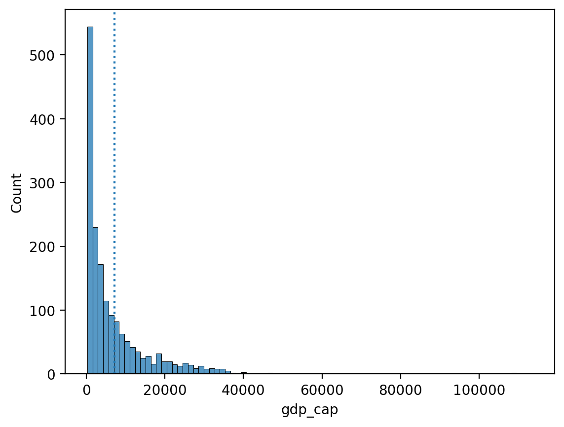
Your turn
Is it possible to calculate the average of the column “continent”? Why or why not?
### Your comment hereYour turn
Subtract each observation in
numbersfrom theaverageof thislist.Then calculate the sum of these deviations from the
average.
What is their sum?
numbers = np.array([1, 2, 3, 4])
### Your code here
Summary of the first part
The mean is one of the most common measures of central tendency.
It can only be used for continuous interval/ratio data.
The sum of deviations from the mean is equal to
0.The “mean” is most affected by skewness and outliers.
Median
Median is calculated by sorting all values from smallest to largest and then finding the value in the middle.
The median is the number that divides a data set into two equal halves.
To calculate the median, we need to sort our data set of n numbers in ascending order.
The median of this data set is the number in the position if is odd.
If n is even, the median is the average of the third number and the third number.
The median is robust to outliers.
Thus, in the case of skewed distributions or when there is concern about outliers, the median may be preferred.
df_gapminder['gdp_cap'].median()np.float64(3531.8469885)Comparison of median and average.
The direction of inclination has less effect on the median.
sns.histplot(data = df_gapminder, x = "gdp_cap")
plt.axvline(df_gapminder['gdp_cap'].mean(), linestyle = "dotted", color = "blue")
plt.axvline(df_gapminder['gdp_cap'].median(), linestyle = "dashed", color = "red");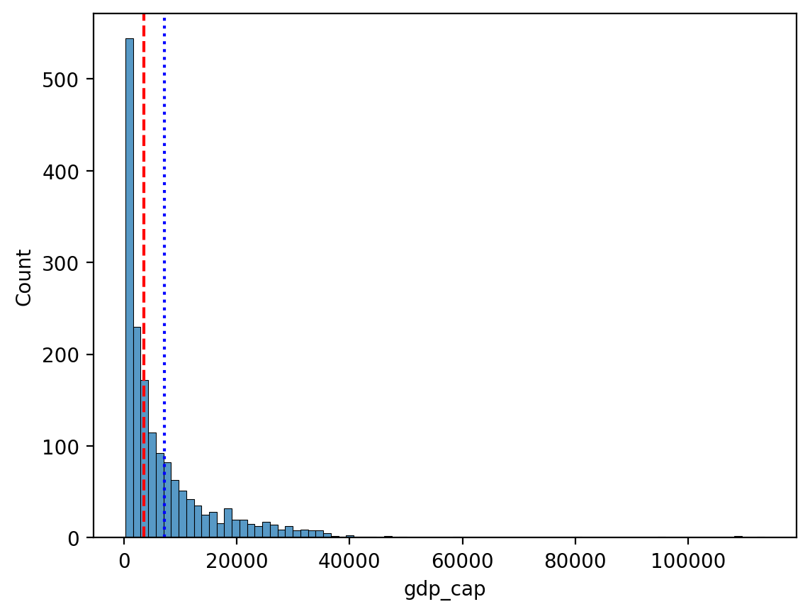
Your turn
Is it possible to calculate the median of the column “continent”? Why or why not?
### Your comment hereMode
Mode is the most common value in a data set.
Unlike median or average, mode can be used with categorical data.
df_pokemon = pd.read_csv("data/pokemon.csv")
df_pokemon['Type 1'].mode()
0 Water
Name: Type 1, dtype: objectmode() returns multiple values?
If multiple values bind for the most frequent one,
mode()will return them all.This is because technically, a distribution can have multiple values for the most frequent - modal!
df_gapminder['gdp_cap'].mode()0 241.165876
1 277.551859
2 298.846212
3 299.850319
4 312.188423
...
1699 80894.883260
1700 95458.111760
1701 108382.352900
1702 109347.867000
1703 113523.132900
Name: gdp_cap, Length: 1704, dtype: float64Measures of central tendency - summary
| Measure | Can be used for: | Limitations |
|---|---|---|
| Mean | Continuous data | Influence on skewness and outliers |
| Median | Continuous data | Does not include the value of all data points in the calculation (ranks only) |
| Mode | Continuous and categorical data | Considers only frequent; ignores other values |
Quantiles
Quantiles are descriptive - positional statistics that divide an ordered data set into equal parts. The most common quantiles are:
Median (quantile of order 0.5),
Quartiles (divide the data into 4 parts),
Deciles (into 10 parts),
Percentiles (into 100 parts).
Definition
A quantile of order is a value of such that:
In other words: of the values in the data set are less than or equal to .
Formula (for an ordered data set)
For a data sample ordered in ascending order, the quantile of order is determined as:
Calculate the positional index:
If is an integer, then the quantile is .
If is not integer, we interpolate linearly between adjacent values:
Note: In practice, different methods are used to determine quantiles - libraries such as NumPy or Pandas have different modes (e.g. method='linear', method='midpoint').
Example - we calculate step by step:
For data:
We arrange the data in ascending order:
Median (quantile of order 0.5):
The number of elements , the middle element is the 5th value:
First quartile (Q1, quantile of order 0.25):
Interpolation between and :
Third quartile (Q3, quantile of 0.75):
Interpolation between and :
Deciles
Deciles divide data into 10 equal parts. For example:
D1 is the 10th percentile (quantile of 0.1),
D5 is the median (0.5),
D9 is the 90th percentile (0.9).
The formula is the same as for overall quantiles, just use the corresponding . E.g. for D3:
Percentiles
Percentiles divide data into 100 equal parts. E.g.:
P25 = Q1,
P50 = median,
P75 = Q3,
P90 is the value below which 90% of the data is.
With percentiles, we can better understand the distribution of data - for example, in standardized tests, a score is often given as a percentile (e.g., “85th percentile” means that someone scored better than 85% of the population).
Quantiles - summary
| Name | Symbol | Quantile ( q ) | Meaning |
|---|---|---|---|
| Q1 | Q1 | 0.25 | 25% of data ≤ Q1 |
| Median | Q2 | 0.5 | 50% of data ≤ Median |
| Q3 | Q3 | 0.75 | 75% of data ≤ Q3 |
| Decile 1 | D1 | 0.1 | 10% of data ≤ D1 |
| Decile 9 | D9 | 0.9 | 90% of data ≤ D9 |
| Percentile 95 | P95 | 0.95 | 95% of data ≤ P95 |
Example - calculations of quantiles
# Sample data
mydata = [3, 7, 8, 5, 12, 14, 21, 13, 18]
mydata_sorted = sorted(mydata)
print("Sorted data:", mydata_sorted)
Sorted data: [3, 5, 7, 8, 12, 13, 14, 18, 21]
# Conversion to Pandas Series
s = pd.Series(mydata)

# Quantiles
q1 = s.quantile(0.25) # lower quartile Q1
median = s.quantile(0.5) # median or middle quartile Q2 = Me
q3 = s.quantile(0.75) # upper quartile Q3

# Deciles
d1 = s.quantile(0.1) # bottom 10% of data...
d9 = s.quantile(0.9) # top 10% of data...

# Percentiles
p95 = s.quantile(0.95)  # top 5% of data...

print("Quantiles:")
print(f"Q1 (25%): {q1}")
print(f"Median (50%): {median}")
print(f"Q3 (75%): {q3}")
print("\nDeciles:")
print(f"D1 (10%): {d1}")
print(f"D9 (90%): {d9}")
print("\nPercentiles:")
print(f"P95 (95%): {p95}")
Quantiles:
Q1 (25%): 7.0
Median (50%): 12.0
Q3 (75%): 14.0
Deciles:
D1 (10%): 4.6
D9 (90%): 18.6
Percentiles:
P95 (95%): 19.799999999999997
# Create boxplot
fig, ax = plt.subplots(figsize=(8, 6))–
sns.boxplot(data=mydata, ax=ax, color='lightblue', width=0.3)

# Calculate statistics
minimum = np.min(mydata)
q1 = np.percentile(mydata, 25)
median = np.median(mydata)
q3 = np.percentile(mydata, 75)
maximum = np.max(mydata)
mean = np.mean(mydata)

ax.scatter(0, minimum, color='red', label='Min', zorder=5)
ax.scatter(0, q1, color='orange', label='Q1 (25th percentile)', zorder=5)
ax.scatter(0, median, color='green', label='Median (50th percentile)', zorder=5)
ax.scatter(0, q3, color='purple', label='Q3 (75th percentile)', zorder=5)
ax.scatter(0, maximum, color='brown', label='Max', zorder=5)
ax.scatter(0, mean, color='black', marker='D', s=60, label='Mean', zorder=5)

for value, name, color in zip(
    [minimum, q1, median, mean, q3, maximum],
    ['Min', 'Q1', 'Median', 'Mean', 'Q3', 'Max'],
    ['red', 'orange', 'green', 'black', 'purple', 'brown']
):
    ax.text(0.1, value, f'{name}: {value:.2f}', verticalalignment='center', color=color)


ax.set_title('Boxplot of mydata with All Measures Marked')
ax.legend(bbox_to_anchor=(1.05, 1), loc='upper left')
plt.show()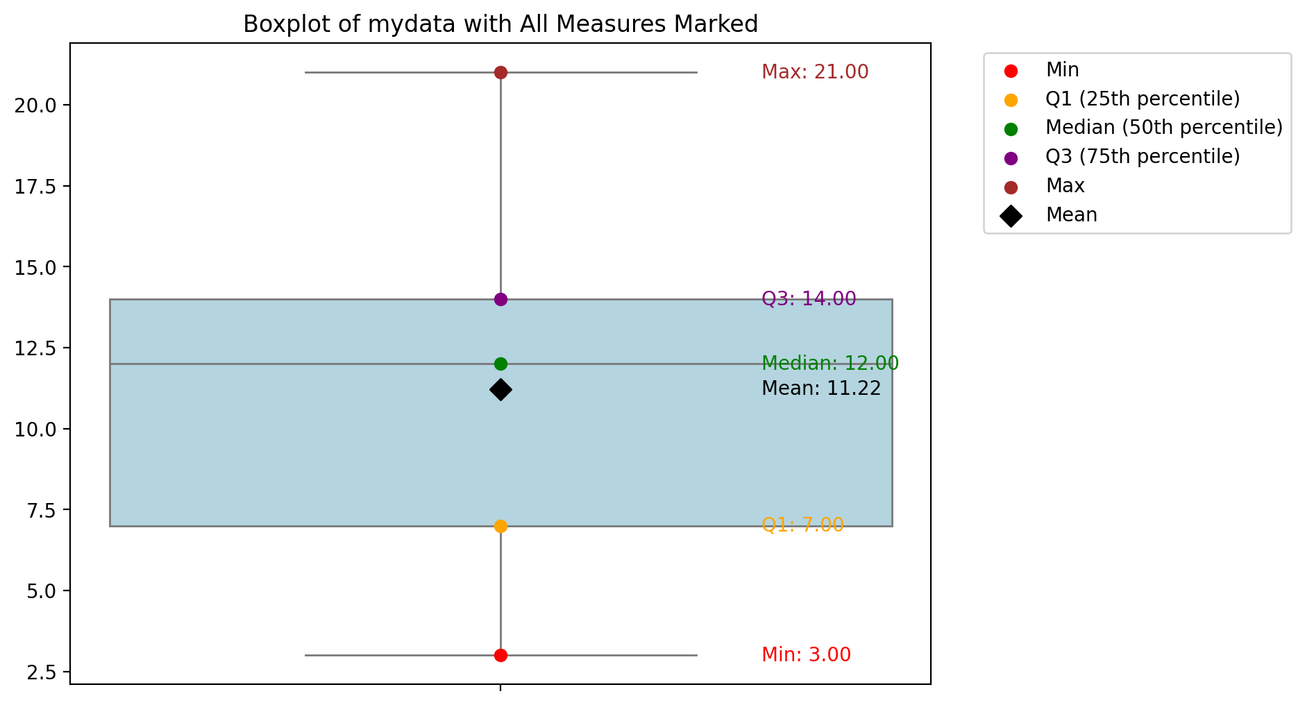
Your turn!
Try to change the boxplot into the violin plot (or add it).
Looking at the aforementioned quantile results and the box plot, try to interpret these measures.
Variability
Variability (or dispersion) refers to the degree to which values in a distribution are dispersed, i.e., differ from each other.
The dispersion is an indicator of how far from the center we can find data values. The most common measures of dispersion are variance, standard deviation and interquartile range (IQR). The variance is a standard measure of dispersion. The standard deviation is the square root of the variance. The variance and standard deviation are two useful measures of scatter.
The mean hides the variance!
Both distributions have the same mean, but different standard deviations.
### Let's create some distributions
d1 = np.random.normal(loc = 0, scale = 1, size = 1000)
d2 = np.random.normal(loc = 0, scale = 5, size = 1000)
### Plots
fig, axes = plt.subplots(1, 2, sharex=True, sharey=True);
p1 = axes[0].hist(d1, alpha = .5)
p2 = axes[1].hist(d2, alpha = .5)
axes[0].set_title("Lower variance");
axes[1].set_title("Higher variance");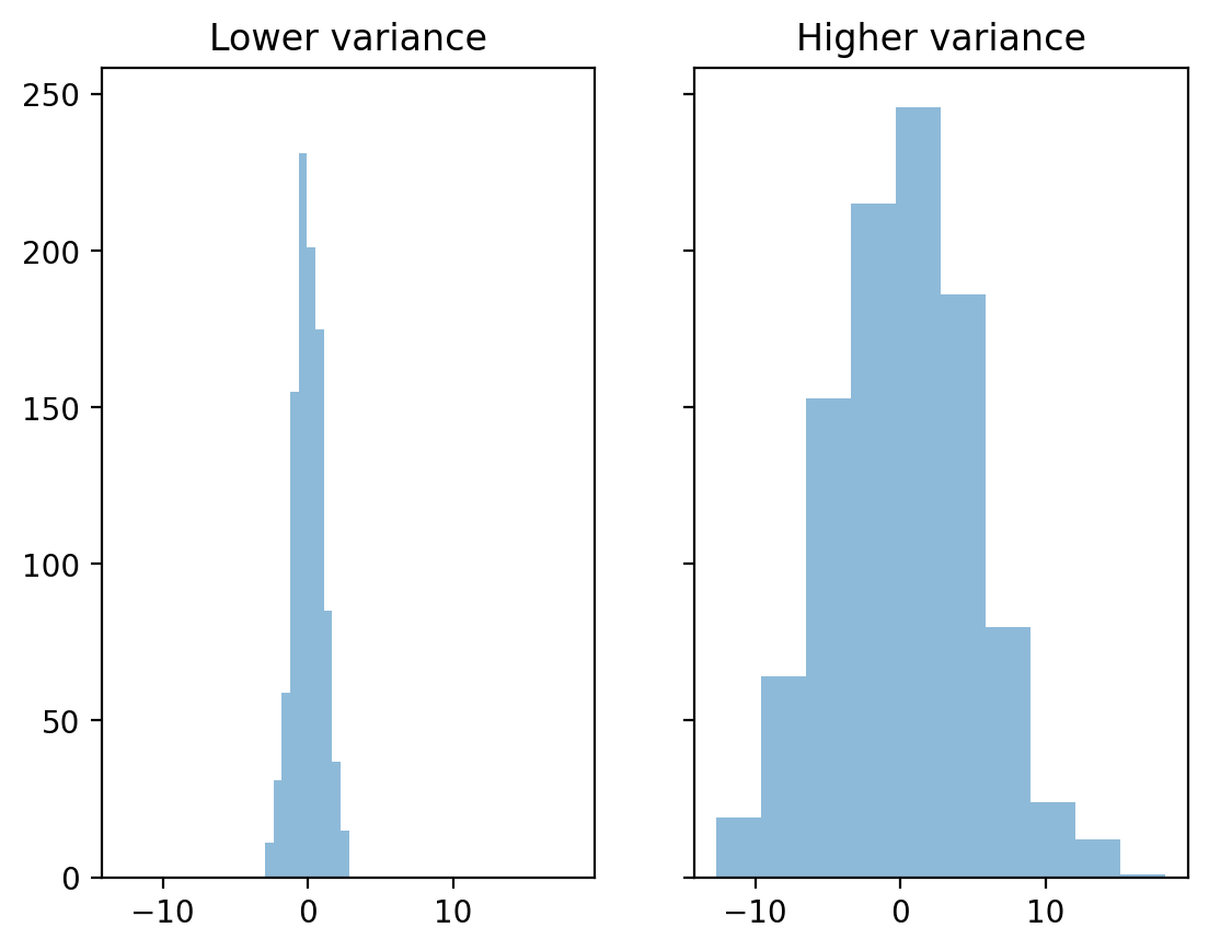
Volatility detection
There are at least three main approaches to quantifying variability:
Range: the difference between the “maximum” and “minimum” value.
Interquartile range (IQR): The range of the middle 50% of the data.
Variance and Standard Deviation: the typical value by which results deviate from the mean.
Range
Range Is the difference between the
maximumandminimumvalues.
Intuitive, but only considers two values in the entire distribution.
d1.max() - d1.min()np.float64(5.773802970965855)d2.max() - d2.min()np.float64(30.896869694831192)IQR
The interquartile range (IQR) is the difference between a value in the 75% percentile and a value in the 25% percentile.
It focuses on the center 50%, but still only considers two values.
IQR is calculated using the limits of the data between the 1st and 3rd quartiles.
The interquartile range (IQR) can be calculated as follows:
In the same way that the median is more robust than the mean, the IQR is a more robust measure of scatter than the variance and standard deviation and should therefore be preferred for small or asymmetric distributions.
It is a robust measure of scatter.
## Let's calculate quantiles - quartiles Q1 and Q3
q3, q1 = np.percentile(d1, [75 ,25])
q3 - q1np.float64(1.345875103819967)## Let's calculate quantiles - quartiles Q1 and Q3
q3, q1 = np.percentile(d2, [75 ,25])
q3 - q1np.float64(6.6243520774932)Variance and standard deviation.
The Variance measures the dispersion of a set of data points around their mean value. It is the average of the squares of the individual deviations. The variance gives the results in original units squared.
Standard deviation (SD) measures the typical value by which the results in the distribution deviate from the mean.
where: - - the number of elements in the sample - - the arithmetic mean of the sample
What to keep in mind:
SD is the square root of variance.
There are actually two measures of SD:
SD of a population: when you measure the entire population of interest (very rare).
SD of a sample: when you measure a sample (typical case); we’ll focus on that.
SD, explained
First, calculate the total square deviation.
What is the total square deviation from the “mean”?
Then divide by
n - 1: normalize to the number of observations.What is the average squared deviation from the `average’?
Finally, take the square root:
What is the average deviation from the “mean”?
The standard deviation represents the typical or “average” deviation from the “mean”.
SD calculation in pandas
df_pokemon['Attack'].std()np.float64(32.45736586949845)df_pokemon['HP'].std()np.float64(25.53466903233207)Note on numpy.std!!!
By default,
numpy.stdcalculates the population standard deviation!You need to modify the
ddofparameter to calculate the sample standard deviation.
This is a very common error.
### SD in population
d1.std()np.float64(1.0006452408451578)### SD for sample
d1.std(ddof = 1)np.float64(1.001145939020521)Coefficient of variation (CV).
The coefficient of variation (CV) is equal to the standard deviation divided by the mean.
It is also known as “relative standard deviation.”
X = [2, 4, 4, 4, 5, 5, 7, 9]
mean = np.mean(X)

# Variance and standard deviation from scipy (for the sample!):
var_sample = stats.tvar(X)      # sample variance
std_sample = stats.tstd(X)      # sample sd

# CV (for sample):
cv_sample = (std_sample / mean) * 100

print(f"Mean: {mean}")
print(f"Sample variance (scipy): {var_sample}")
print(f"Sample sd (scipy): {std_sample}")
print(f"CV (scipy): {cv_sample:.2f}%")
Mean: 5.0
Sample variance (scipy): 4.571428571428571
Sample sd (scipy): 2.138089935299395
CV (scipy): 42.76%
Interquartile deviation
Interquartile deviation (sometimes called the semi-interquartile range) is defined as half of the interquartile range:
This value shows the average distance from the median to the quartiles and is a robust measure of variability.
A small interquartile deviation means the middle 50% of the data are close to the median.
A large interquartile deviation means the middle 50% are more spread out.
It is less sensitive to outliers than the standard deviation or range!
Your turn!
Calculate STD and CV for the SPEED of LEGENDARY and NOT LEGENDARY pokemons. What is the IQR deviation?
# Your code here!
Measures of the shape of the distribution
Now we will look at measures of the shape of the distribution. There are two statistical measures that can tell us about the shape of a distribution. These are skewness and curvature. These measures can be used to tell us about the shape of the distribution of a data set.
Skewness
Skewness is a measure of the symmetry of a distribution, or more precisely, the lack of symmetry.
It is used to determine the lack of symmetry with respect to the mean of a data set.
It is a characteristic of deviation from the mean.
It is used to indicate the shape of a data distribution.
Skewness is a measure of the asymmetry of the distribution of data relative to the mean. It tells us whether the data are more ‘stretched’ to one side.
Interpretation:
Skewness > 0 - right-tailed (positive): long tail on the right (larger values are more dispersed)
Skewness < 0 - left (negative): long tail on the left (smaller values are more dispersed)
Skewness ≈ 0 - symmetric distribution (e.g. normal distribution)
Formula (for the sample):
where:
- number of observations
- sample mean
- standard deviation of the sample
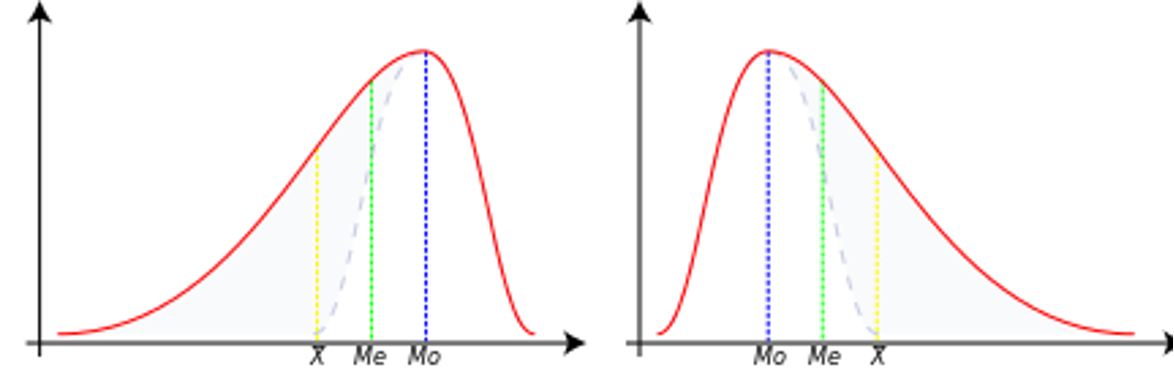
Negative skewness
In this case, the data are skewed or shifted to the left.
By skewed to the left, we mean that the left tail is long relative to the right tail.
The data values may extend further to the left, but are concentrated on the right.
So we are dealing with a long tail, and the distortion is caused by very small values that pull the mean down and it is smaller than the median.
In this case we have Mean < Median < Mode.
Zero skewness
This means that the dataset is symmetric.
A dataset is symmetric if it looks the same to the left and right of the midpoint.
A dataset is bell-shaped or symmetric.
A perfectly symmetrical dataset will have a skewness of zero.
So a normal distribution that is perfectly symmetric has a skewness of 0.
In this case we have Mean = Median = Mode.
Positive skewness
The dataset is skewed or shifted to the right.
By skewed to the right we mean that the right tail is long relative to the left tail.
The data values are concentrated on the right side.
There is a long tail on the right side, which is caused by very large values that pull the mean upwards and it is larger than the median.
So we have Mean > Median > Mode.
from scipy.stats import skew
X = [2, 4, 4, 4, 5, 5, 7, 9]
skewness = skew(X)
print(f"Skewness of X: {skewness:.4f}")
Skewness of X: 0.6562
Your turn
Try to interpret the above-mentioned result and calculate example slant ratios for several groups of Pokémon.
# Your comment hereInterquartile Skewness
IQR skewness is a robust, non-parametric measure of skewness that uses the positions of the quartiles rather than the mean and standard deviation. It is particularly useful for detecting asymmetry in data distributions, especially when outliers are present.
The formula for IQR Skewness is:
This method is less sensitive to outliers and more robust than moment-based skewness, making it ideal for exploratory data analysis.
Your turn
Try to calculate the IQR Skewness coefficient for the sample data:
mydata = [3, 7, 8, 5, 12, 14, 21, 13, 18]
# Your code here
Kurtosis
Contrary to what some textbooks claim, kurtosis does not measure the ‘flattening’, the ‘peaking’ of a distribution.
Kurtosis depends on the intensity of the extremes, so it measures what happens in the ‘tails’ of the distribution, the shape of the ‘top’ is irrelevant!
Excess kurtosis is just kurtosis minus 3. It’s used to compare a distribution to the normal distribution (which has kurtosis = 3).
Sample kurtosis:
Reference range for kurtosis
The reference standard is the normal distribution, which has a kurtosis of 3.
Often Excess is presented instead of kurtosis, where excess is simply Kurtosis - 3.
Mesocurve
A normal distribution has a kurtosis of exactly 3 (Excess exactly 0).
Any distribution with kurtosis (exces ≈ 0) is called mezocurtic.
Platykurtic curve
A distribution with kurtosis (Excess < 0) is called platykurtic.
Compared to a normal distribution, its central peak is lower and wider and its tails are shorter and thinner.
Leptokurtic curve
A distribution with kurtosis (Excess > 0) is called leptocurtic.
Compared to a normal distribution, its central peak is higher and sharper and its tails are longer and thicker.
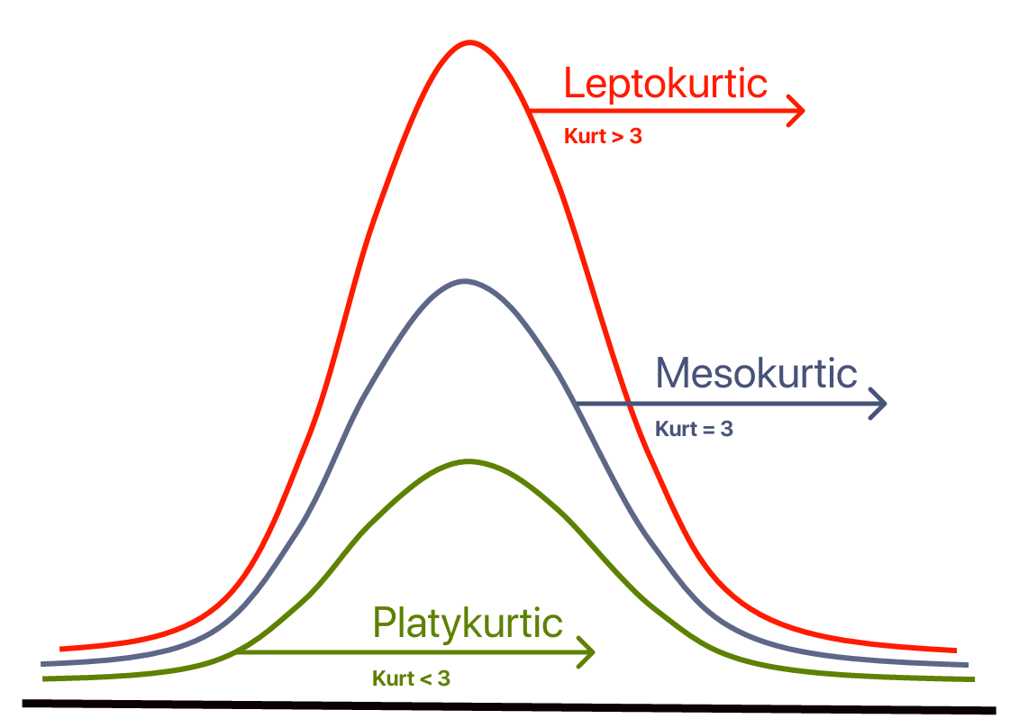
So:
Excess Kurtosis ≈ 0 → Normal distribution
Excess Kurtosis > 0 → Leptokurtic (heavy tails)
Excess Kurtosis < 0 → Platykurtic (light tails)
from scipy.stats import kurtosis
import numpy as np

data = np.array([2, 8, 0, 4, 1, 9, 9, 0])

# By default, it returns excess kurtosis
excess_kurt = kurtosis(data)
print("Excess Kurtosis:", excess_kurt)

# To get regular kurtosis (not excess), set fisher=False
regular_kurt = kurtosis(data, fisher=False)
print("Regular Kurtosis:", regular_kurt)
Excess Kurtosis: -1.6660010752838508
Regular Kurtosis: 1.3339989247161492
Interquartile Kurtosis
IQR Kurtosis is a robust, non-parametric measure of kurtosis that focuses on the tails of the distribution using interquartile ranges. It is particularly useful for detecting the intensity of extreme values in data distributions, especially when outliers are present.
The formula for IQR Kurtosis is:
Where:
is the first quartile (25th percentile),
is the third quartile (75th percentile),
is the 90th percentile,
is the 10th percentile.
Interpretation:
IQR Kurtosis differs from traditional kurtosis in its interpretation. While traditional kurtosis focuses on the intensity of the tails of a distribution (e.g., heavy or light tails), IQR Kurtosis is a robust measure that emphasizes the relative spread of the interquartile range (IQR) and the symmetry of the distribution around the median.
Your turn
Try to calculate the IQR Kurtosis coefficient for the sample data:
mydata = [3, 7, 8, 5, 12, 14, 21, 13, 18]
# Your code here
Summary statistics
A great tool for creating elegant summaries of descriptive statistics in Markdown format (ideal for Jupyter Notebooks) is pandas, especially in combination with the .describe() function and tabulate.
Example with pandas + tabulate (a nice table in Markdown):
from scipy.stats import skew, kurtosis
from tabulate import tabulate

def markdown_summary(df, round_decimals=3):
    summary = df.describe().T  # transpose so that the variables are in rows
    # Add skewness and kurtosis
    summary['Skewness'] = df.skew()
    summary['Kurtosis'] = df.kurt()
    # Rounding up the results
    summary = summary.round(round_decimals)
    # Nice summary table!
    return tabulate(summary, headers='keys', tablefmt='github')
# We select only the numerical columns for analysis:
quantitative = df_pokemon.select_dtypes(include='number')
# We use our function:
print(markdown_summary(quantitative))| | count | mean | std | min | 25% | 50% | 75% | max | Skewness | Kurtosis |
|------------|---------|---------|---------|-------|--------|-------|--------|-------|------------|------------|
| # | 800 | 362.814 | 208.344 | 1 | 184.75 | 364.5 | 539.25 | 721 | -0.001 | -1.166 |
| Total | 800 | 435.102 | 119.963 | 180 | 330 | 450 | 515 | 780 | 0.153 | -0.507 |
| HP | 800 | 69.259 | 25.535 | 1 | 50 | 65 | 80 | 255 | 1.568 | 7.232 |
| Attack | 800 | 79.001 | 32.457 | 5 | 55 | 75 | 100 | 190 | 0.552 | 0.17 |
| Defense | 800 | 73.842 | 31.184 | 5 | 50 | 70 | 90 | 230 | 1.156 | 2.726 |
| Sp. Atk | 800 | 72.82 | 32.722 | 10 | 49.75 | 65 | 95 | 194 | 0.745 | 0.298 |
| Sp. Def | 800 | 71.902 | 27.829 | 20 | 50 | 70 | 90 | 230 | 0.854 | 1.628 |
| Speed | 800 | 68.278 | 29.06 | 5 | 45 | 65 | 90 | 180 | 0.358 | -0.236 |
| Generation | 800 | 3.324 | 1.661 | 1 | 2 | 3 | 5 | 6 | 0.014 | -1.24 |
To make a summary table cross-sectionally (i.e. by group), you need to use the groupby() method on the DataFrame and then, for example, describe() or your own aggregate function.
Let’s say you want to group the data by the ‘Type 1’ column (i.e. e.g. Pokémon type: Fire, Water, etc.) and then summarise the quantitative variables (mean, variance, min, max, etc.).
# Grouping by ‘Type 1’ column and statistical summary of numeric columns:
group_summary = df_pokemon.groupby('Type 1')[quantitative.columns].describe()
print(group_summary)
# \
count mean std min 25% 50% 75% max
Type 1
Bug 69.0 334.492754 210.445160 10.0 168.00 291.0 543.00 666.0
Dark 31.0 461.354839 176.022072 197.0 282.00 509.0 627.00 717.0
Dragon 32.0 474.375000 170.190169 147.0 373.00 443.5 643.25 718.0
Electric 44.0 363.500000 202.731063 25.0 179.75 403.5 489.75 702.0
Fairy 17.0 449.529412 271.983942 35.0 176.00 669.0 683.00 716.0
Fighting 27.0 363.851852 218.565200 56.0 171.50 308.0 536.00 701.0
Fire 52.0 327.403846 226.262840 4.0 143.50 289.5 513.25 721.0
Flying 4.0 677.750000 42.437209 641.0 641.00 677.5 714.25 715.0
Ghost 32.0 486.500000 209.189218 92.0 354.75 487.0 709.25 711.0
Grass 70.0 344.871429 200.264385 1.0 187.25 372.0 496.75 673.0
Ground 32.0 356.281250 204.899855 27.0 183.25 363.5 535.25 645.0
Ice 24.0 423.541667 175.465834 124.0 330.25 371.5 583.25 713.0
Normal 98.0 319.173469 193.854820 16.0 161.25 296.5 483.00 676.0
Poison 28.0 251.785714 228.801767 23.0 33.75 139.5 451.25 691.0
Psychic 57.0 380.807018 194.600455 63.0 201.00 386.0 528.00 720.0
Rock 44.0 392.727273 213.746140 74.0 230.75 362.5 566.25 719.0
Steel 27.0 442.851852 164.847180 208.0 305.50 379.0 600.50 707.0
Water 112.0 303.089286 188.440807 7.0 130.00 275.0 456.25 693.0
Total ... Speed Generation \
count mean ... 75% max count mean
Type 1 ...
Bug 69.0 378.927536 ... 85.00 160.0 69.0 3.217391
Dark 31.0 445.741935 ... 98.50 125.0 31.0 4.032258
Dragon 32.0 550.531250 ... 97.75 120.0 32.0 3.875000
Electric 44.0 443.409091 ... 101.50 140.0 44.0 3.272727
Fairy 17.0 413.176471 ... 60.00 99.0 17.0 4.117647
Fighting 27.0 416.444444 ... 86.00 118.0 27.0 3.370370
Fire 52.0 458.076923 ... 96.25 126.0 52.0 3.211538
Flying 4.0 485.000000 ... 121.50 123.0 4.0 5.500000
Ghost 32.0 439.562500 ... 84.25 130.0 32.0 4.187500
Grass 70.0 421.142857 ... 80.00 145.0 70.0 3.357143
Ground 32.0 437.500000 ... 90.00 120.0 32.0 3.156250
Ice 24.0 433.458333 ... 80.00 110.0 24.0 3.541667
Normal 98.0 401.683673 ... 90.75 135.0 98.0 3.051020
Poison 28.0 399.142857 ... 77.00 130.0 28.0 2.535714
Psychic 57.0 475.947368 ... 104.00 180.0 57.0 3.385965
Rock 44.0 453.750000 ... 70.00 150.0 44.0 3.454545
Steel 27.0 487.703704 ... 70.00 110.0 27.0 3.851852
Water 112.0 430.455357 ... 82.00 122.0 112.0 2.857143
std min 25% 50% 75% max
Type 1
Bug 1.598433 1.0 2.00 3.0 5.00 6.0
Dark 1.353609 2.0 3.00 5.0 5.00 6.0
Dragon 1.431219 1.0 3.00 4.0 5.00 6.0
Electric 1.604697 1.0 2.00 4.0 4.25 6.0
Fairy 2.147160 1.0 2.00 6.0 6.00 6.0
Fighting 1.800601 1.0 1.50 3.0 5.00 6.0
Fire 1.850665 1.0 1.00 3.0 5.00 6.0
Flying 0.577350 5.0 5.00 5.5 6.00 6.0
Ghost 1.693203 1.0 3.00 4.0 6.00 6.0
Grass 1.579173 1.0 2.00 3.5 5.00 6.0
Ground 1.588454 1.0 1.75 3.0 5.00 5.0
Ice 1.473805 1.0 2.75 3.0 5.00 6.0
Normal 1.575407 1.0 2.00 3.0 4.00 6.0
Poison 1.752927 1.0 1.00 1.5 4.00 6.0
Psychic 1.644845 1.0 2.00 3.0 5.00 6.0
Rock 1.848375 1.0 2.00 3.0 5.00 6.0
Steel 1.350319 2.0 3.00 3.0 5.00 6.0
Water 1.558800 1.0 1.00 3.0 4.00 6.0
[18 rows x 72 columns]
Cross-sectional analysis
Let’s try to calculate all those statistics by group i.e. perform descriptive analysis for Attack points by Legendary (for legendary and not legendary pokemons.)
grouped_attack = df_pokemon.groupby('Legendary')['Attack']
grouped_summary = grouped_attack.describe()
# let's add skewness and kurtosis now:
grouped_summary['Skewness'] = grouped_attack.apply(lambda x: x.skew())
grouped_summary['Kurtosis'] = grouped_attack.apply(lambda x: x.kurt())
from tabulate import tabulate
print(tabulate(grouped_summary, headers='keys', tablefmt='github'))  #summary in markdown table now
| Legendary | count | mean | std | min | 25% | 50% | 75% | max | Skewness | Kurtosis |
|-------------|---------|----------|---------|-------|-------|-------|-------|-------|------------|------------|
| False | 735 | 75.6694 | 30.4902 | 5 | 54.5 | 72 | 95 | 185 | 0.523333 | 0.145037 |
| True | 65 | 116.677 | 30.348 | 50 | 100 | 110 | 131 | 190 | 0.50957 | -0.18957 |
Your turn!
Add some cross-sectional plots and try to interpret the results.
# your plots and comments hereQuiz answers on measurement scales:
B
C
C
C
D