Abstract
This notebook provides an introduction to data wrangling and preprocessing techniques in Python. It covers strategies for identifying and handling missing data, merging datasets, and reshaping data into tidy formats for analysis and visualization. Practical examples demonstrate how to clean, transform, and prepare real-world datasets, emphasizing best practices for ensuring data quality and usability in data science workflows.
Goals of this lecture
A huge of science involves data wrangling.
This could be an entire course on its own, but today we’ll focus on:
What is data wrangling?
What to do about missing values?
How to combine datasets?
Tidy data!
What is it?
How do we make our data tidy?
Importing relevant libraries
import seaborn as sns ### importing seaborn
import pandas as pd
import numpy as np
%matplotlib inline
%config InlineBackend.figure_format = 'retina'What is data wrangling?
Data wrangling refers to manipulating, reshaping, or transforming a dataset as needed for your goals (e.g., visualization and/or analysis).
A huge of working with data involves “wrangling”.
Includes:
“Cleaning” data (missing values, recasting variables, etc.).
Merging/combining different datasets.
Reshaping data as needed.
Types of missing data
Before we start analyzing missing values, it is important to understand the different reasons for missing data. Generally speaking, there are three possible reasons:
1. Missing completely at random (MCAR).
The missing values
of a given variable (Y) are not related to other variables in the data set or to the variable (Y) itself. In other words, there is no specific reason for the missing values.
2. Missing at random (MAR).
MAR occurs when the missing value is not random, but when the missing value can be fully explained by variables for which there is complete information.
3. Missing not at random (MNAR).
The missing value depends on unobserved data or on the values
of the missing data itself.
MCAR
What does it mean? When missing data points do not follow any particular reasoning or pattern.
Example 1. You have demographic data for your community. But the “Middle Name” variable is missing 50% of the values. This 50% of the data is a perfect example of MCAR data. There is no pattern or reason why the middle name is blank in most of the entries.
Example 2. In a paper survey, one page accidentally fell out of several forms during shipping. So the answers to questions on page 3 are missing, but regardless of who the respondent was or how they answered earlier.
How
For MCAR data, the following methods can be used:
Row-wise deletion: Delete a record if there is missing data in any of the variables/columns in the dataset. This works best only when the amount of missing data is small, such as when only 2% of the data in the dataset is missing completely at random.
Pairwise deletion: Pairwise deletion removes only the cases where one of the variables used in the statistical method under consideration is missing. It works on the same principle as the correlation matrix. In case of missing values
between two variables (in the sense of pairwise), finding the correlation matrix takes into account all the complete cases for those two variables. Suppose the number of cases in this scenario is N. After taking another set of variables and calculating the correlation matrix, the number of complete cases will be different from N. This serves as the main difference between rowwise and pairwise deletion. Pairwise deletion has the advantage of causing minimal data loss. In case of a data set which has common missing values in almost all variables, pairwise deletion would be a wiser choice to deal with the missing values. 3. Mean, Median and Mode Imputation: Missing values can also be replaced by the mean, median and mode of the respective variables.
MAR
What does it mean? When missing data points follow a pattern.
Example 1. Take the same example of demographic data for your community. But this time, the salaries of several men over the age of 45 are missing.
Example 2. In a health survey, women are more likely than men to not report their weight. Missing data is determined by gender (which is known), but not by the weight value itself.
In this case, missing data is imputed to data from another variable. As such, it is a “missing at random” mechanism. MAR is probably the most difficult to understand because of its name.
How
Because there is a relationship in this mechanism, the best option would be to use an imputation technique—mean, median, mode, or multiple imputation.
MNAR
What does this mean?
When the missing data points follow a pattern, it means that they follow the MNAR mechanism.
Example 1. In the same demographic data of residents of your community, let’s say that the salary of several men is missing when the salary exceeds a certain amount. (say, one million).
Example 2. People with very high incomes do not want to disclose their earnings in the survey. The missing data on income depends directly on its value (i.e. the one that is missing).
In this case, we are dealing with the “Missing Not at Random” mechanism. Usually, when the missing data is not MCAR or MAR, it tends to follow MNAR.
How
Since MNAR is a self-induced dependence, the best way to avoid it is to pool the data or model the missing data.
The reason we need to analyze the mechanisms of missing values
Dealing with missing values
In practice, real-world data is often messy.
This includes missing values, which take on the value/label
NaN.NaN= “Not a Number”.
Dealing with
NaNvalues is one of the main challenges in EDA!
Loading a dataset with missing values
The titanic dataset contains information about different Titanic passengers and whether they Survived (1 vs. 0).
Commonly used as a tutorial for machine learning, regression, and data wrangling.
df_titanic = pd.read_csv("data/wrangling/titanic.csv")
df_titanic.head(3)Why is missing data a problem?
If you’re unaware of missing data:
You might be overestimating the size of your dataset.
You might be biasing the results of a visualization or analysis (if missing data are non-randomly distributed).
You might be complicating an analysis.
By default, many analysis packages will “drop” missing data––so you need to be aware of whether this is happening.
How to deal with missing data
Identify whether and where your data has missing values.
Analyze how these missing values are distributed.
Decide how to handle them.
Not an easy problem––especially step 3!
Step 1: Identifying missing values
The first step is identifying whether and where your data has missing values.
There are several approaches to this:
Using
.isnaUsing
.infoUsing
.isnull
isna()
The
isna()function tells us whether a given cell of aDataFramehas a missing value or not (Truevs.False).If we call
isna().any(), it tells us which columns have missing values.
df_titanic.isna().head(1)df_titanic.isna().any()PassengerId False
Survived False
Pclass False
Name False
Sex False
Age True
SibSp False
Parch False
Ticket False
Fare False
Cabin True
Embarked True
dtype: boolInspecting columns with nan
Now we can inspect specific columns that have nan values.
df_titanic[df_titanic['Age'].isna()].head(5)How many nan?
If we call sum on the nan values, we can calculate exactly how many nan values are in each column.
df_titanic.isna().sum()PassengerId 0
Survived 0
Pclass 0
Name 0
Sex 0
Age 177
SibSp 0
Parch 0
Ticket 0
Fare 0
Cabin 687
Embarked 2
dtype: int64info
The info() function gives us various information about the DataFrame, including the number of not-null (i.e., non-missing) values in each column.
df_titanic.info()<class 'pandas.core.frame.DataFrame'>
RangeIndex: 891 entries, 0 to 890
Data columns (total 12 columns):
# Column Non-Null Count Dtype
--- ------ -------------- -----
0 PassengerId 891 non-null int64
1 Survived 891 non-null int64
2 Pclass 891 non-null int64
3 Name 891 non-null object
4 Sex 891 non-null object
5 Age 714 non-null float64
6 SibSp 891 non-null int64
7 Parch 891 non-null int64
8 Ticket 891 non-null object
9 Fare 891 non-null float64
10 Cabin 204 non-null object
11 Embarked 889 non-null object
dtypes: float64(2), int64(5), object(5)
memory usage: 83.7+ KB
Check-in
How many rows of the DataFrame have missing values for Cabin?
### Your code hereSolution
### How many? (Quite a few!)
df_titanic[df_titanic['Cabin'].isna()].shape
(687, 13)Visualizing missing values
Finally, we can visualize the rate of missing values across columns using
seaborn.heatmap.The dark cells are those with not-null values.
The light cells have
nanvalues.
sns.heatmap(df_titanic.isna())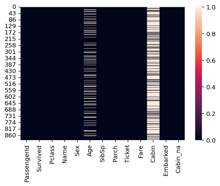
Step 2: Analyze how the data are distributed
Having identified missing data, the next step is determining how those missing data are distributed.
Is variable different depending on whether is nan?
One approach is to ask whether some variable of interest (e.g., Survived) is different depending on whether some other variable is nan.
### Mean survival for people without data about Cabin info
df_titanic[df_titanic['Cabin'].isna()]['Survived'].mean()0.29985443959243085### Mean survival for people *with* data about Cabin info
df_titanic[~df_titanic['Cabin'].isna()]['Survived'].mean()0.6666666666666666Check-in
What is the mean Survived rate for values with a nan value for Age vs. those with not-null values? How does this compare to the overall Survived rate?
### Your code hereSolution
### Mean survival for people without data about Age
df_titanic[df_titanic['Age'].isna()]['Survived'].mean()0.2937853107344633### Mean survival for people *with* data about Age
df_titanic[~df_titanic['Age'].isna()]['Survived'].mean()0.4061624649859944### Mean survival for people overall
df_titanic['Survived'].mean()0.3838383838383838Package missingno
If you want to dig deeper, you can check out the missingno Python library (which needs to be installed separately).
Finding the reason for missing data using a matrix chart
import missingno as msno
msno.matrix(df_titanic);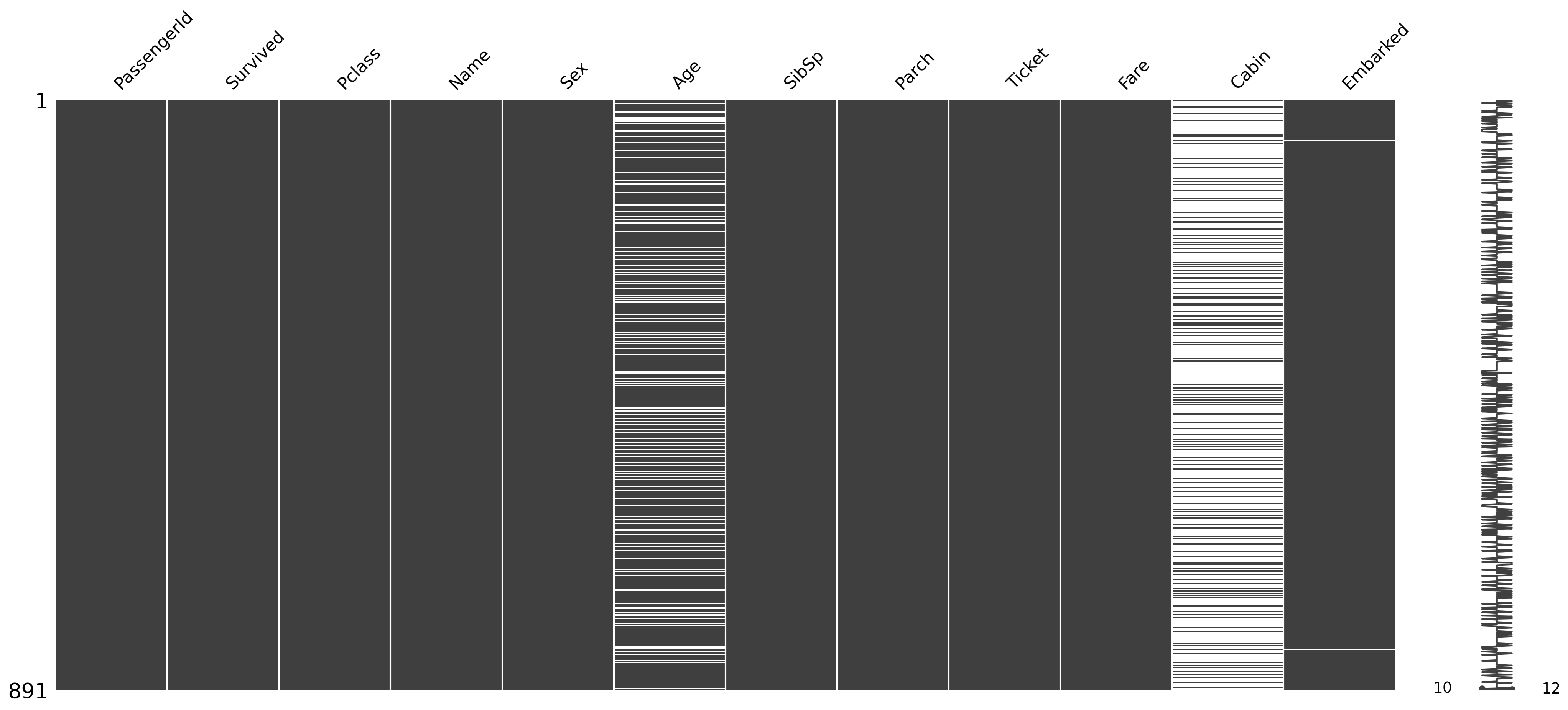
Finding the cause of missing data using Heatmap
msno.heatmap(df_titanic);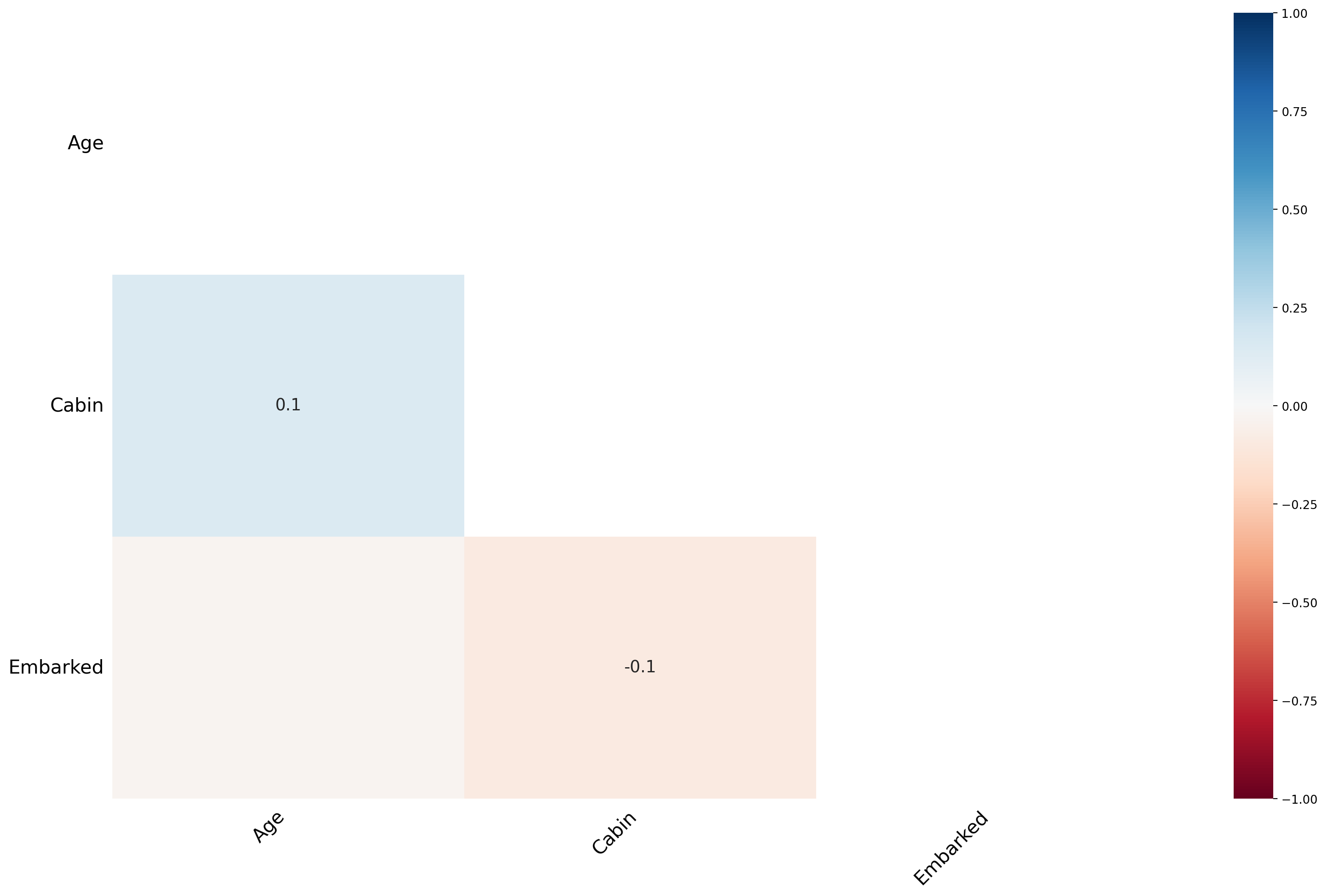
The heat map feature shows that there are no strong correlations between missing values
Finding the Cause of Missing Data Using a Dendrogram
A dendrogram is a tree diagram of missing data. It groups together highly correlated variables.
msno.dendrogram(df_titanic);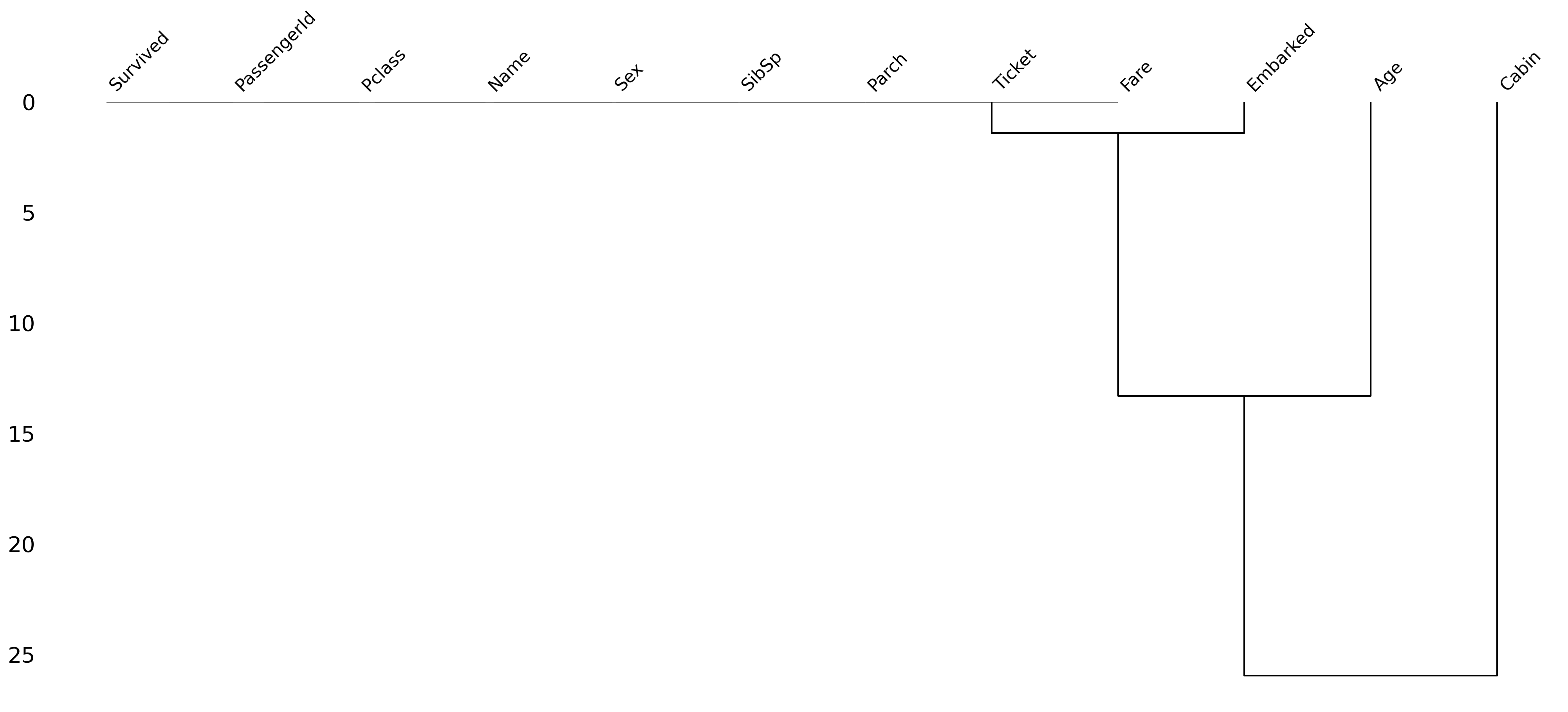
Step 3: Determine what to do!
Having identified missing data, you need to determine how to handle it.
There are several approaches you can take.
Removing all rows with any missing data.
Removing rows with missing data only when that variable is relevant to the analysis or visualization.
Imputing (i.e., guessing) what values missing data should have.
Removing all rows with any missing data
We can filter our
DataFrameusingdropna, which will automatically “drop” any rows containing null values.Caution: if you have lots of missing data, this can substantially impact the size of your dataset.
df_filtered = df_titanic.dropna()
df_filtered.shape
(183, 13)Removing all rows with missing data in specific columns
Here, we specify that we only want to
dropnafor rows that havenanin theAgecolumn specifically.We still have missing
nanforCabin, but perhaps that’s fine in our case.
df_filtered = df_titanic.dropna(subset = "Age")
df_filtered.shape
(714, 13)Imputing missing data
One of the most complex (and controversial) approaches is to impute the values of missing data.
There are (again) multiple ways to do this:
Decide on a constant value and assign it to all
nanvalues.E.g., assign the
meanAgeto all people withnanin that column.
Try to guess the value based on specific characteristics of the data.
E.g., based on other characteristics of this person, what is their likely
Age?
Imputing a constant value
We can use fillna to assign all values with nan for Age some other value.
## Assign the mean Age to all people with nan for Age
df_titanic['Age_imputed1'] = df_titanic['Age'].fillna(df_titanic['Age'].mean())
## Now let's look at those rows
df_titanic[df_titanic['Age'].isna()].head(5)Guessing based on other characteristics
You can try to guess what their
Agewould be, based on other features.The more sophisticated version of this is to use statistical modeling or using
SimpleImputerfrom thesklearnlibrary.For now, simply note that
Agecorrelates with other features (likePclass).
## Passenger Class is correlated with Age
sns.barplot(data = df_titanic, x = 'Pclass', y = 'Age');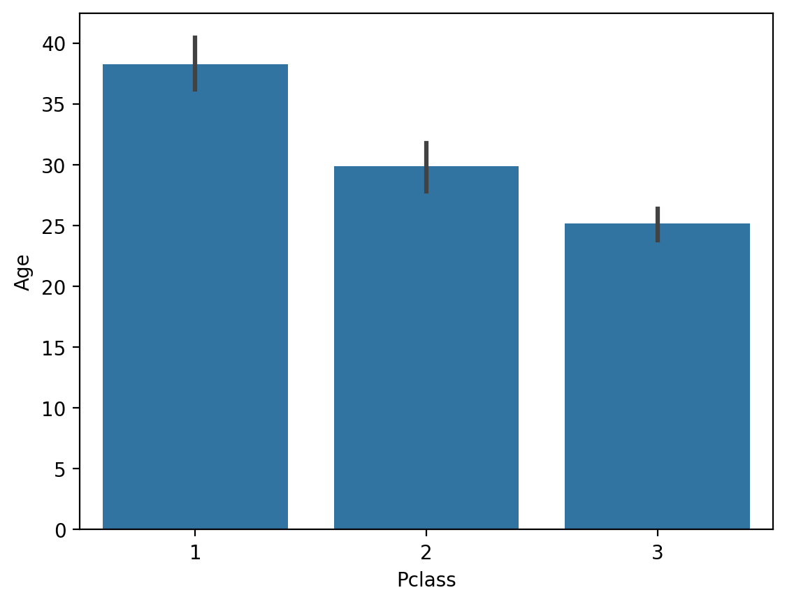
Check-in
What would happen if you used fillna with the median Age instead of the mean? Why would this matter?
### Your code hereSolution
The median Age is slightly lower.
## Assign the median Age to all people with nan for Age
df_titanic['Age_imputed2'] = df_titanic['Age'].fillna(df_titanic['Age'].median())
## Now let's look at those rows
df_titanic[df_titanic['Age'].isna()].head(5)Random imputation/hot deck
Hot deck imputation is a method in which each missing value is replaced with a value from a similar record in the dataset, often referred to as the “donor.” The donor record is selected based on matching criteria—such as demographic characteristics or proximity in a multidimensional feature space—to ensure that the imputation preserves the inherent distribution and relationships in the data.
For example, if income data for a survey respondent are missing, the income value of a similar respondent (based on factors such as occupation, geographic location, and education level) is used as a surrogate.
Hot deck imputation is crucial to maintaining the integrity of the dataset. It ensures that:
Statistical analyses are not biased by the arbitrary or discarded incomplete cases.
Natural variability and distributional patterns present in complete cases are preserved.
Comparisons between different groups within the data remain feasible and valid.
Hot Deck Random Imputation: In this method, missing values
Hot Deck Nearest Neighbor Imputation: In this case, a donor is selected based on the similarity of observed features. A commonly used algorithm is the k-nearest neighbors (k-NN) approach, which calculates a distance metric between observations. For a record with a missing value, its k nearest neighbors (in terms of Euclidean or Mahalanobis distance) are determined, and one of their values
The k-NN algorithm identifies the closest records that minimize the distance:
where:
and are two points in n-dimensional space,
and are the coordinates of points and in dimension ,
is the Euclidean distance between points and .
Hot Deck imputation offers several advantages over other methods:
Mean/Median Imputation: Unlike simply replacing missing values
with the grand mean or median, Hot Deck imputation uses information from similar cases. This preserves local variability and takes into account relationships between variables. Regression Imputation: While regression imputation relies on predictive models to estimate missing values, it can lead to biased estimates if model assumptions are violated. Hot Deck imputation, on the other hand, borrows directly from observed values, often making it more robust under different conditions.
Multiple Imputation: Multiple imputation creates multiple imputed data sets and combines the results for a final analysis, accounting for imputation uncertainty. Although it is often more statistically sophisticated, it can be computationally expensive. Hot Deck imputation remains a practical choice when maintaining ease of interpretation and computational efficiency are priorities.
The main conclusion is that Hot Deck imputation offers an intuitive, practically feasible approach that still respects the statistical properties of the data.
Hot-deck Random Imputation
# Hot Deck Random Imputation Example
def random_hot_deck_imputation(df, column):
    # We filter non-null values
    non_null_values = df[column].dropna().values
    # We replace NaN with a random value from the existing ones
    df[column] = df[column].apply(lambda x: np.random.choice(non_null_values) if pd.isna(x) else x)
    return df

# Imputation for 'Age' column
df_titanic = random_hot_deck_imputation(df_titanic, 'Age')
df_titanic.isna().any()
PassengerId False
Survived False
Pclass False
Name False
Sex False
Age False
SibSp False
Parch False
Ticket False
Fare False
Cabin True
Embarked True
dtype: boolHot Deck Nearest Neighbor (k-NN) Imputation
from sklearn.impute import KNNImputer

# We create a KNNImputer object
knn_imputer = KNNImputer(n_neighbors=5)  # You can change the number of neighbors

# We select numeric columns for imputation
columns_to_impute = ['Age', 'Fare']  # Columns
df_titanic[columns_to_impute] = knn_imputer.fit_transform(df_titanic[columns_to_impute])

df_titanic.isna().any()
PassengerId False
Survived False
Pclass False
Name False
Sex False
Age False
SibSp False
Parch False
Ticket False
Fare False
Cabin True
Embarked True
dtype: boolSummary
Hot Deck Random Imputation:
NaN values
in a column are replaced with a random value from existing data in the same column. It is fast but may introduce randomness that does not take into account the relationships between variables.
Hot Deck Nearest Neighbor Imputation (k-NN):
The k-NN algorithm uses other features (e.g. Pclass, Fare) to find similar records and impute missing values.
It is more advanced and takes into account the relationships between variables.
Dirty Data
Many times we spend hours troubleshooting missing values, logical inconsistencies, or outliers in our datasets. In this tutorial, we will discuss the most popular data cleaning techniques.
We will work with the unstructured iris dataset. Originally published in the UCI Machine Learning Repository: Iris Data Set, this small dataset from 1936 is often used to test machine learning algorithms and visualizations. Each row of the table represents an iris flower, including its species and the dimensions of its botanical parts, sepal and petal, in centimeters.
Check out this dataset here:
dirty_iris = pd.read_csv("data/dirty_iris.csv")
dirty_iris.head(3)Coherent data are technically correct data that are suitable for statistical analysis. They are data in which missing values, special values, (obvious) errors, and outliers have been removed, corrected, or imputed. The data conform to constraints based on actual knowledge about the subject that the data describes.

We have the following basic knowledge:
The species should be one of the following values: setosa, versicolor, or virginica.
All measured numerical properties of the iris should be positive.
The length of an iris petal is at least 2 times its width.
The length of an iris sepal cannot exceed 30 cm.
The sepals of the iris are longer than its petals.
We will now define these rules in a separate “RULES” object and read them into Python. We will print the resulting constraint object:
# We define rules as functions:
def check_rules(df):
    rules = {
        "Sepal.Length <= 30": df["Sepal.Length"] <= 30,
        "Species in ['setosa', 'versicolor', 'virginica']": df["Species"].isin(['setosa', 'versicolor', 'virginica']),
        "Sepal.Length > 0": df["Sepal.Length"] > 0,
        "Sepal.Width > 0": df["Sepal.Width"] > 0,
        "Petal.Length > 0": df["Petal.Length"] > 0,
        "Petal.Width > 0": df["Petal.Width"] > 0,
        "Petal.Length >= 2 * Petal.Width": df["Petal.Length"] >= 2 * df["Petal.Width"],
        "Sepal.Length > Petal.Length": df["Sepal.Length"] > df["Petal.Length"]
    }
    return rules

# Data frame rules:
rules = check_rules(dirty_iris)

# Print:
for rule, result in rules.items():
    print(f"{rule}: {result.all()}")
Sepal.Length <= 30: False
Species in ['setosa', 'versicolor', 'virginica']: True
Sepal.Length > 0: False
Sepal.Width > 0: False
Petal.Length > 0: False
Petal.Width > 0: False
Petal.Length >= 2 * Petal.Width: False
Sepal.Length > Petal.Length: False
Now we can determine how often each rule is broken (violations). We can also summarize and plot the result.
# We check for rule violations:
violations = {rule: ~result for rule, result in rules.items()}

# We summarize them:
summary = {rule: result.sum() for rule, result in violations.items()}

# Print:
print("Summary of Violations:")
for rule, count in summary.items():
    print(f"{rule}: {count} violations")
Summary of Violations:
Sepal.Length <= 30: 12 violations
Species in ['setosa', 'versicolor', 'virginica']: 0 violations
Sepal.Length > 0: 11 violations
Sepal.Width > 0: 19 violations
Petal.Length > 0: 20 violations
Petal.Width > 0: 12 violations
Petal.Length >= 2 * Petal.Width: 34 violations
Sepal.Length > Petal.Length: 30 violations
What percentage of % of data has errors?
import matplotlib.pyplot as plt
# Violation Chart:
violation_counts = pd.Series(summary)
ax = violation_counts.plot(kind='bar', figsize=(10, 6))
plt.title('Summary of errors in data')
plt.xlabel('Rules')
plt.ylabel('Number of errors')

# I add the percentages above the bars:
for p in ax.patches:
    ax.annotate(f'{p.get_height() / len(dirty_iris) * 100:.1f}%',
                (p.get_x() + p.get_width() / 2., p.get_height()),
                ha='center', va='center', xytext=(0, 10),
                textcoords='offset points')

plt.show()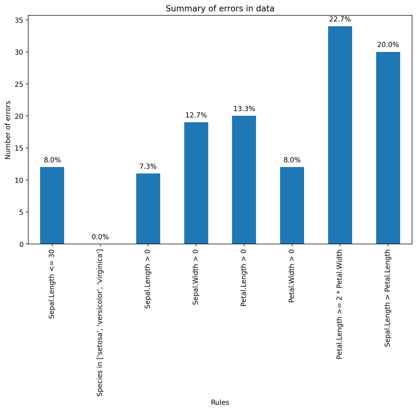
Find which flowers have sepals that are too long using the violation results.
violations = {rule: ~result for rule, result in rules.items()}
violated_df = pd.DataFrame(violations)
violated_rows = dirty_iris[violated_df["Sepal.Length <= 30"]]
print(violated_rows)
Sepal.Length Sepal.Width Petal.Length Petal.Width Species
14 NaN 3.9 1.70 0.4 setosa
18 NaN 4.0 NaN 0.2 setosa
24 NaN 3.0 5.90 2.1 virginica
27 73.0 29.0 63.00 NaN virginica
29 NaN 2.8 0.82 1.3 versicolor
57 NaN 2.9 4.50 1.5 versicolor
67 NaN 3.2 5.70 2.3 virginica
113 NaN 3.3 5.70 2.1 virginica
118 NaN 3.0 5.50 2.1 virginica
119 NaN 2.8 4.70 1.2 versicolor
124 49.0 30.0 14.00 2.0 setosa
137 NaN 3.0 4.90 1.8 virginica
Let’s find outliers in the plot length using the boxplot method.
We’ll take the relevant observations and check the remaining values.
Any ideas what might have happened?
We’ll set outliers to NA (or whatever value you think is more appropriate).
plt.figure(figsize=(10, 6))
plt.boxplot(dirty_iris['Sepal.Length'].dropna())
plt.title('Sepal Length Box Plot')
plt.ylabel('Sepal Length')
plt.show()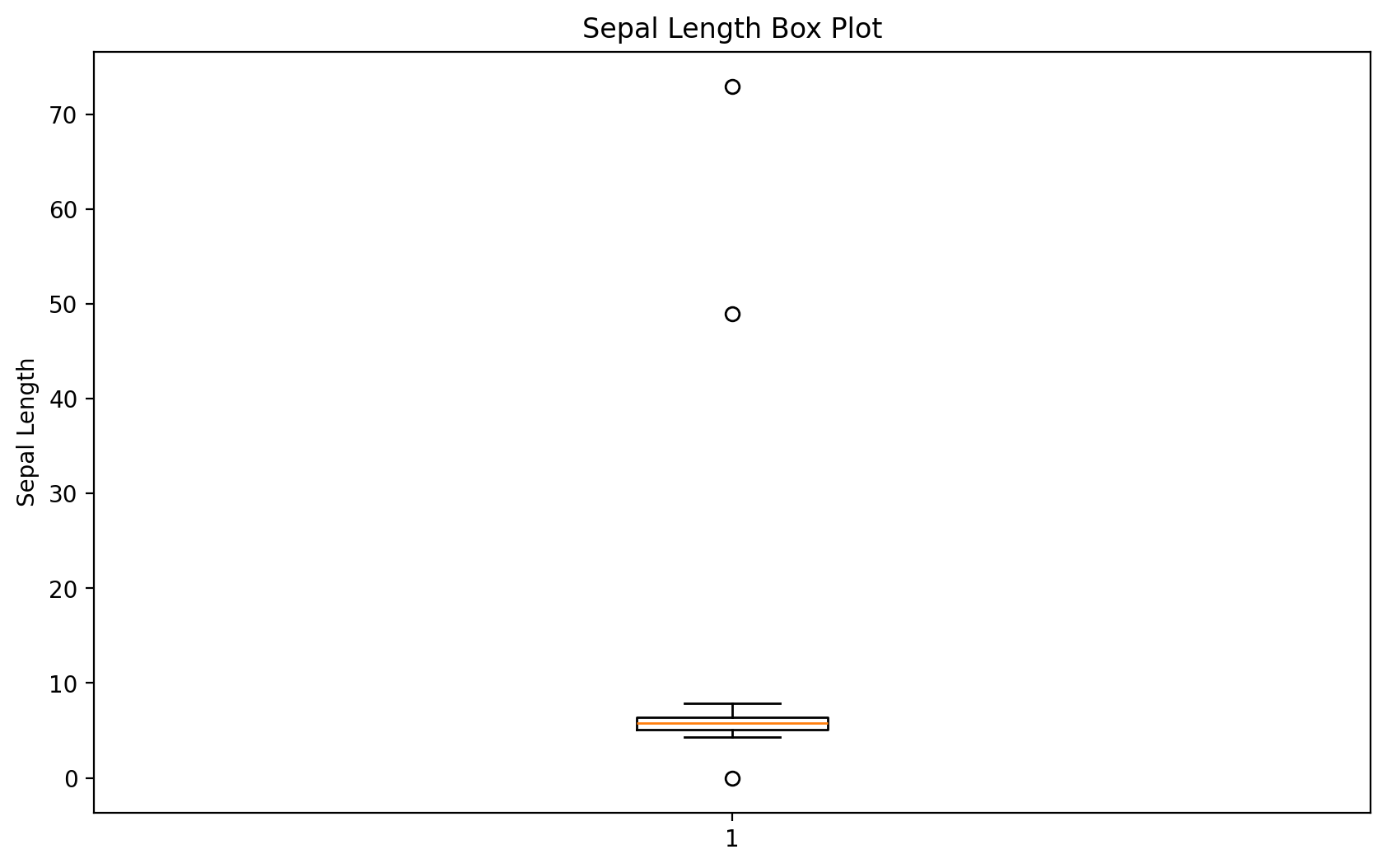
# We will find outliers:
outliers = dirty_iris['Sepal.Length'][np.abs(dirty_iris['Sepal.Length'] - dirty_iris['Sepal.Length'].mean()) > (1.5 * dirty_iris['Sepal.Length'].std())]
outliers_idx = dirty_iris.index[dirty_iris['Sepal.Length'].isin(outliers)]

# We will print them:
print("Outliers:")
print(dirty_iris.loc[outliers_idx])
Outliers:
Sepal.Length Sepal.Width Petal.Length Petal.Width Species
27 73.0 29.0 63.0 NaN virginica
124 49.0 30.0 14.0 2.0 setosa
They all seem too big... maybe they were measured in mm instead of cm?
# We will correct outliers (assuming they were measured in mm instead of cm).
dirty_iris.loc[outliers_idx, ['Sepal.Length', 'Sepal.Width', 'Petal.Length', 'Petal.Width']] /= 10
plt.figure(figsize=(10, 6))
sns.boxplot(x='Species', y='Sepal.Length', data=dirty_iris)
plt.title('Boxplot of Sepal Length by Species')
plt.xlabel('Species')
plt.ylabel('Sepal Length')
plt.show()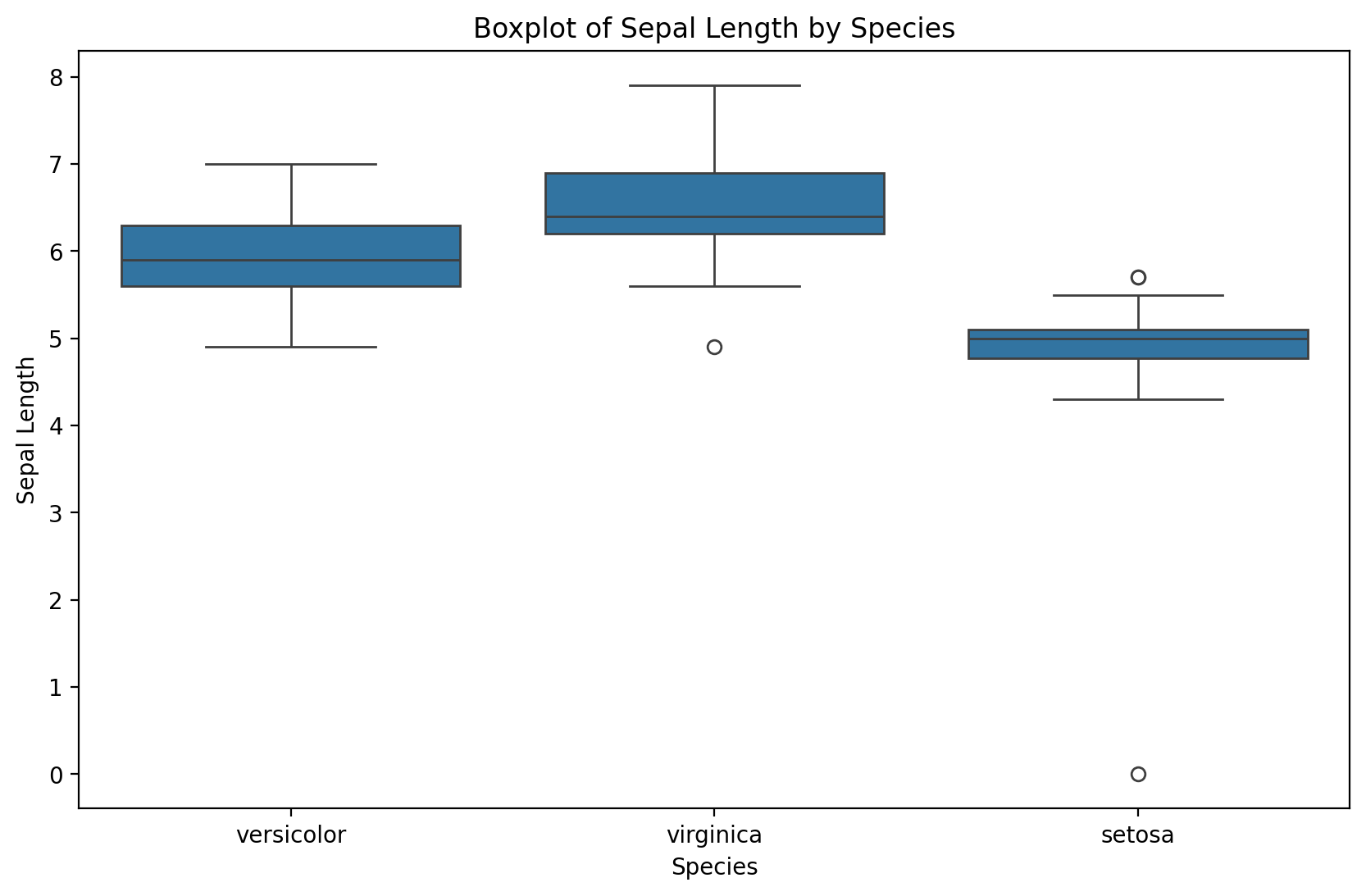
Notice that the simple boxplot shows an additional outlier!
Error Correction
Let’s replace non-positive values
# We define the correction rule:
def correct_sepal_width(df):
    df.loc[(~df['Sepal.Width'].isna()) & (df['Sepal.Width'] <= 0), 'Sepal.Width'] = np.nan
    return df

# We apply correction to the data frame:
mydata_corrected = correct_sepal_width(dirty_iris)

# and let's look at the data:
print(mydata_corrected)
Sepal.Length Sepal.Width Petal.Length Petal.Width Species
0 6.4 3.2 4.5 1.5 versicolor
1 6.3 3.3 6.0 2.5 virginica
2 6.2 NaN 5.4 2.3 virginica
3 5.0 3.4 1.6 0.4 setosa
4 5.7 2.6 3.5 1.0 versicolor
.. ... ... ... ... ...
145 6.7 3.1 5.6 2.4 virginica
146 5.6 3.0 4.5 1.5 versicolor
147 5.2 3.5 1.5 0.2 setosa
148 6.4 3.1 NaN 1.8 virginica
149 5.8 2.6 4.0 NaN versicolor
[150 rows x 5 columns]
Replacing all error values
# we apply rules for violations (errors):
rules = check_rules(dirty_iris)
violations = {rule: ~result for rule, result in rules.items()}
violated_df = pd.DataFrame(violations)

# we locate errors and change them to NA:
for col in violated_df.columns:
    dirty_iris.loc[violated_df[col], col.split()[0]] = np.nan
Better to have NA before errors in data. One could possibly attempt to impute newly created gaps now...
Merging datasets
Merging refers to combining different datasets to leverage the power of additional information.
In Week 1, we discussed this in the context of data linkage.
Can link datasets as a function of:
Shared time window.
Shared identity.
Why merge?
Each dataset contains limited information.
E.g.,
GDPbyYear.
But merging datasets allows us to see how more variables relate and interact.
Much of social science research involves locating datasets and figuring out how to combine them.
How to merge?
In Python, pandas.merge allows us to merge two DataFrames on a common column(s).
pd.merge(df1, df2, on = "shared_column")merge in practice
For demonstration, we’ll merge two Linguistics datasets:
One dataset contains information about the Age of Acquisition of different English words (Kuperman et al., 2014).
The other dataset contains information about the Frequency and Concreteness of English words (Brysbaert et al., 2014).
Loading datasets
df_aoa = pd.read_csv("data/wrangling/AoA.csv")
df_aoa.head(1)df_conc = pd.read_csv("data/wrangling/concreteness.csv")
df_conc.head(1)Different kinds of merging
As we see, the datasets are not the same size. This leaves us with a decision to make when merging.
innerjoin: Do we preserve only the words in both datasets?leftjoin: Do we preserve all the words in one dataset (the “left” one), regardless of whether they occur in the other?rightjoin: Do we preserve all the words in one dataset (the “right” one), regardless of whether they occur in the other?outerjoin: Do we preserve all words in both, leaving empty (nan) values where a word only appears in one dataset?
df_aoa.shape(31124, 2)df_conc.shape(28612, 4)inner join
For our purposes, it makes the most sense to use an
innerjoin.This leaves us with fewer words than occur in either dataset.
df_merged = pd.merge(df_aoa, df_conc, on = "Word", how = "inner")
df_merged.head(2)df_merged.shape(23569, 5)Check-in
What happens if you use a different kind of join, e.g., outer or left? What do you notice about the shape of the resulting DataFrame? Do some rows have nan values?
### Your code hereSolution
df_outer_join = pd.merge(df_aoa, df_conc, on = "Word", how = "outer")
df_outer_join.shape
(36167, 5)df_outer_join.head(4)Why merge is so useful
Now that we’ve merged our datasets, we can look at how variables across them relate to each other.
sns.scatterplot(data = df_merged, x = 'Concreteness',
                y = 'AoA', alpha = .2 );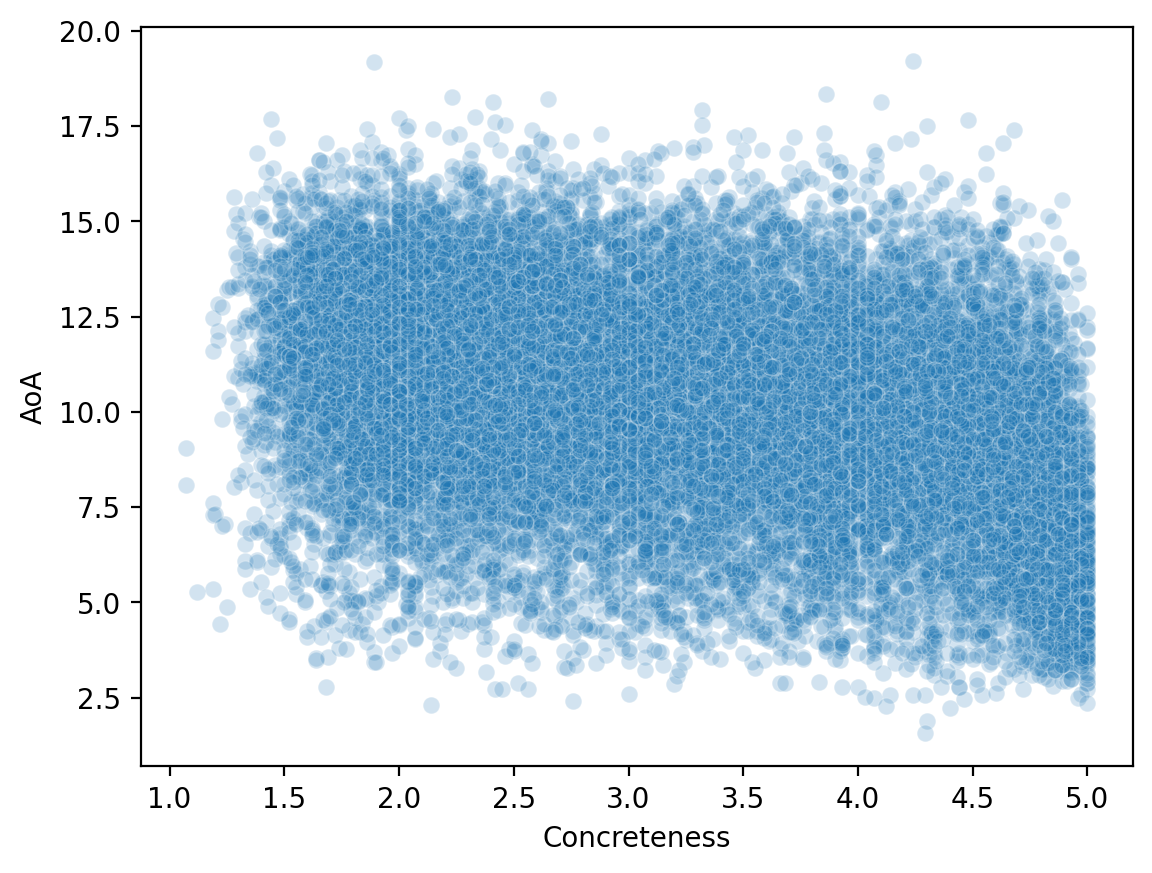
Reshaping data
Reshaping data involves transforming it from one format (e.g., “wide”) to another format (e.g., “long”), to make it more amenable to visualization and analysis.
Often, we need to make our data tidy.
What is tidy data?
Tidy data is a particular way of formatting data, in which:
Each variable forms a column (e.g.,
GDP).Each observation forms a row (e.g., a
country).Each type of observational unit forms a table (tabular data!).
Originally developed by Hadley Wickham, creator of the tidyverse in R.
Tidy vs. “untidy” data
Now let’s see some examples of tidy vs. untidy data.
Keep in mind:
These datasets all contain the same information, just in different formats.
“Untidy” data can be useful for other things, e.g., presenting in a paper.
The key goal of tidy data is that each row represents an observation.
Tidy data
Check-in: Why is this data considered tidy?
df_tidy = pd.read_csv("data/wrangling/tidy.csv")
df_tidyUntidy data 1
Check-in: Why is this data not considered tidy?
df_messy1 = pd.read_csv("data/wrangling/messy1.csv")
df_messy1Untidy data 2
Check-in: Why is this data not considered tidy?
df_messy2 = pd.read_csv("data/wrangling/messy2.csv")
df_messy2Making data tidy
Fortunately, pandas makes it possible to turn an “untidy” DataFrame into a tidy one.
The key function here is pandas.melt.
pd.melt(df, ### Dataframe
        id_vars = [...], ### what are the identifying columns?
        var_name = ..., ### name for variable grouping over columns
        value_name = ..., ### name for the value this variable takes on
If this seems abstract, don’t worry––it’ll become clearer with examples!
Using pd.melt
Let’s start with our first messy
DataFrame.Has columns for each
ppt, which contain info aboutrt.
df_messy1pd.melt(df_messy1, id_vars = 'condition', ### condition is our ID variable
var_name = 'ppt', ### new row for each ppt observation
value_name = 'rt') ### label for the info we have about each pptCheck-in
Try to use pd.melt to turn df_messy2 into a tidy DataFrame.
Hint: Think about the existing structure of the DataFrame––how is data grouped––and what the id_vars would be.
df_messy2### Your code hereSolution
pd.melt(df_messy2, id_vars = 'ppt', ### here, ppt is our ID variable
       var_name = 'condition', ### new row for each ppt observation
value_name = 'rt') ### label for the info we have about each pptHands-on: a real dataset
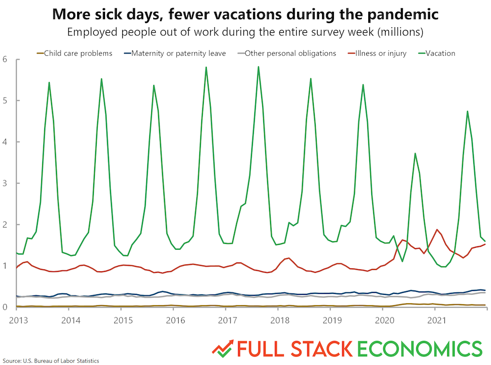
Now, we’ll turn to a real dataset, which Timothy Lee, creator of Full Stack Economics, compiled and shared with me.
df_work = pd.read_csv("data/viz/missing_work.csv")
df_work.head(5)Check-in
Is this dataset tidy? How could we make it tidy, if not––i.e., if we wanted each row to be a single observation corresponding to one of the reasons for missing work?
### Your code hereSolution
df_melted = pd.melt(df_work, id_vars = ['Year', 'Month'],
                    var_name = "Reason",
                    value_name = "Days Missed")
df_melted.head(2)Why tidy data is useful
Finally, let’s use this dataset to recreate a graph from FullStackEconomics.
Original graph
Check-in
As a first-pass approach, what tools from seaborn could you use to recreate this plot?
### Your code hereSolution
This is okay, but not really what we want. This is grouping it by Year. But we want to group by both Year and Month.
# Your code here# %load ./solutions/solution7.pyUsing datetime
Let’s make a new column called
date, which combines theMonthandYear.Then we can use
pd.to_datetimeto turn that into a custompandasrepresentation.
## First, let's concatenate each month and year into a single string
df_melted['date'] = df_melted.apply(lambda row: str(row['Month']) + '-' + str(row['Year']), axis = 1)
df_melted.head(2)## Now, let's create a new "datetime" column using the `pd.to_datetime` function
df_melted['datetime'] = pd.to_datetime(df_melted['date'])
df_melted.head(2)Plotting again
Much better!
sns.lineplot(data = df_melted, x = "datetime", y = "Days Missed", hue = "Reason");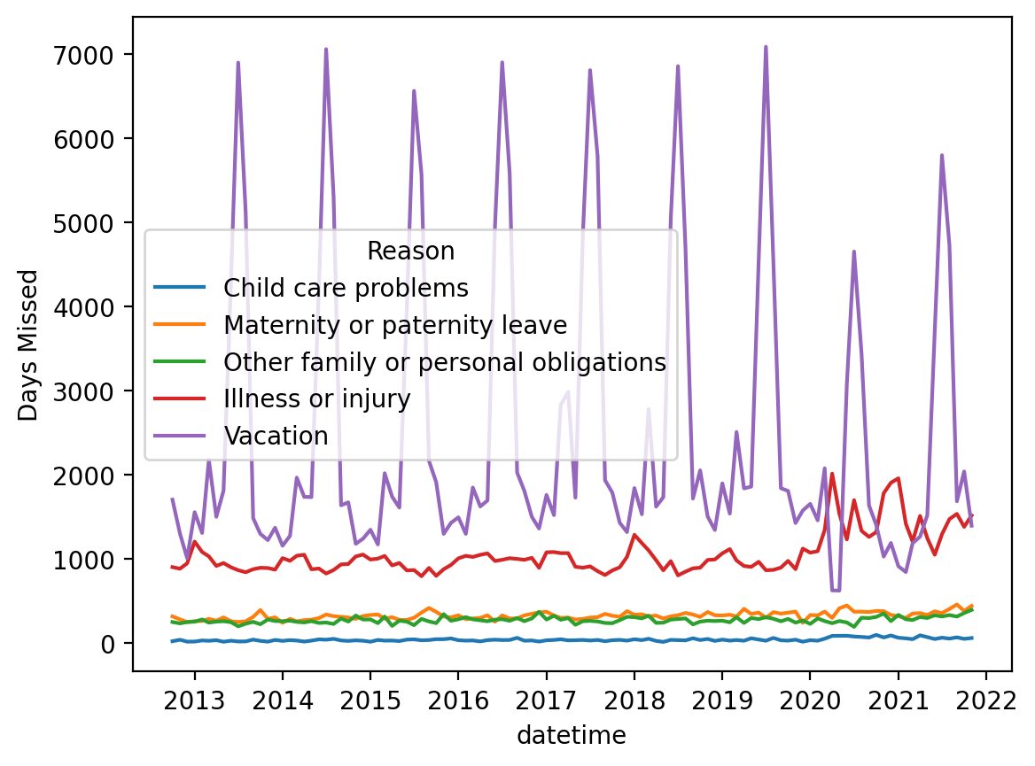
Data Transformations
Sometimes we come across a situation where we have problems with skewed distributions or we simply want to transform, recode or perform discretization. Let’s look at some of the most popular transformation methods.
First, standardization (also known as normalization):
-score approach - a standardization procedure, using the formula: , where = mean and = standard deviation. scores are also known as standardized scores; these are scores (or data values) that have been assigned a common standard. This standard is a mean of zero and a standard deviation of 1.
minmax approach - An alternative approach to normalizing (or standardizing) the score is the so-called MinMax scaling (often also called simply “normalization” - which is a common cause of ambiguity). In this approach, the data is scaled to a fixed range - usually from 0 to 1. The trade-off of having this limited range - unlike normalization - is that we get smaller standard deviations, which can suppress the effect of outliers. If you want to do MinMax scaling - simply subtract the minimum value and divide it by the range: .
To solve problems with very skewed distributions, we can also use several types of simple transformations:
Exercise: Normalize income and plot the transformed income distribution in a box plot.
income = pd.read_csv("data/models/income.csv")
income.head(3)plt.figure(figsize=(10, 6))
plt.hist(income['Income'], edgecolor='black')
plt.title('Histogram of Income')
plt.xlabel('Income')
plt.ylabel('Frequency')
plt.show()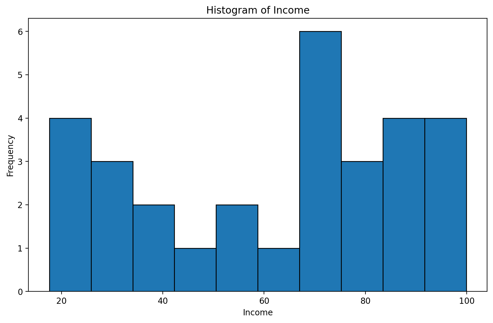
# your code hereBox - Cox Transformations
The Box-Cox transformation is a technique used in data wrangling that helps stabilize the variance and transform the data so that it is closer to a normal distribution—which is desirable in many statistical analysis and modeling methods. This transformation works particularly well for data with a right-skewed distribution. It requires positive values
Let be the data to which the Box-Cox transformation is to be applied. Box and Cox defined their transformation as:
for :
for
such as the unknown ,
where is the -transformed data, X is the design matrix (possible covariates of interest), is a set of parameters associated with the -transformed data, and is an error term. Since the goal of equation (1) is that
then . Note that the transformation in equation (1) is only valid for > 0, i = 1, 2, ..., n, and modifications must be made when negative observations are present.
import numpy as np
import pandas as pd
import random
import matplotlib.pyplot as plt
import seaborn as sns

from scipy.stats import boxcox
import warnings
warnings.filterwarnings('ignore')
plt.figure(figsize = (4, 4))
data = np.random.beta(1, 3, 5000) # we create random non normal data (from beta distribution)
sns.distplot(data)
plt.show()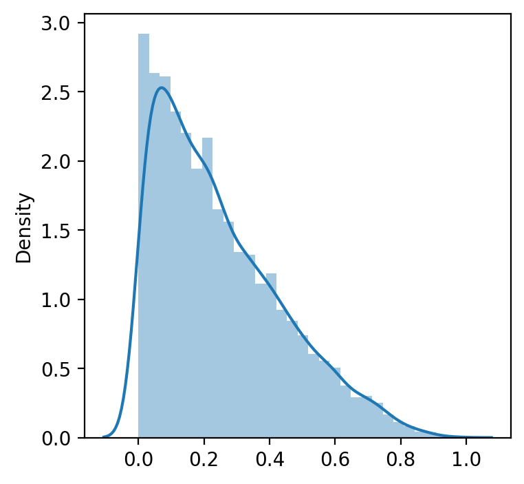
data_transformed, lambda_ = boxcox(data) #If lambda is None, the second argument returned is a lambda that maximizes the log-likelihood function.
print('Transformed data to normal distribution', data_transformed)
print(40*'==')
print('Lambda, which maximizes the log-likelihood function for the normal distribution:', lambda_)
Transformed data to normal distribution [-1.18780311 -1.24561546 -0.73856995 ... -1.36663233 -1.20507286
-0.89269272]
================================================================================
Lambda, which maximizes the log-likelihood function for the normal distribution: 0.40914726473864266
manually_transformed = [(i**lambda_ -1)/lambda_ for i in data] # manuallywarnings.filterwarnings('ignore')
plt.figure(figsize = (4, 4))
sns.distplot(data_transformed)
plt.show()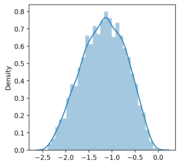
warnings.filterwarnings('ignore')
plt.figure(figsize = (4, 4))
sns.distplot(manually_transformed) # manually selected lambda
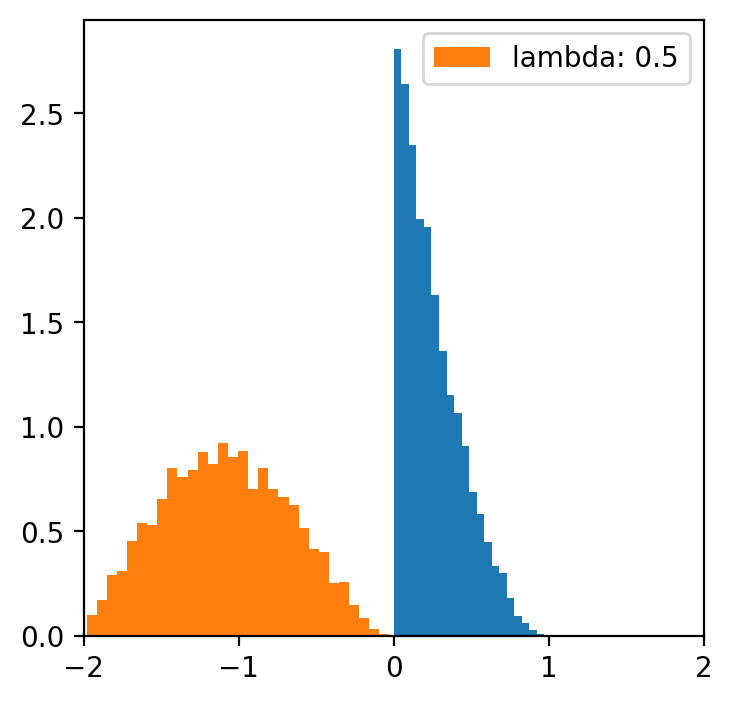
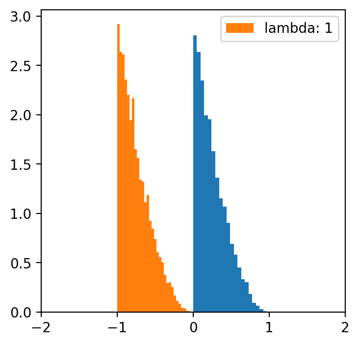
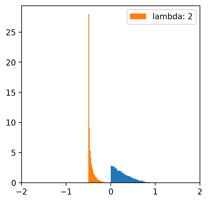
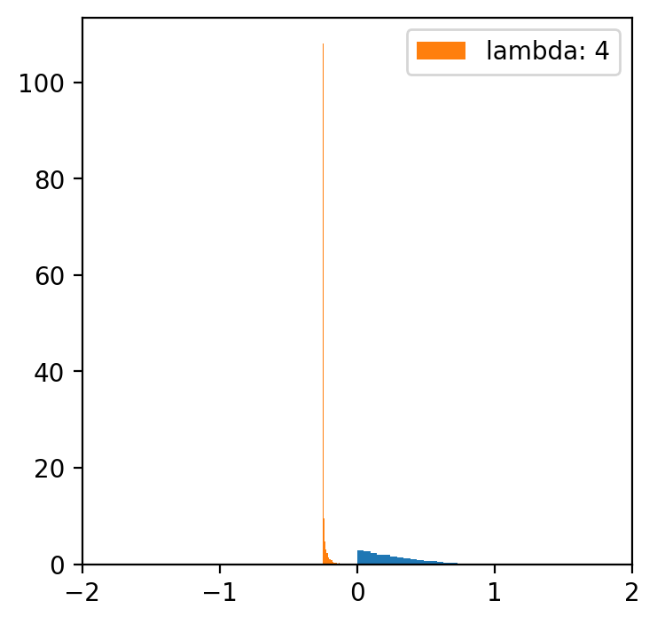
plt.show()lambde = [-4,-2,-1,0.5,1,2,4] # only for lambda 0.5 we have a normal distribution
x = np.linspace(data.min(), data.max(), 5000)
for l in lambde:
transformed = [(i**l -1)/l for i in data]
plt.figure(figsize=(4,4))
plt.hist(data, bins=20, density=True)
plt.hist(transformed, bins=30, density=True, label = f'lambda: {l}')
plt.xlim(-2, 2)
plt.legend()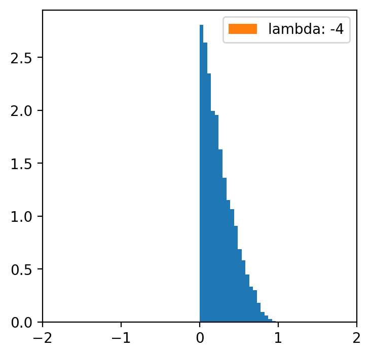


Data categorization
Sometimes we would simply like to perform the so-called “binning” procedure to be able to analyze our categorical data, compare several categorical variables, construct statistical models, etc. With the “binning” function, we can transform quantitative variables into categorical ones using several methods:
Quantile Binning
Divides data into equal-sized groups based on percentiles. Formula:
Example: pd.qcut(data, q=4) creates 4 quantile-based bins.
Equal-Width Binning
binning to obtain a fixed length of intervals (e.g. every 100 USD)
Formula:
Example: pd.cut(data, bins=5) creates 5 equal-width bins.
Pretty Binning
A compromise between quantile and equal-width binning, creating aesthetically pleasing intervals.
Rounded values based on data range and bin count.
K-Means Binning
Uses the K-Means clustering algorithm to group data into bins.
Formula:
where is the mean of cluster .
Bag Clustering (BClust)
Groups data using bagging techniques to improve clustering stability.
Clusters are formed by aggregating results from multiple clustering models.
Each method is suited for different use cases, depending on the data distribution and analysis goals.
Exercise Using the quantile approach, binning the “Income” variable. Hint: Pandas has a ready-to-use function pd.qcut
# Your code hereSummary
That was an introduction to data wrangling.
As mentioned, data organization is an incredibly important topic - and could be an entire subject in this postgraduate program.
But today we focused on:
Identifying and removing missing data.
Merging data sets.
Organizing data.