Abstract
This notebook introduces the foundations of descriptive statistics in Python. It covers measures of central tendency (mean, median, mode), variability (range, interquartile range, standard deviation), and techniques for detecting outliers using z-scores. Additionally, it explores bivariate relationships through linear correlations, highlighting their strengths and limitations. Practical examples and visualizations are provided to help users understand and apply these statistical concepts effectively.
Looking back: Exploratory Data Analysis
First, we dove deep into data visualization.
Then, we’ve learned how to wrangle and clean our data.
Now we’ll turn to describing our data - as well as the foundations of statistics.
Goals of this lecture
There are many ways to describe a distribution.
Here we will discuss:
Measures of central tendency: what is the typical value in this distribution?
Measures of variability: how much do the values differ from each other?
Measures of skewness: how strong is the asymmetry of the distribution?
Measures of curvature: what is the intensity of extreme values?
Measurement of the relationship between distributions using linear, rank correlations.
Measurement of the relationship between qualitative variables using contingency.
Importing relevant libraries
import numpy as np
import matplotlib.pyplot as plt
import seaborn as sns ### importing seaborn
import pandas as pd
import scipy.stats as ss
%matplotlib inline
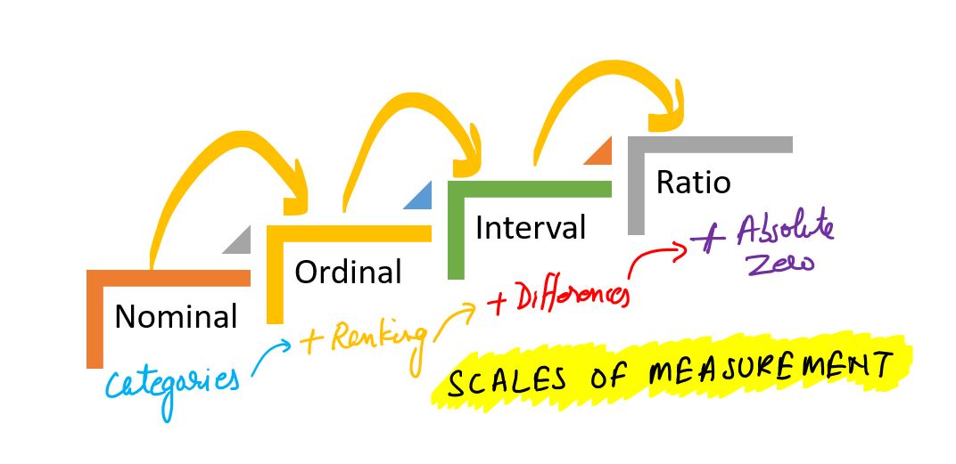
%config InlineBackend.figure_format = 'retina'Measurement scales in statistics
Measurement scales determine what mathematical and statistical operations can be performed on data. There are four basic types of scales:
Nominal scale
Data is used only for naming or categorizing.
The order between values cannot be determined.
Possible operations: count, mode, frequency analysis.
Examples:
Pokémon type (type_1): “fire”, ‘water’, “grass”, etc.
Species, gender, colors.
import pandas as pd
df_pokemon = pd.read_csv("data/pokemon.csv")
df_pokemon["Type 1"].value_counts()
Type 1
Water 112
Normal 98
Grass 70
Bug 69
Psychic 57
Fire 52
Electric 44
Rock 44
Dragon 32
Ground 32
Ghost 32
Dark 31
Poison 28
Steel 27
Fighting 27
Ice 24
Fairy 17
Flying 4
Name: count, dtype: int64Ordinal scale
Data can be ordered, but the distances between them are not known.
Possible operations: median, quantiles, rank tests (e.g. Spearman).
Examples:
Strength level: “low,” “medium,” “high.”
Quality ratings: “weak,” “good,” “very good.”
import seaborn as sns

titanic = sns.load_dataset("titanic")

print(titanic["class"].unique())
['Third', 'First', 'Second']
Categories (3, object): ['First', 'Second', 'Third']
Interval scale
Data are numerical, with equal intervals, but no absolute zero.
Differences, mean, standard deviation can be calculated.
No sense for quotients (e.g., “twice as much”).
Examples:
Temperature in °C (but not in Kelvin!). Why? No absolute zero - zero does not mean the absence of a characteristic, it is just a conventional reference point. 0°C does not mean no temperature; 20°C is not 2 x 10°C.
Year in the calendar (e.g., 1990). Why. Year 0 does not mean the beginning of time; 2000 is not 2 x 1000.
Time in the hour system (e.g., 1 p.m.). Why. 0:00 is not the absence of time, but a fixed reference point.
Ratio scale
Numerical data, have absolute zero.
All mathematical operations can be performed, including division.
Not all numerical (numerical) data are on the quotient scale! Example: temperature in degrees Celsius is not on the quotient scale, because 0°C does not mean no temperature. In contrast, temperature in Kelvin (K) already does, because 0 K is the absolute absence of heat energy.
Examples:
Height, weight, number of Pokémon’s attack points (attack), HP, speed.
df_pokemon[["HP", "Attack", "Speed"]].describe()Table: Measurement Scales in Statistics
| Scale | Example | Can it be ordered? | Equal intervals? | Absolute zero? | Example of statistical operations |
|---|---|---|---|---|---|
| Nominal | Type of Pokémon (fire, water, etc.) | ❌ | ❌ | ❌ | Mode, counts, frequency analysis |
| Ordinal | Ticket class (First, Second, Third) | ✅ | ❌ | ❌ | Median, quantiles, rank tests |
| Interval | Temperature in °C | ✅ | ✅ | ❌ | Mean, standard deviation |
| Ratio | HP, attack, growth | ✅ | ✅ | ✅ | All mathematical operations/statistics |
Conclusion: The type of scale affects the choice of statistical methods - for example, the Pearson correlation test requires quotient or interval data, while the Chi² test requires nominal data.
Central Tendency
Central Tendency refers to the “typical value” in a distribution.
Many ways to measure what’s “typical”.
The
mean.The
median.The
mode.
Why is this useful?
A dataset can contain lots of observations.
E.g., survey responses about
height.
One way to “describe” this distribution is to visualize it.
But it’s also helpful to reduce that distribution to a single number.
This is necessarily a simplification of our dataset!
The mean
The arithmetic mean is defined as the
sumof all values in a distribution, divided by the number of observations in that distribution.
numbers = [1, 2, 3, 4]
### Calculating the mean by hand
sum(numbers)/len(numbers)2.5numpy.mean
The numpy package has a function to calculate the mean on a list or numpy.ndarray.
np.mean(numbers)2.5Calculating the mean of a pandas column
If we’re working with a DataFrame, we can calculate the mean of specific columns.
df_gapminder = pd.read_csv("data/viz/gapminder_full.csv")
df_gapminder.head(2)df_gapminder['life_exp'].mean()59.47443936619714Check-in
How would you calculate the mean of the gdp_cap column?
### Your code hereSolution
This tells us the average gdp_cap of countries in this dataset across all years measured.
df_gapminder['gdp_cap'].mean()7215.327081212142The mean and skew
Skew means there are values elongating one of the “tails” of a distribution.
Of the measures of central tendency, the mean is most affected by the direction of skew.
How would you describe the skew below?
Do you think the
meanwould be higher or lower than themedian?
sns.histplot(data = df_gapminder, x = "gdp_cap")
plt.axvline(df_gapminder['gdp_cap'].mean(), linestyle = "dotted")
Check-in
Could you calculate the mean of the continent column? Why or why not?
### Your answer hereSolution
You cannot calculate the mean of
continent, which is a categorical variable.The
meancan only be calculated for continuous variables.
Check-in
Subtract each observation in
numbersfrom themeanof thislist.Then, calculate the sum of these deviations from the
mean.
What is their sum?
numbers = np.array([1, 2, 3, 4])
### Your code here
Solution
The sum of deviations from the mean is equal to
0.This will be relevant when we discuss standard deviation.
deviations = numbers - numbers.mean()
sum(deviations)0.0Interim summary
The
meanis one of the most common measures of central tendency.It can only be used for continuous interval/ratio data.
The sum of deviations from the mean is equal to
0.The
meanis most affected by skew and outliers.
The median
The median is calculated by sorting all values from least to greatest, then finding the value in the middle.
If there is an even number of values, you take the mean of the middle two values.
df_gapminder['gdp_cap'].median()3531.8469885Comparing median and mean
The median is less affected by the direction of skew.
sns.histplot(data = df_gapminder, x = "gdp_cap")
plt.axvline(df_gapminder['gdp_cap'].mean(), linestyle = "dotted", color = "blue")
plt.axvline(df_gapminder['gdp_cap'].median(), linestyle = "dashed", color = "red")
Check-in
Could you calculate the median of the continent column? Why or why not?
### Your answer hereSolution
You cannot calculate the median of
continent, which is a categorical variable.The
mediancan only be calculated for ordinal (ranked) or interval/ratio variables.
The mode
The mode is the most frequent value in a dataset.
Unlike the median or mean, the mode can be used with categorical data.
df_pokemon = pd.read_csv("data/pokemon.csv")
### Most common type = Water
df_pokemon['Type 1'].mode()
0 Water
Name: Type 1, dtype: objectmode() returns multiple values?
If multiple values tie for the most frequent,
mode()will return all of them.This is because technically, a distribution can have multiple modes!
df_gapminder['gdp_cap'].mode()0 241.165876
1 277.551859
2 298.846212
3 299.850319
4 312.188423
...
1699 80894.883260
1700 95458.111760
1701 108382.352900
1702 109347.867000
1703 113523.132900
Name: gdp_cap, Length: 1704, dtype: float64Central tendency: a summary
| Measure | Can be used for: | Limitations |
|---|---|---|
| Mean | Continuous data | Affected by skew and outliers |
| Median | Continuous data | Doesn’t include values of all data points in calculation (only ranks) |
| Mode | Continuous and Categorical data | Only considers the most frequent; ignores other values |
Quantiles
Quantiles are descriptive statistics that divide an ordered dataset into equal parts. The most common quantiles are:
Median (quantile of order 0.5),
Quartiles (divide data into 4 parts),
Deciles (divide data into 10 parts),
Percentiles (divide data into 100 parts).
Definition
A quantile of order is a value such that:
In other words: of the values in the dataset are less than or equal to .
Formula (for an ordered dataset)
For a dataset sorted in ascending order, the quantile of order is calculated as:
Compute the positional index:
If is an integer, the quantile is .
If is not an integer, interpolate linearly between the neighboring values:
Note: In practice, different methods for calculating quantiles are used — libraries like NumPy or Pandas offer various modes (e.g., method='linear', method='midpoint').
Example - Manual Calculation
For the dataset:
Sort the data in ascending order:
Median (quantile of order 0.5):
The number of elements , the middle element is the 5th value:
First quartile (Q1, quantile of order 0.25):
Interpolate between and :
Third quartile (Q3, quantile of order 0.75):
Interpolate between and :
Deciles
Deciles divide data into 10 equal parts. For example:
D1 is the 10th percentile (quantile of order 0.1),
D5 is the median (0.5),
D9 is the 90th percentile (0.9).
The formula is the same as for general quantiles, using the appropriate . For example, for D3:
Percentiles
Percentiles divide data into 100 equal parts. For example:
P25 = Q1,
P50 = median,
P75 = Q3,
P90 is the value below which 90% of the data lies.
Percentiles help us better understand the data distribution — for example, in standardized tests, results are often expressed as percentiles (e.g., “85th percentile” means someone scored better than 85% of the population).
Quantiles - Summary
| Name | Symbol | Quantile ( q ) | Meaning |
|---|---|---|---|
| Q1 | Q1 | 0.25 | 25% of data ≤ Q1 |
| Median | Q2 | 0.5 | 50% of data ≤ Median |
| Q3 | Q3 | 0.75 | 75% of data ≤ Q3 |
| Decile 1 | D1 | 0.1 | 10% of data ≤ D1 |
| Decile 9 | D9 | 0.9 | 90% of data ≤ D9 |
| Percentile 95 | P95 | 0.95 | 95% of data ≤ P95 |
Example - we compute quantiles
# Sample data
mydata = [3, 7, 8, 5, 12, 14, 21, 13, 18]
mydata_sorted = sorted(mydata)
print("Sorted data:", mydata_sorted)
Sorted data: [3, 5, 7, 8, 12, 13, 14, 18, 21]
# Converting to Pandas Series object
s = pd.Series(mydata)

# Quantiles
q1 = s.quantile(0.25)
median = s.quantile(0.5)
q3 = s.quantile(0.75)

# Deciles
d1 = s.quantile(0.1)
d9 = s.quantile(0.9)

# Percentiles
p95 = s.quantile(0.95)

print("Quantiles:")
print(f"Q1 (25%): {q1}")
print(f"Median (50%): {median}")
print(f"Q3 (75%): {q3}")
print("\nDeciles:")
print(f"D1 (10%): {d1}")
print(f"D9 (90%): {d9}")
print("\nPercentiles:")
print(f"P95 (95%): {p95}")
Quantiles:
Q1 (25%): 7.0
Median (50%): 12.0
Q3 (75%): 14.0
Deciles:
D1 (10%): 4.6
D9 (90%): 18.6
Percentiles:
P95 (95%): 19.799999999999997
plt.figure(figsize=(6, 4))
plt.boxplot(mydata, vert=False, patch_artist=True, boxprops=dict(facecolor='lightblue'));
plt.title("Boxplot – data distribution")
plt.xlabel("Values")
plt.grid(True, axis='x', linestyle='--', alpha=0.7)
plt.show()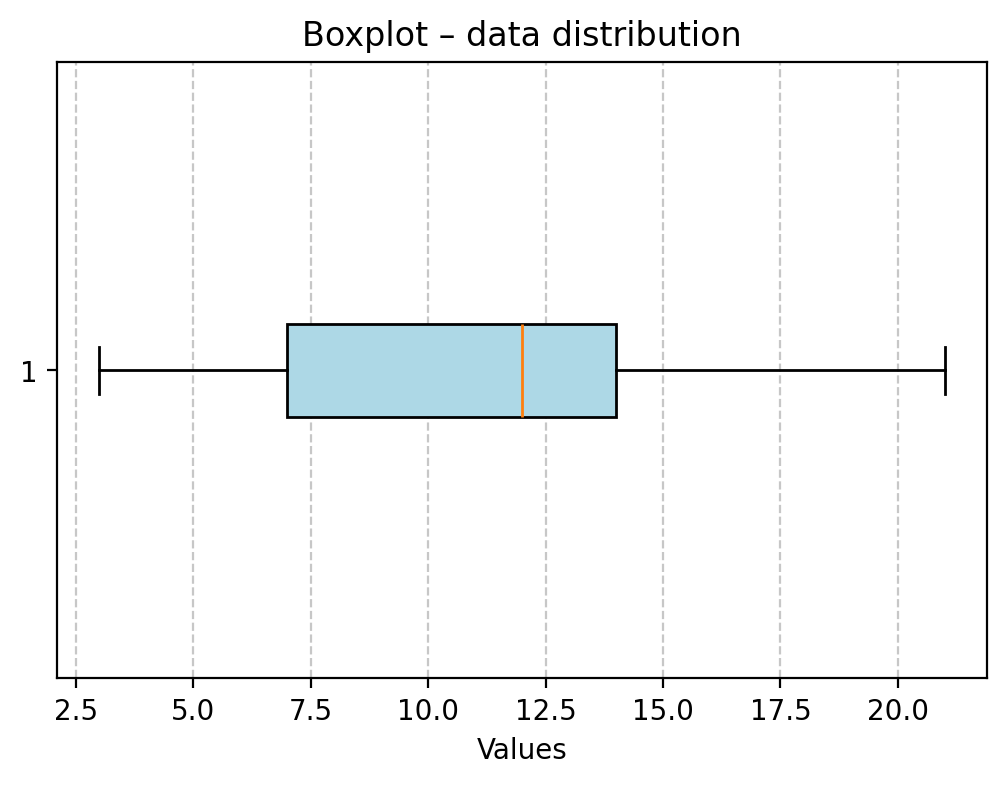
Your turn!
Looking at the aforementioned quantile results and the box plot, try to interpret these measures.
Variability
Variability (or dispersion) refers to the degree to which values in a distribution are spread out, i.e., different from each other.
The mean hides variance
Both distributions have the same mean, but different standard deviations.
### Create distributions
d1 = np.random.normal(loc = 0, scale = 1, size = 1000)
d2 = np.random.normal(loc = 0, scale = 5, size = 1000)
### Create subplots
fig, axes = plt.subplots(1, 2, sharex=True, sharey=True)
p1 = axes[0].hist(d1, alpha = .5)
p2 = axes[1].hist(d2, alpha = .5)
axes[0].set_title("Lower variance")
axes[1].set_title("Higher variance")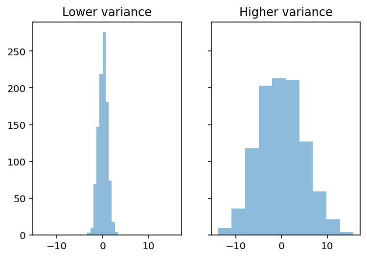
Capturing variability
There are at least three major approaches to quantifying variability:
Range: the difference between the
maximumandminimumvalue.Interquartile range (IQR): The range of the middle 50% of data.
Standard deviation: the typical amount that scores deviate from the mean.
Range
Range is the difference between the
maximumandminimumvalue.
Intuitive, but only considers two values in the entire distribution.
d1.max() - d1.min()6.671539927777442d2.max() - d2.min()29.536578725663045IQR
Interquartile range (IQR) is the difference between the value at the 75% percentile and the value at the 25% percentile.
Focuses on middle 50%, but still only considers two values.
## Get 75% and 25% values
q3, q1 = np.percentile(d1, [75 ,25])
q3 - q11.353946514402774## Get 75% and 25% values
q3, q1 = np.percentile(d2, [75 ,25])
q3 - q16.923650741817414Standard deviation
Standard deviation (SD) measures the typical amount that scores in a distribution deviate from the mean.
Things to keep in mind:
SD is the square root of the variance.
There are actually two measures of SD:
Population SD: when you’re measuring the entire population of interest (very rare).
Sample SD: when you’re measuring a sample (the typical case); we’ll focus on this one.
Sample SD
The formula for sample standard deviation of is as follows:
: number of observations.
: mean of .
: difference between a particular value of and
mean.: sum of all these squared deviations.
Check-in
The formula involves summing the squared deviations of each value in with the mean of . Why do you think we square these deviations first?
### Your answer hereSolution
If you simply summed the raw deviations from the mean, you’d get 0 (this is part of the definition of the mean).
SD, explained
First, calculate sum of squared deviations.
What is total squared deviation from the
mean?
Then, divide by
n - 1: normalize to number of observations.What is average squared deviation from the
mean?
Finally, take the square root:
What is average deviation from the
mean?
Standard deviation represents the typical or “average” deviation from the mean.
Calculating SD in pandas
df_pokemon['Attack'].std()32.45736586949843df_pokemon['HP'].std()25.534669032332047Watching out for np.std
By default,
numpy.stdwill calculate the population standard deviation!Must modify the
ddofparameter to calculate sample standard deviation.
This is a very common mistake.
### Pop SD
d1.std()0.9851116165856464### Sample SD
d1.std(ddof = 1)0.9856045421189125Coefficient of variation (CV).
The coefficient of variation (CV) is equal to the standard deviation divided by the mean.
It is also known as “relative standard deviation.”
import scipy.stats as stats
X = [2, 4, 4, 4, 5, 5, 7, 9]
mean = np.mean(X)

# Variance and standard deviation from scipy (for a sample!)
var_sample = stats.tvar(X)      # var for the sample
std_sample = stats.tstd(X)      # sd for the sample

# CV (sample)
cv_sample = (std_sample / mean) * 100

print(f"Mean: {mean}")
print(f"Var for the sample (scipy): {var_sample}")
print(f"SD for the sample (scipy): {std_sample}")
print(f"CV (scipy): {cv_sample:.2f}%")
Mean: 5.0
Var for the sample (scipy): 4.571428571428571
SD for the sample (scipy): 2.138089935299395
CV (scipy): 42.76%
Measures of the shape of the distribution
Now we will look at measures of the shape of the distribution. There are two statistical measures that can tell us about the shape of a distribution. These are skewness and kurtosis. These measures can be used to tell us about the shape of the distribution of a data set.
Skewness
Skewness is a measure of the symmetry of a distribution, or more precisely, the lack of symmetry.
It is used to determine the lack of symmetry with respect to the mean of a data set.
It is a characteristic of deviation from the mean.
It is used to indicate the shape of a data distribution.
Skewness is a measure of the asymmetry of the distribution of data relative to the mean. It tells us whether the data are more “stretched” to one side.
Interpretation:
Skewness > 0 - right-sided (positive): long tail on the right (larger values are more dispersed)
Skewness < 0 - left (negative): long tail on the left (smaller values are more dispersed)
Skewness ≈ 0 - symmetric distribution (e.g., normal distribution)
Formula (for the sample):
where: - - number of observations - - sample mean - - standard deviation of the sample
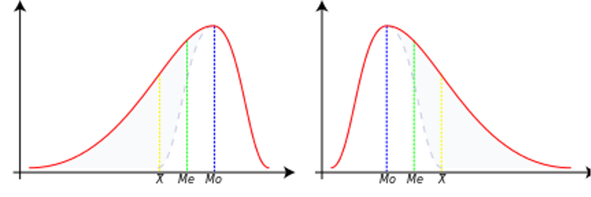
Negative skewness
In this case, the data is skewed or shifted to the left.
By skewed to the left, we mean that the left tail is long relative to the right tail.
The data values may extend further to the left, but are concentrated on the right side.
So we are dealing with a long tail, and the distortion is caused by very small values that pull the mean down and it is smaller than the median.
In this case, we have Mean < Median < Mode.
Zero skewness
This means that the data set is symmetric.
A dataset is symmetric if it looks the same to the left and right of the center point.
A dataset is bell-shaped or symmetric.
A perfectly symmetrical data set will have a skewness of zero.
So a normal distribution that is perfectly symmetric has a skewness of 0.
In this case, we have Mean = Median = Mode.
Positive skewness
The data set is skewed or shifted to the right.
By skewed to the right, we mean that the right tail is long relative to the left tail.
The data values are concentrated on the right side.
There is a long tail on the right side, which is caused by very large values that pull the mean up and it is larger than the median.
So we have Mean > Median > Mode.
X = [2, 4, 4, 4, 5, 5, 7, 9]
skewness = stats.skew(X)
print(f"Skewness for X: {skewness:.4f}")
Skewness for X: 0.6562
Your turn.
Try to interpret the above mentioned measures and calculate sample statistics for several Types of Pokémons.
# Your code hereKurtosis
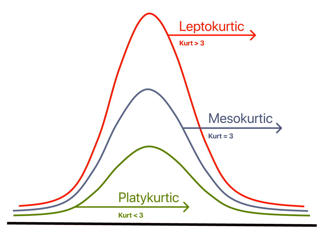
Contrary to what some textbooks claim, kurtosis does not measure the “flatness” or “peakedness” of a distribution.
Kurtosis depends on the intensity of extreme values, so it measures what happens in the “tails” of the distribution, and the shape of the “peak” is irrelevant!
Sample Kurtosis:
Reference Range for Kurtosis
The reference standard is the normal distribution, which has a kurtosis of 3.
Often, instead of kurtosis, excess kurtosis is presented, where excess kurtosis is simply kurtosis - 3.
Mesokurtic Curve
A normal distribution has a kurtosis of exactly 3 (excess kurtosis of exactly 0).
Any distribution with kurtosis ≈3 (excess kurtosis ≈ 0) is called mesokurtic.
Platykurtic Curve
A distribution with kurtosis < 3 (excess kurtosis < 0) is called platykurtic.
Compared to the normal distribution, its central peak is lower and wider, and its tails are shorter and thinner.
Leptokurtic Curve
A distribution with kurtosis > 3 (excess kurtosis > 0) is called leptokurtic.
Compared to the normal distribution, its central peak is higher and sharper, and its tails are longer and thicker.
from scipy.stats import kurtosis
mydata = [2, 4, 4, 4, 5, 5, 7, 9]
# Calculation of kurtosis (normalized by default, i.e. -3 already subtracted)
norm_kurtosis = kurtosis(mydata)
# If you want raw (without subtracting 3), set fisher=False
kurtosis_raw = kurtosis(mydata, fisher=False)
print("Normalized kurtosis:", norm_kurtosis)
print("Raw kurtosis:", kurtosis_raw)
Normalized kurtosis: -0.21875
Raw kurtosis: 2.78125
Summary statistics
A great tool for creating elegant summaries of descriptive statistics in Markdown format (ideal for Jupyter Notebooks) is pandas, especially in combination with the .describe() function and tabulate.
Example with pandas + tabulate (nice table in Markdown):
from scipy.stats import skew, kurtosis
from tabulate import tabulate

def markdown_summary(df, round_decimals=3):
    summary = df.describe().T  # We transpose so that the variables are in lines
    # Add skewness and kurtosis
    summary['Skewness'] = df.skew()
    summary['Kurtosis'] = df.kurt()
    # Rounding up the results
    summary = summary.round(round_decimals)
    # A table with the results!
    return tabulate(summary, headers='keys', tablefmt='github')
# We select only numerical columns for analysis
quantitative = df_pokemon.select_dtypes(include='number')
# We use our function
print(markdown_summary(quantitative))| | count | mean | std | min | 25% | 50% | 75% | max | Skewness | Kurtosis |
|------------|---------|---------|---------|-------|--------|-------|--------|-------|------------|------------|
| # | 800 | 362.814 | 208.344 | 1 | 184.75 | 364.5 | 539.25 | 721 | -0.001 | -1.166 |
| Total | 800 | 435.102 | 119.963 | 180 | 330 | 450 | 515 | 780 | 0.153 | -0.507 |
| HP | 800 | 69.259 | 25.535 | 1 | 50 | 65 | 80 | 255 | 1.568 | 7.232 |
| Attack | 800 | 79.001 | 32.457 | 5 | 55 | 75 | 100 | 190 | 0.552 | 0.17 |
| Defense | 800 | 73.842 | 31.184 | 5 | 50 | 70 | 90 | 230 | 1.156 | 2.726 |
| Sp. Atk | 800 | 72.82 | 32.722 | 10 | 49.75 | 65 | 95 | 194 | 0.745 | 0.298 |
| Sp. Def | 800 | 71.902 | 27.829 | 20 | 50 | 70 | 90 | 230 | 0.854 | 1.628 |
| Speed | 800 | 68.278 | 29.06 | 5 | 45 | 65 | 90 | 180 | 0.358 | -0.236 |
| Generation | 800 | 3.324 | 1.661 | 1 | 2 | 3 | 5 | 6 | 0.014 | -1.24 |
To make a summary table cross-sectionally (that is, by group), you need to use the groupby() method on DataFrame, and then, for example, describe() or your own aggregation function.
Suppose you want to group data by “Type 1” column (i.e., for example, Pokémon type: Fire, Water, etc.), and then summarize quantitative variables (mean, variance, min, max, etc.).
# Grouping by ‘Type 1’ column and statistical summary of numeric columns
group_summary = df_pokemon.groupby('Type 1')[quantitative.columns].describe()
print(group_summary)
# \
count mean std min 25% 50% 75% max
Type 1
Bug 69.0 334.492754 210.445160 10.0 168.00 291.0 543.00 666.0
Dark 31.0 461.354839 176.022072 197.0 282.00 509.0 627.00 717.0
Dragon 32.0 474.375000 170.190169 147.0 373.00 443.5 643.25 718.0
Electric 44.0 363.500000 202.731063 25.0 179.75 403.5 489.75 702.0
Fairy 17.0 449.529412 271.983942 35.0 176.00 669.0 683.00 716.0
Fighting 27.0 363.851852 218.565200 56.0 171.50 308.0 536.00 701.0
Fire 52.0 327.403846 226.262840 4.0 143.50 289.5 513.25 721.0
Flying 4.0 677.750000 42.437209 641.0 641.00 677.5 714.25 715.0
Ghost 32.0 486.500000 209.189218 92.0 354.75 487.0 709.25 711.0
Grass 70.0 344.871429 200.264385 1.0 187.25 372.0 496.75 673.0
Ground 32.0 356.281250 204.899855 27.0 183.25 363.5 535.25 645.0
Ice 24.0 423.541667 175.465834 124.0 330.25 371.5 583.25 713.0
Normal 98.0 319.173469 193.854820 16.0 161.25 296.5 483.00 676.0
Poison 28.0 251.785714 228.801767 23.0 33.75 139.5 451.25 691.0
Psychic 57.0 380.807018 194.600455 63.0 201.00 386.0 528.00 720.0
Rock 44.0 392.727273 213.746140 74.0 230.75 362.5 566.25 719.0
Steel 27.0 442.851852 164.847180 208.0 305.50 379.0 600.50 707.0
Water 112.0 303.089286 188.440807 7.0 130.00 275.0 456.25 693.0
Total ... Speed Generation \
count mean ... 75% max count mean
Type 1 ...
Bug 69.0 378.927536 ... 85.00 160.0 69.0 3.217391
Dark 31.0 445.741935 ... 98.50 125.0 31.0 4.032258
Dragon 32.0 550.531250 ... 97.75 120.0 32.0 3.875000
Electric 44.0 443.409091 ... 101.50 140.0 44.0 3.272727
Fairy 17.0 413.176471 ... 60.00 99.0 17.0 4.117647
Fighting 27.0 416.444444 ... 86.00 118.0 27.0 3.370370
Fire 52.0 458.076923 ... 96.25 126.0 52.0 3.211538
Flying 4.0 485.000000 ... 121.50 123.0 4.0 5.500000
Ghost 32.0 439.562500 ... 84.25 130.0 32.0 4.187500
Grass 70.0 421.142857 ... 80.00 145.0 70.0 3.357143
Ground 32.0 437.500000 ... 90.00 120.0 32.0 3.156250
Ice 24.0 433.458333 ... 80.00 110.0 24.0 3.541667
Normal 98.0 401.683673 ... 90.75 135.0 98.0 3.051020
Poison 28.0 399.142857 ... 77.00 130.0 28.0 2.535714
Psychic 57.0 475.947368 ... 104.00 180.0 57.0 3.385965
Rock 44.0 453.750000 ... 70.00 150.0 44.0 3.454545
Steel 27.0 487.703704 ... 70.00 110.0 27.0 3.851852
Water 112.0 430.455357 ... 82.00 122.0 112.0 2.857143
std min 25% 50% 75% max
Type 1
Bug 1.598433 1.0 2.00 3.0 5.00 6.0
Dark 1.353609 2.0 3.00 5.0 5.00 6.0
Dragon 1.431219 1.0 3.00 4.0 5.00 6.0
Electric 1.604697 1.0 2.00 4.0 4.25 6.0
Fairy 2.147160 1.0 2.00 6.0 6.00 6.0
Fighting 1.800601 1.0 1.50 3.0 5.00 6.0
Fire 1.850665 1.0 1.00 3.0 5.00 6.0
Flying 0.577350 5.0 5.00 5.5 6.00 6.0
Ghost 1.693203 1.0 3.00 4.0 6.00 6.0
Grass 1.579173 1.0 2.00 3.5 5.00 6.0
Ground 1.588454 1.0 1.75 3.0 5.00 5.0
Ice 1.473805 1.0 2.75 3.0 5.00 6.0
Normal 1.575407 1.0 2.00 3.0 4.00 6.0
Poison 1.752927 1.0 1.00 1.5 4.00 6.0
Psychic 1.644845 1.0 2.00 3.0 5.00 6.0
Rock 1.848375 1.0 2.00 3.0 5.00 6.0
Steel 1.350319 2.0 3.00 3.0 5.00 6.0
Water 1.558800 1.0 1.00 3.0 4.00 6.0
[18 rows x 72 columns]
Your turn!
Try to interpret some of the mentioned statistics.
Detecting (potential) outliers with z-scores
Defining and detecting outliers is notoriously difficult.
Sometimes, an observation in a histogram clearly looks like an outlier.
But how do we quantify this?
What is a z-score?
A z-score is a standardized measure of how many any given point deviates from the mean:
This is useful because it allows us to quantify the standardized distance between some observation and the mean.
Calculating z-scores
## Original distribution
numbers
array([1, 2, 3, 4])## z-scored distribution
numbers_z = (numbers - numbers.mean()) / numbers.std(ddof=1)
numbers_zarray([-1.161895 , -0.38729833, 0.38729833, 1.161895 ])Check-in
Can anyone deduce why a z-score would be useful for defining outliers?
Z-scores and outliers
Outliers are data points that differ significantly from other points in a distribution.
A z-score gives us a standardized measure of how different a given value is from the rest of the distribution.
We can define thresholds, e.g.:
Testing our operationalization
## First, let's define a distribution with some possible outliers
norm = np.random.normal(loc = 10, scale = 1, size = 1000)
upper_outliers = np.array([21, 21, 21, 21]) ## some random outliers
data = np.concatenate((norm, upper_outliers))
p = plt.hist(data, alpha = .6)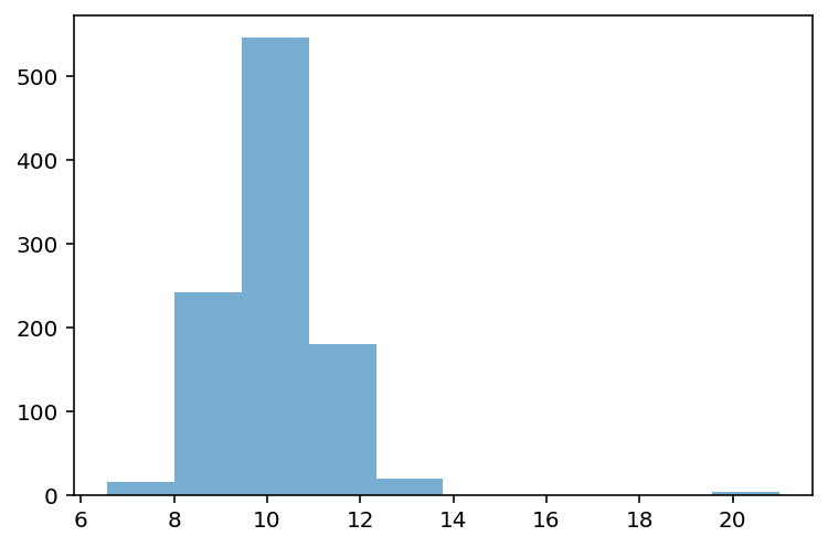
Z-scoring our distribution
What is the z-score of the values way off to the right?
data_z = (data - data.mean()) / data.std(ddof=1)
p = plt.hist(data_z, alpha = .6)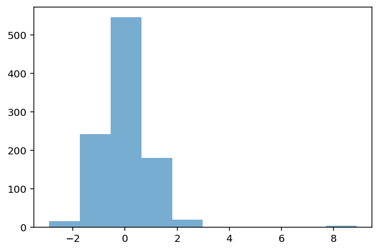
Removing outliers
data_z_filtered = data_z[abs(data_z)<=3]
p = plt.hist(data_z_filtered, alpha = .6)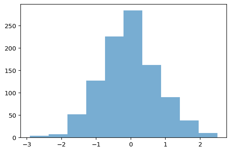
Check-in
Can anyone think of challenges or problems with this approach to detecting outliers?
Caveats, complexity, and context
There is not a single unifying definition of what an outlier is.
Depending on the shape of the distribution, removing observations where might be removing important data.
E.g., in a skewed distribution, we might just be “cutting off the tail”.
Even if the values do seem like outliers, there’s a philosophical question of why and what that means.
Are those values “random”? What’s the underlying *data-generating process?
This is why statistics is not a mere matter of applying formulas. Context always matters!
Describing bivariate data with correlations
So far, we’ve been focusing on univariate data: a single distribution.
What if we want to describe how two distributions relate to each other?
For today, we’ll focus on continuous distributions.
Bivariate relationships: height
A classic example of continuous bivariate data is the
heightof aparentandchild.
df_height = pd.read_csv("data/wrangling/height.csv")
df_height.head(2)Plotting Pearson’s height data
sns.scatterplot(data = df_height, x = "Father", y = "Son", alpha = .5);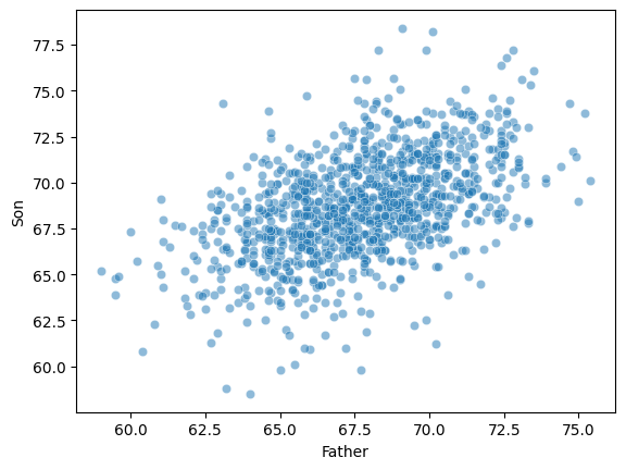
Introducing linear correlations
A correlation coefficient is a number between that describes the relationship between a pair of variables.
Specifically, Pearson’s correlation coefficient (or Pearson’s ) describes a (presumed) linear relationship.
Two key properties:
Sign: whether a relationship is positive (+) or negative (–).
Magnitude: the strength of the linear relationship.
Where:
- Pearson correlation coefficient
, - values of the variables
, - arithmetic means
- number of observations
Pearson’s correlation coefficient measures the strength and direction of the linear relationship between two continuous variables. Its value ranges from -1 to 1:
1 → perfect positive linear correlation
0 → no linear correlation
-1 → perfect negative linear correlation
This coefficient does not tell about nonlinear correlations and is sensitive to outliers.
Calculating Pearson’s with scipy
scipy.stats has a function called pearsonr, which will calculate this relationship for you.
Returns two numbers:
: the correlation coefficent.
: the p-value of this correlation coefficient, i.e., whether it’s significantly different from
0.
ss.pearsonr(df_height['Father'], df_height['Son'])PearsonRResult(statistic=np.float64(0.5011626808075912), pvalue=np.float64(1.2729275743661585e-69))Check-in
Using scipy.stats.pearsonr (here, ss.pearsonr), calculate Pearson’s for the relationship between the Attack and Defense of Pokemon.
Is this relationship positive or negative?
How strong is this relationship?
### Your code hereSolution
ss.pearsonr(df_pokemon['Attack'], df_pokemon['Defense'])(0.4386870551184888, 5.858479864290367e-39)Check-in
Pearson’r measures the linear correlation between two variables. Can anyone think of potential limitations to this approach?
Limitations of Pearson’s 
Pearson’s presumes a linear relationship and tries to quantify its strength and direction.
But many relationships are non-linear!
Unless we visualize our data, relying only on Pearson’r could mislead us.
Non-linear data where 
x = np.arange(1, 40)
y = np.sin(x)
p = sns.lineplot(x = x, y = y)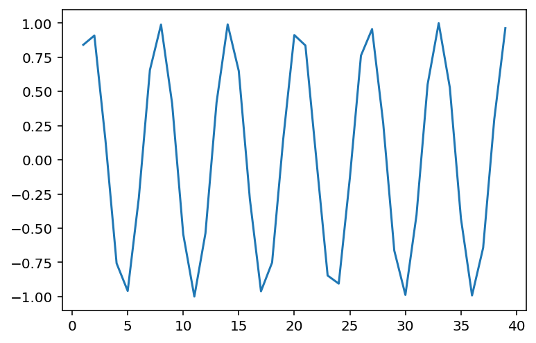
### r is close to 0, despite there being a clear relationship!
ss.pearsonr(x, y)
(-0.04067793461845844, 0.8057827185936633)When is invariant to the real relationship
All these datasets have roughly the same correlation coefficient.
df_anscombe = sns.load_dataset("anscombe")
sns.relplot(data = df_anscombe, x = "x", y = "y", col = "dataset");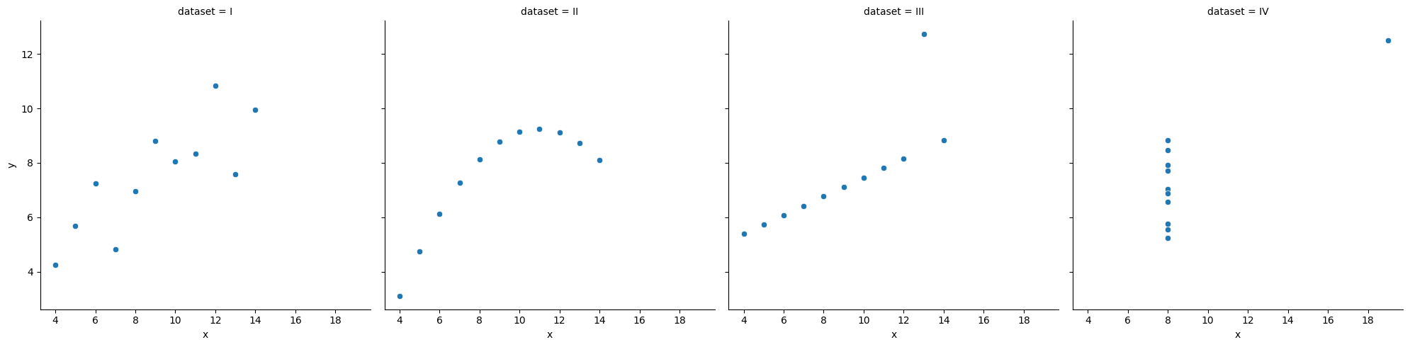
# Compute correlation matrix
corr = df_pokemon.corr(numeric_only=True)

# Set up the matplotlib figure
plt.figure(figsize=(10, 8))

# Create a heatmap
sns.heatmap(corr,
            annot=True,         # Show correlation coefficients
            fmt=".2f",          # Format for coefficients
            cmap="coolwarm",    # Color palette
            vmin=-1, vmax=1,    # Fixed scale
            square=True,        # Make cells square
            linewidths=0.5,     # Line width between cells
            cbar_kws={"shrink": .75})  # Colorbar shrink

# Title and layout
plt.title("Correlation Heatmap", fontsize=16)
plt.tight_layout()

# Show plot
plt.show()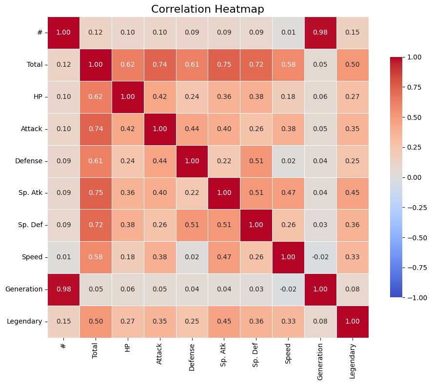
Rank Correlations
Rank correlations are measures of the strength and direction of a monotonic (increasing or decreasing) relationship between two variables. Instead of numerical values, they use ranks, i.e., positions in an ordered set.
They are less sensitive to outliers and do not require linearity (unlike Pearson’s correlation).
Types of Rank Correlations
(rho) Spearman’s
Based on the ranks of the data.
Value: from –1 to 1.
Works well for monotonic but non-linear relationships.
Where:
– differences between the ranks of observations,
– number of observations.
(tau) Kendall’s
Measures the number of concordant vs. discordant pairs.
More conservative than Spearman’s – often yields smaller values.
Also ranges from –1 to 1.
Where:
— Kendall’s correlation coefficient,
— number of concordant pairs,
— number of discordant pairs,
— number of observations,
— total number of possible pairs of observations.
What are concordant and discordant pairs?
Concordant pair: if < and < , or > and > .
Discordant pair: if < and > , or > and < .
When to use rank correlations?
When the data are not normally distributed.
When you suspect a non-linear but monotonic relationship.
When you have rank correlations, such as grades, ranking, preference level.
| Correlation type | Description | When to use |
|---|---|---|
| Spearman’s (ρ) | Monotonic correlation, based on ranks | When data are nonlinear or have outliers |
| Kendall’s (τ) | Counts the proportion of congruent and incongruent pairs | When robustness to ties is important |
Interpretation of correlation values
| Range of values | Correlation interpretation |
|---|---|
| 0.8 - 1.0 | very strong positive |
| 0.6 - 0.8 | strong positive |
| 0.4 - 0.6 | moderate positive |
| 0.2 - 0.4 | weak positive |
| 0.0 - 0.2 | very weak or no correlation |
| < 0 | similarly - negative correlation |
# Compute Kendall rank correlation
corr_kendall = df_pokemon.corr(method='kendall', numeric_only=True)

# Set up the matplotlib figure
plt.figure(figsize=(10, 8))

# Create a heatmap
sns.heatmap(corr,
            annot=True,         # Show correlation coefficients
            fmt=".2f",          # Format for coefficients
            cmap="coolwarm",    # Color palette
            vmin=-1, vmax=1,    # Fixed scale
            square=True,        # Make cells square
            linewidths=0.5,     # Line width between cells
            cbar_kws={"shrink": .75})  # Colorbar shrink

# Title and layout
plt.title("Correlation Heatmap", fontsize=16)
plt.tight_layout()

# Show plot
plt.show()
Comparison of Correlation Coefficients
| Property | Pearson (r) | Spearman (ρ) | Kendall (τ) |
|---|---|---|---|
| What it measures? | Linear relationship | Monotonic relationship (based on ranks) | Monotonic relationship (based on pairs) |
| Data type | Quantitative, normal distribution | Ranks or ordinal/quantitative data | Ranks or ordinal/quantitative data |
| Sensitivity to outliers | High | Lower | Low |
| Value range | –1 to 1 | –1 to 1 | –1 to 1 |
| Requires linearity | Yes | No | No |
| Robustness to ties | Low | Medium | High |
| Interpretation | Strength and direction of linear relationship | Strength and direction of monotonic relationship | Proportion of concordant vs discordant pairs |
| Significance test | Yes (scipy.stats.pearsonr) | Yes (spearmanr) | Yes (kendalltau) |
Brief summary:
Pearson - best when the data are normal and the relationship is linear.
Spearman - works better for non-linear monotonic relationships.
Kendall - more conservative, often used in social research, less sensitive to small changes in data.
Your Turn
For the Pokemon dataset, find the pairs of variables that are most appropriate for using one of the quantitative correlation measures. Calculate them, then visualize them.
from scipy.stats import pearsonr, spearmanr, kendalltau

## Your code here
Correlation of Qualitative Variables
A categorical variable is one that takes descriptive values
Such variables cannot be analyzed directly using correlation methods for numbers (Pearson, Spearman, Kendall). Other techniques are used instead.
Contingency Table
A contingency table is a special cross-tabulation table that shows the frequency (i.e., the number of cases) for all possible combinations of two categorical variables.
It is a fundamental tool for analyzing relationships between qualitative features.
Chi-Square Test of Independence
The Chi-Square test checks whether there is a statistically significant relationship between two categorical variables.
Concept:
We compare:
observed values (from the contingency table),
with expected values, assuming the variables are independent.
Where:
– observed count in cell (, ),
– expected count in cell (, ), assuming independence.
Example: Calculating Expected Values and Chi-Square Statistic in Python
Here’s how you can calculate the expected values and Chi-Square statistic (χ²) step by step using Python.
Step 1: Create the Observed Contingency Table
We will use the Pokémon example:
| Type 1 | Legendary = False | Legendary = True | Total |
|---|---|---|---|
| Fire | 18 | 5 | 23 |
| Water | 25 | 3 | 28 |
| Grass | 20 | 2 | 22 |
| Total | 63 | 10 | 73 |
import numpy as np
import pandas as pd
from scipy.stats import chi2_contingency

# Observed values (contingency table)
observed = np.array([
    [18, 5],  # Fire
    [25, 3],  # Water
    [20, 2]   # Grass
])

# Convert to DataFrame for better visualization
observed_df = pd.DataFrame(
    observed,
    columns=["Legendary = False", "Legendary = True"],
    index=["Fire", "Water", "Grass"]
)
print("Observed Table:")
print(observed_df)
Observed Table:
Legendary = False Legendary = True
Fire 18 5
Water 25 3
Grass 20 2
Step 2: Calculate Expected Values The expected values are calculated using the formula:
You can calculate this manually or use scipy.stats.chi2_contingency, which automatically computes the expected values.
# Perform Chi-Square test
chi2, p, dof, expected = chi2_contingency(observed)

# Convert expected values to DataFrame for better visualization
expected_df = pd.DataFrame(
    expected,
    columns=["Legendary = False", "Legendary = True"],
    index=["Fire", "Water", "Grass"]
)
print("\nExpected Table:")
print(expected_df)
Expected Table:
       Legendary = False  Legendary = True
Fire           19.849315          3.150685
Water          24.164384          3.835616
Grass          18.986301          3.013699
Step 3: Calculate the Chi-Square Statistic The Chi-Square statistic is calculated using the formula:
This is done automatically by scipy.stats.chi2_contingency, but you can also calculate it manually:
# Manual calculation of Chi-Square statistic
chi2_manual = np.sum((observed - expected) ** 2 / expected)
print(f"\nChi-Square Statistic (manual): {chi2_manual:.4f}")
Chi-Square Statistic (manual): 1.8638
Step 4: Interpret the Results The chi2_contingency function also returns:
p-value: The probability of observing the data if the null hypothesis (independence) is true. Degrees of Freedom (dof): Calculated as (rows - 1) * (columns - 1).
print(f"\nChi-Square Statistic: {chi2:.4f}")
print(f"p-value: {p:.4f}")
print(f"Degrees of Freedom: {dof}")
Chi-Square Statistic: 1.8638
p-value: 0.3938
Degrees of Freedom: 2
Interpretation of the Chi-Square Test Result:
| Value | Meaning |
|---|---|
| High χ² value | Large difference between observed and expected values |
| Low p-value | Strong basis to reject the null hypothesis of independence |
| p < 0.05 | Statistically significant relationship between variables |
Qualitative Correlations
Cramér’s V
Cramér’s V is a measure of the strength of association between two categorical variables. It is based on the Chi-Square test but scaled to a range of 0–1, making it easier to interpret the strength of the relationship.
Where:
– Chi-Square test statistic,
– number of observations,
– the smaller number of categories (rows/columns) in the contingency table.
Phi Coefficient ()
Application:
Both variables must be dichotomous (e.g., Yes/No, 0/1), meaning the table must have the smallest size of 2×2.
Ideal for analyzing relationships like gender vs purchase, type vs legendary.
Where:
– Chi-Square test statistic for a 2×2 table,
– number of observations.
Tschuprow’s T
Tschuprow’s T is a measure of association similar to Cramér’s V, but it has a different scale. It is mainly used when the number of categories in the two variables differs. This is a more advanced measure applicable to a broader range of contingency tables.
Where:
– Chi-Square test statistic,
– number of observations,
– the smaller number of categories (rows or columns) in the contingency table.
Application: Tschuprow’s T is useful when dealing with contingency tables with varying numbers of categories in rows and columns.
Summary - Qualitative Correlations
| Measure | What it measures | Application | Value Range | Strength Interpretation |
|---|---|---|---|---|
| Cramér’s V | Strength of association between nominal variables | Any categories | 0 – 1 | 0.1–weak, 0.3–moderate, >0.5–strong |
| Phi () | Strength of association in a 2×2 table | Two binary variables | -1 – 1 | Similar to correlation |
| Tschuprow’s T | Strength of association, alternative to Cramér’s V | Tables with similar category counts | 0 – 1 | Less commonly used |
| Chi² () | Statistical test of independence | All categorical variables | 0 – ∞ | Higher values indicate stronger differences |
Example
Let’s investigate whether the Pokémon’s type (type_1) is affected by whether the Pokémon is legendary.
We’ll use the scipy library.
This library already has built-in functions for calculating various qualitative correlation measures.
from scipy.stats.contingency import association

# Contingency table:
ct = pd.crosstab(df_pokemon["Type 1"], df_pokemon["Legendary"])

# Calculating Cramér's V measure
V = association(ct, method="cramer") # https://docs.scipy.org/doc/scipy/reference/generated/scipy.stats.contingency.association.html#association

print(f"Cramer's V: {V}") # interpret!
Cramer's V: 0.3361928228447545
Your turn
What visualization would be most appropriate for presenting a quantitative, ranked, and qualitative relationship?
Try to think about which pairs of variables could have which type of analysis based on the Pokemon data.
## Your code and discussion hereHeatmaps for qualitative correlations
# git clone https://github.com/ayanatherate/dfcorrs.git
# cd dfcorrs
# pip install -r requirements.txt

from dfcorrs.cramersvcorr import Cramers
cram=Cramers()
# cram.corr(df_pokemon)
cram.corr(df_pokemon, plot_htmp=True)
Summary
There are many ways to describe our data:
Measure central tendency.
Measure its variability; skewness and kurtosis.
Measure what correlations our data have.
All of these are useful and all of them are also exploratory data analysis (EDA).