Abstract
This notebook provides a comprehensive introduction to data visualization in Python using Matplotlib and Pyplot. It covers the basics of creating visualizations such as histograms, scatterplots, and bar charts, while emphasizing their importance in exploratory data analysis, communicating insights, and making impactful decisions. Practical examples and best practices are included to help users effectively visualize and interpret data.
Chapters 5-6-7
In the following chapters we will delve into data visualization.
How to create visualizations in Python?
What principles should we remember?
How to work with Matplotlib, Pyplot?
How to work on visualizations in Seaborn?
What are the best practices for creating data visualizations?
Next, before we start statistical analysis, we will work on managing and cleaning our data.
How to deal with missing values?
How to deal with dirty data?
What are the basic ways to describe data?
Remember that these chapters are an integral part of Exploratory Data Analysis in Python.
In this chapter
What is data visualization and why is it important?
Introduction to
matplotlib.Types of one-dimensional charts:
Histograms (one-dimensional).
Scatterplots (two-dimensional).
Bar charts (also two-dimensional).
Introduction: data visualization
What is data visualization?
Data visualization refers to the process (and result) of representing data graphically.
For our purposes today, we’ll be talking mostly about common methods of plotting data, including:
Histograms
Scatterplots
Line plots
Bar plots
Why is data visualization important?
Exploratory data analysis
Communicating insights
Impacting the world
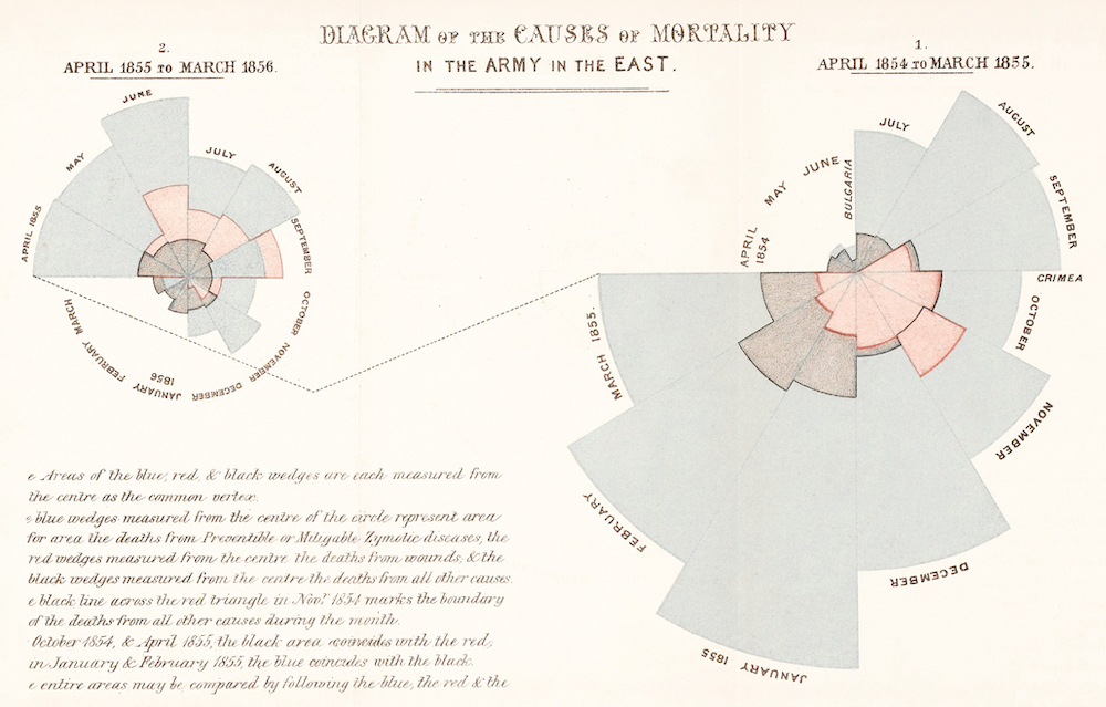
Impacting the world
Florence Nightingale (1820-1910) was a social reformer, statistician, and founder of modern nursing.
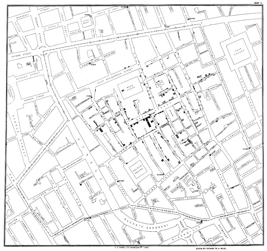
Impacting the world (pt. 2)
John Snow (1813-1858) was a physician whose visualization of cholera outbreaks helped identify the source and spreading mechanism (water supply).
Introducing matplotlib
Loading packages
Here, we load the core packages we’ll be using.
We also add some lines of code that make sure our visualizations will plot “inline” with our code, and that they’ll have nice, crisp quality.
import numpy as np
import pandas as pd
import matplotlib.pyplot as plt
import scipy.stats as ss
/opt/anaconda3/lib/python3.9/site-packages/scipy/__init__.py:146: UserWarning: A NumPy version >=1.16.5 and <1.23.0 is required for this version of SciPy (detected version 1.23.1
warnings.warn(f"A NumPy version >={np_minversion} and <{np_maxversion}"
%matplotlib inline
%config InlineBackend.figure_format = 'retina'
What is matplotlib?
matplotlibis a plotting library for Python.
Note that seaborn (which we’ll cover soon) uses matplotlib “under the hood”.
What is pyplot?
pyplotis a collection of functions withinmatplotlibthat make it really easy to plot data.
With pyplot, we can easily plot things like:
Histograms (
plt.hist)Scatterplots (
plt.scatter)Line plots (
plt.plot)Bar plots (
plt.bar)
Example dataset
Let’s load our familiar Pokemon dataset, which can be found in data/pokemon.csv.
df_pokemon = pd.read_csv("data/pokemon.csv")
df_pokemon.head(3)Histograms
What are histograms?
A histogram is a visualization of a single continuous, quantitative variable (e.g., income or temperature).
Histograms are useful for looking at how a variable distributes.
Can be used to determine whether a distribution is normal, skewed, or bimodal.
A histogram is a univariate plot, i.e., it displays only a single variable.
Histograms in matplotlib
To create a histogram, call plt.hist with a single column of a DataFrame (or a numpy.ndarray).
Check-in: What is this graph telling us?
p = plt.hist(df_pokemon['Attack'])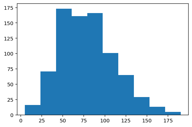
Changing the number of bins
A histogram puts your continuous data into bins (e.g., 1-10, 11-20, etc.).
The height of each bin reflects the number of observations within that interval.
Increasing or decreasing the number of bins gives you more or less granularity in your distribution.
### This has lots of bins
p = plt.hist(df_pokemon['Attack'], bins = 30)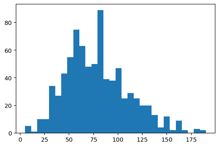
### This has fewer bins
p = plt.hist(df_pokemon['Attack'], bins = 5)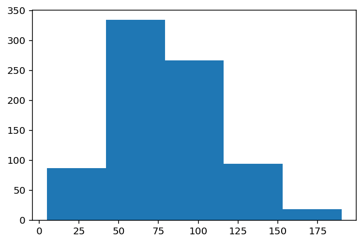
Changing the alpha level
The alpha level changes the transparency of your figure.
### This has fewer bins
p = plt.hist(df_pokemon['Attack'], alpha = .6)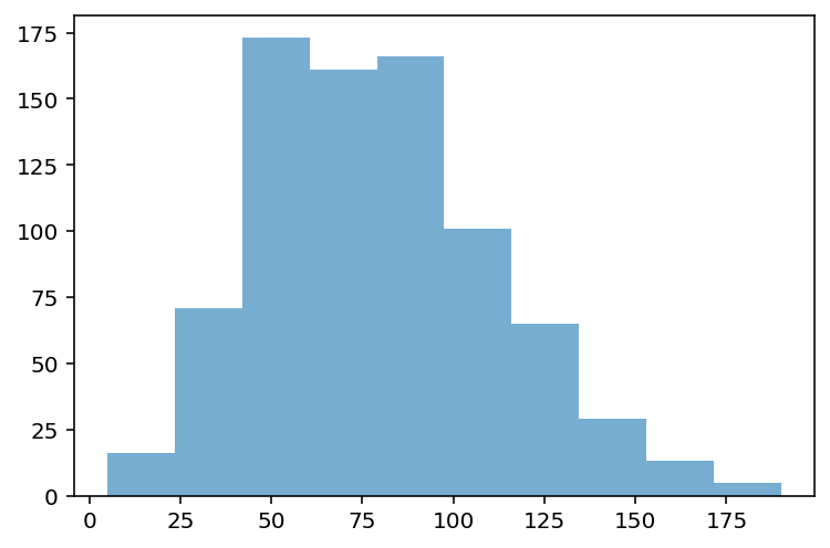
Check-in:
How would you make a histogram of the scores for Defense?
### Your code hereSolution
p = plt.hist(df_pokemon['Defense'], alpha = .6)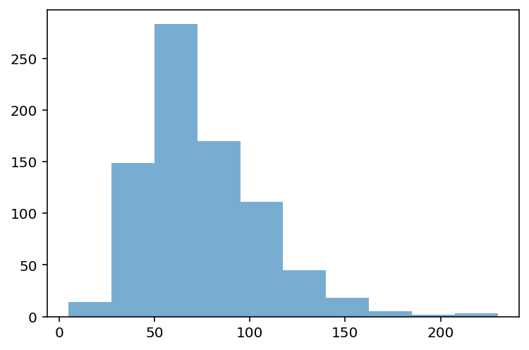
Check-in:
Could you make a histogram of the scores for Type 1?
### Your code hereSolution
Not exactly.
Type 1is a categorical variable, so there’s no intrinsic ordering.The closest we could do is count the number of each
Type 1and then plot those counts.
Learning from histograms
Histograms are incredibly useful for learning about the shape of our distribution. We can ask questions like:
Normally distributed data
We can use the numpy.random.normal function to create a normal distribution, then plot it.
A normal distribution has the following characteristics:
Classic “bell” shape (symmetric).
Mean, median, and mode are all identical.
norm = np.random.normal(loc = 10, scale = 1, size = 1000)
p = plt.hist(norm, alpha = .6)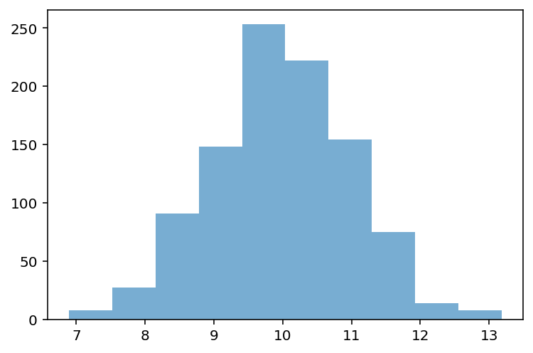
Skewed data
Skew means there are values elongating one of the “tails” of a distribution.
Positive/right skew: the tail is pointing to the right.
Negative/left skew: the tail is pointing to the left.
rskew = ss.skewnorm.rvs(20, size = 1000) # make right-skewed data
lskew = ss.skewnorm.rvs(-20, size = 1000) # make left-skewed data
fig, axes = plt.subplots(1, 2)
axes[0].hist(rskew)
axes[0].set_title("Right-skewed")
axes[1].hist(lskew)
axes[1].set_title("Left-skewed")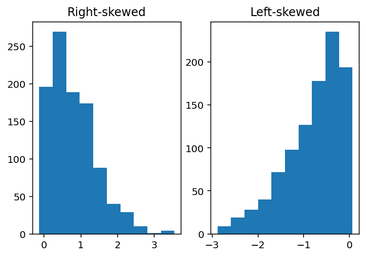
Outliers
Outliers are data points that differ significantly from other points in a distribution.
Unlike skewed data, outliers are generally discontinuous with the rest of the distribution.
Next week, we’ll talk about more ways to identify outliers; for now, we can rely on histograms.
norm = np.random.normal(loc = 10, scale = 1, size = 1000)
upper_outliers = np.array([21, 21, 21, 21]) ## some random outliers
data = np.concatenate((norm, upper_outliers))
p = plt.hist(data, alpha = .6)
plt.arrow(20, 100, dx = 0, dy = -50, width = .3, head_length = 10, facecolor = "red")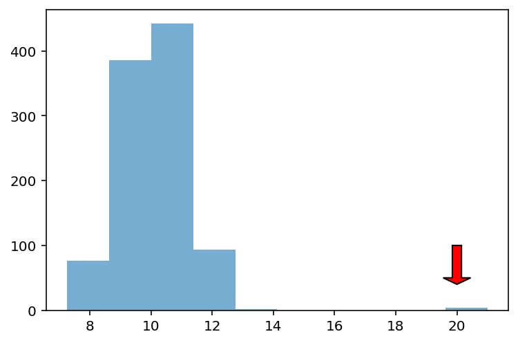
Check-in
How would you describe the following distribution?
Normal vs. skewed?
With or without outliers?
p = plt.hist(df_pokemon['HP'], alpha = .6)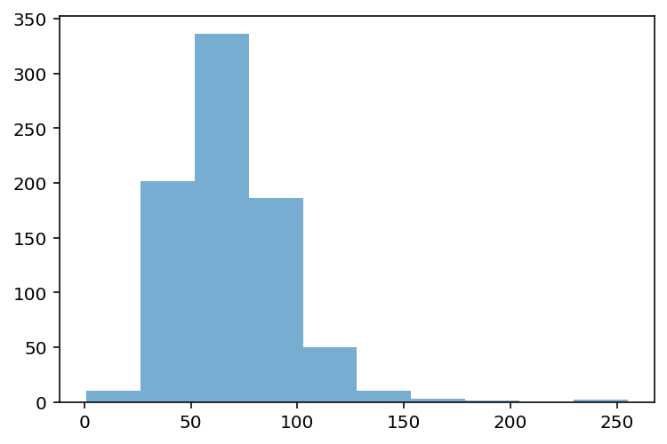
Check-in
How would you describe the following distribution?
Normal vs. skewed?
With or without outliers?
p = plt.hist(df_pokemon['Sp. Atk'], alpha = .6)
Check-in
In a somewhat right-skewed distribution (like below), what’s larger––the mean or the median?
p = plt.hist(df_pokemon['Sp. Atk'], alpha = .6)Solution
The mean is the most affected by skew, so it is pulled the furthest to the right in a right-skewed distribution.
p = plt.hist(df_pokemon['Sp. Atk'], alpha = .6)
plt.axvline(df_pokemon['Sp. Atk'].mean(), linestyle = "dashed", color = "green")
plt.axvline(df_pokemon['Sp. Atk'].median(), linestyle = "dotted", color = "red")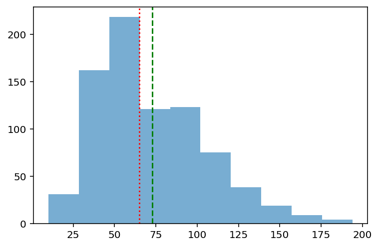
Modifying our plot
A good data visualization should also make it clear what’s being plotted.
Clearly labeled
xandyaxes, title.
Sometimes, we may also want to add overlays.
E.g., a dashed vertical line representing the
mean.
Adding axis labels
p = plt.hist(df_pokemon['Attack'], alpha = .6)
plt.xlabel("Attack")
plt.ylabel("Count")
plt.title("Distribution of Attack Scores")
Adding a vertical line
The plt.axvline function allows us to draw a vertical line at a particular position, e.g., the mean of the Attack column.
p = plt.hist(df_pokemon['Attack'], alpha = .6)
plt.xlabel("Attack")
plt.ylabel("Count")
plt.title("Distribution of Attack Scores")
plt.axvline(df_pokemon['Attack'].mean(), linestyle = "dotted")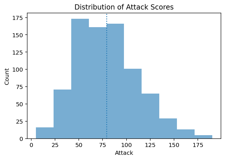
Scatterplots
What are scatterplots?
A scatterplot is a visualization of how two different continuous distributions relate to each other.
Each individual point represents an observation.
Very useful for exploratory data analysis.
Are these variables positively or negatively correlated?
A scatterplot is a bivariate plot, i.e., it displays at least two variables.
Scatterplots with matplotlib
We can create a scatterplot using plt.scatter(x, y), where x and y are the two variables we want to visualize.
x = np.arange(1, 10)
y = np.arange(11, 20)
p = plt.scatter(x, y)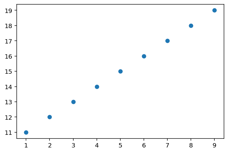
Check-in
Are these variables related? If so, how?
x = np.random.normal(loc = 10, scale = 1, size = 100)
y = x * 2 + np.random.normal(loc = 0, scale = 2, size = 100)
plt.scatter(x, y, alpha = .6)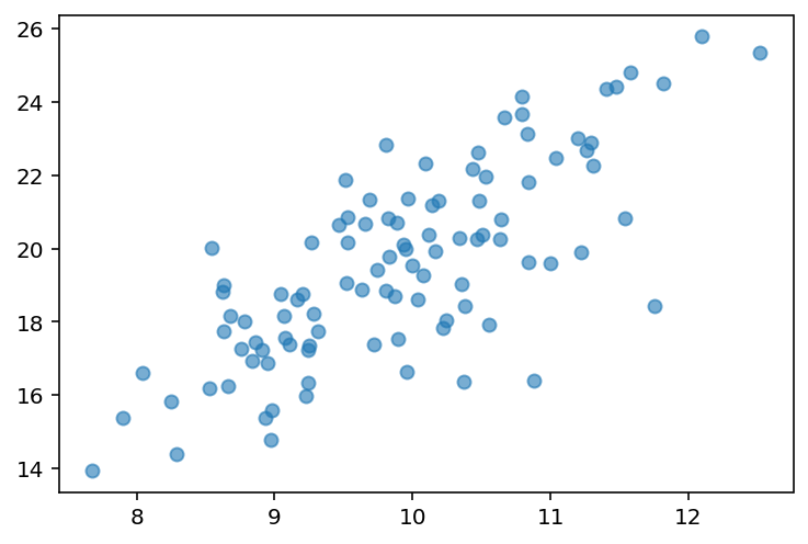
Check-in
Are these variables related? If so, how?
x = np.random.normal(loc = 10, scale = 1, size = 100)
y = -x * 2 + np.random.normal(loc = 0, scale = 2, size = 100)
plt.scatter(x, y, alpha = .6)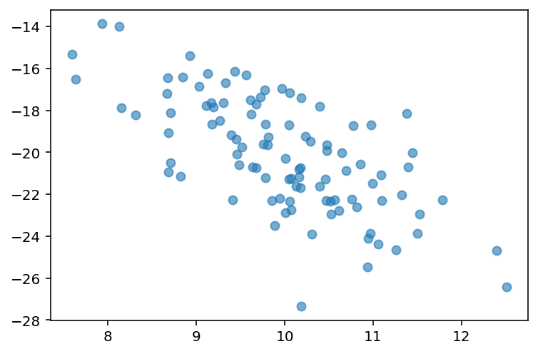
Scatterplots are useful for detecting non-linear relationships
x = np.random.normal(loc = 10, scale = 1, size = 100)
y = np.sin(x)
plt.scatter(x, y, alpha = .6)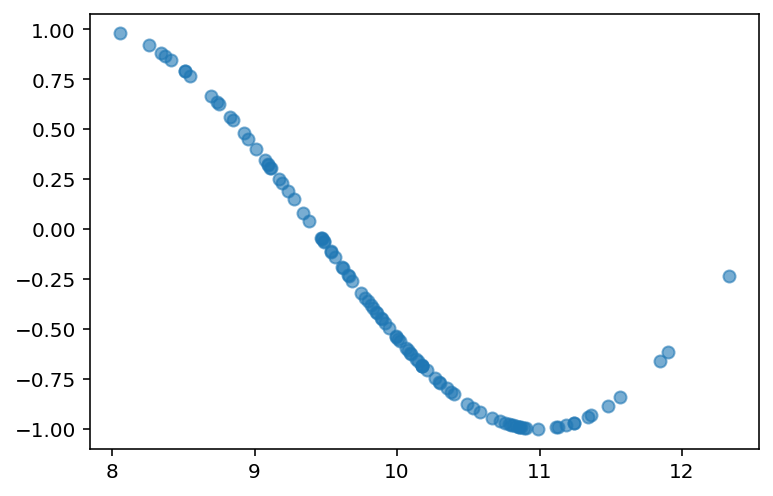
Check-in
How would we visualize the relationship between Attack and Speed in our Pokemon dataset?
### Check-inSolution
Perhaps somewhat positively correlated, but not too much.
Side note: what would it mean for the Pokemon game if all these attributes (Speed, Defense, etc.) were extremely positively correlated?
plt.scatter(df_pokemon['Attack'], df_pokemon['Speed'], alpha = .6)
plt.xlabel("Attack")
plt.ylabel("Speed")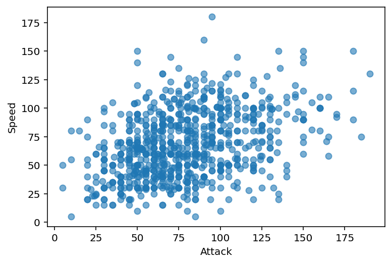
Scatter plots with pyplot express
Bubble plots
Scatter plots with resizable circular markers are often called bubble plots. Note that the color and size data is added to the hover information. You can add other columns to the hover data using the hover_data argument in px.scatter.
import plotly.express as px
df = px.data.iris()
fig = px.scatter(df, x="sepal_width", y="sepal_length", color="species",
                 size='petal_length', hover_data=['petal_width'])
fig.show()Color can be continuous, as below, or discrete/categorical, as above.
df = px.data.iris()
fig = px.scatter(df, x="sepal_width", y="sepal_length", color='petal_length')
fig.show()The symbol argument can also be mapped to a column. A wide range of symbols is available.
df = px.data.iris()
fig = px.scatter(df, x="sepal_width", y="sepal_length", color="species", symbol="species")
fig.show()Grouped Scatterplots
Scatterplots support grouping - so-called faceting.
df = px.data.tips()
fig = px.scatter(df, x="total_bill", y="tip", color="smoker", facet_col="sex", facet_row="time")
fig.show()Adding lines
The estimated linear function can be superimposed on the scatterplot:
df = px.data.tips()
fig = px.scatter(df, x="total_bill", y="tip", trendline="ols")
fig.show()Barplots
What is a barplot?
A barplot visualizes the relationship between one continuous variable and a categorical variable.
The height of each bar generally indicates the mean of the continuous variable.
Each bar represents a different level of the categorical variable.
A barplot is a bivariate plot, i.e., it displays at least two variables.
Barplots with matplotlib
plt.bar can be used to create a barplot of our data.
E.g., average
AttackbyLegendarystatus.However, we first need to use
groupbyto calculate the meanAttackper level.
Step 1: Using groupby
summary = df_pokemon[['Legendary', 'Attack']].groupby("Legendary").mean().reset_index()
summary### Turn Legendary into a str
summary['Legendary'] = summary['Legendary'].apply(lambda x: str(x))
summaryStep 2: Pass values into plt.bar
Check-in:
What do we learn from this plot?
What is this plot missing?
plt.bar(x = summary['Legendary'],
       height = summary['Attack'],
       alpha = .6)
plt.xlabel("Legendary status")
plt.ylabel("Attack")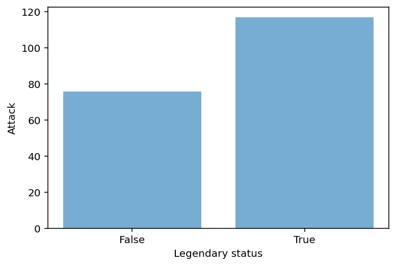
Adding error bars
Without some measure of variance, bar plots just tell us the
meanof each level.Ideally, we’d have a way to measure how much variance there is around that
mean.
Typically, error bars are calculated using the standard error of the mean.
Standard error of the mean
The standard error of the mean is the standard deviation of the distribution of sample means; in practice, it’s an estimate of how much variance there is around our estimate of the
mean.
Standard deviation, or , is a measure of how much scores deviate around the mean.
Standard error of the mean, or \sigma_\bar{x}, incorporates standard deviation, but also sample size, or .
\Large \sigma_\bar{x} = \frac{\sigma}{\sqrt{n}}
As increases, \sigma_\bar{x} decreases.
I.e., larger sample size decreases standard error of the mean––which is good for our estimates!
Turning standard error into error bars
An error bar represents a “confidence interval”.
Typically, the lower/upper bounds of a confidence interval are calculated by subtracting or adding 2 * \sigma_\bar{x} to the
mean.
Note: Next week, we’ll learn all about why this is!
Step 1: calculate standard errors with sem
sem_summ = df_pokemon[['Legendary', 'Attack']].groupby("Legendary").sem().reset_index()
sem_summ### Turn Legendary into a str
sem_summ['Legendary'] = sem_summ['Legendary'].apply(lambda x: str(x))
sem_summStep 2: Create plot using plt.errorbar
The
xandycoordinates are just from our original summaryDataFrame.The
yerris the standard error we just calculated.
plt.errorbar(x = summary['Legendary'], # original coordinate
             y = summary['Attack'], # original coordinate
             yerr = sem_summ['Attack'] * 2, # standard error
            ls = 'none', ## toggle this to connect or not connect the lines
             color = "black"
            )
plt.xlabel("Legendary status")
plt.ylabel("Attack")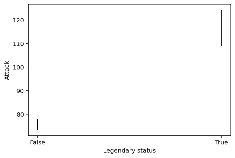
Step 3: Combining with plt.bar
plt.errorbar(x = summary['Legendary'], # original coordinate
             y = summary['Attack'], # original coordinate
             yerr = sem_summ['Attack'] * 2, # standard error
            ls = 'none', ## toggle this to connect or not connect the lines
             color = "black"
            )
plt.bar(x = summary['Legendary'],
       height = summary['Attack'],
       alpha = .6)
plt.xlabel("Legendary status")
plt.ylabel("Attack")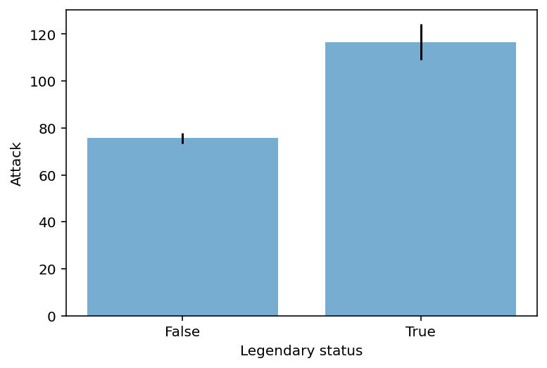
Check-in
Create a barplot with errorbars representing:
meanSpeedbyType 1Focusing only on Pokemone with a
Type 1ofGrassorElectric.
### Your code hereSolution
This is a multi-step one! Steps involved:
Filter our
DataFrameto be onlyGrassorElectric.Use
groupbyto calculate the meanSpeedbyType 1.Use
groupbyto calculate the standard error of the mean forSpeedbyType 1.Use
plt.barandplt.errorbarto plot these data.
Step 1
df_filtered = df_pokemon[df_pokemon['Type 1'].isin(['Grass', 'Electric'])]
df_filtered['Type 1'].value_counts()
Grass 70
Electric 44
Name: Type 1, dtype: int64Steps 2-3
summary = df_filtered[['Type 1', 'Speed']].groupby("Type 1").mean().reset_index()
summarysem_speed = df_filtered[['Type 1', 'Speed']].groupby("Type 1").sem().reset_index()
sem_speedStep 4
plt.errorbar(x = summary['Type 1'], # original coordinate
             y = summary['Speed'], # original coordinate
             yerr = sem_speed['Speed'] * 2, # standard error
            ls = 'none', color = "black"
            )
plt.bar(x = summary['Type 1'],
       height = summary['Speed'],
       alpha = .6)
plt.xlabel("Type 1")
plt.ylabel("Speed")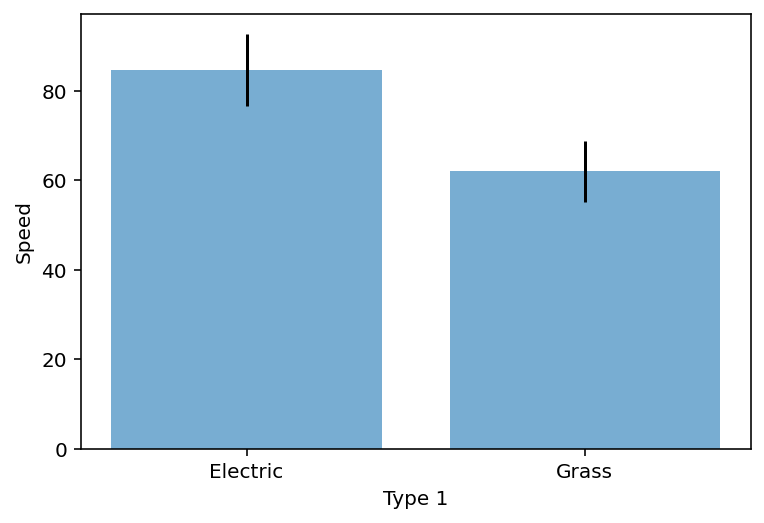
Plotly express
Plotly Express is an easy-to-use, high-level interface to Plotly that works with a variety of data types and creates easy-to-style charts.
With px.bar, each row of a DataFrame is represented as a rectangular bar. To aggregate multiple data points into the same rectangular bar, see the histogram documentation.
In the example below, there is only one row of data per year, so one bar per year is displayed.
import plotly.express as px
data_canada = px.data.gapminder().query("country == 'Canada'")
fig = px.bar(data_canada, x='year', y='pop')
fig.show()Bar charts with long data
Long data has one row per observation and one column per variable. This is suitable for storing and displaying multidimensional data, i.e. with dimensions greater than 2. This format is sometimes called “ordered”.
To learn more about how to provide a specific form of column-oriented data to 2D-Cartesian Plotly Express functions such as px.bar, see the Plotly Express Wide-Form Support in Python documentation.
long_df = px.data.medals_long()

fig = px.bar(long_df, x="nation", y="count", color="medal", title="Data in long format")
fig.show()Let’s take a look at the data:
long_dfBar charts with wide data
Wide data has one row for the value of one of the first variables and one column for the value of the second variable.
This is suitable for storing and displaying two-dimensional data.
wide_df = px.data.medals_wide()

fig = px.bar(wide_df, x="nation", y=["gold", "silver", "bronze"], title="Data in wide format")
fig.show()Let’s see what the data looks like in wide format:
wide_dfColored Bars
The bar chart can be customized with keyword arguments, for example to use a continuous color as below, or a discrete color as above.
df = px.data.gapminder().query("country == 'Poland'")
fig = px.bar(df, x='year', y='pop',
             hover_data=['lifeExp', 'gdpPercap'], color='lifeExp',
             labels={'pop':'Population - Poland'}, height=400)
fig.show()df = px.data.gapminder().query("continent == 'Oceania'")
fig = px.bar(df, x='year', y='pop',
hover_data=['lifeExp', 'gdpPercap'], color='country',
labels={'pop':'population of Canada'}, height=400)
fig.show()Stack vs Grouped Bars
When multiple rows have the same x value (here Female or Male), the rectangles are stacked on top of each other by default.
df = px.data.tips()
fig = px.bar(df, x="sex", y="total_bill", color='time')
fig.show()The default behavior of a stacked bar chart can be changed to grouped (also known as clustered) using the barmode argument:
df = px.data.tips()
fig = px.bar(df, x="sex", y="total_bill",
             color='smoker', barmode='group',
             height=400)
fig.show()Grouping bar charts
Using the facet_row (or facet_col) keyword arguments will create grouped subplots where different rows (or columns) correspond to different values facet_row.
df = px.data.tips()
fig = px.bar(df, x="sex", y="total_bill", color="smoker", barmode="group",
             facet_row="time", facet_col="day",
             category_orders={"day": ["Thur", "Fri", "Sat", "Sun"],
                              "time": ["Lunch", "Dinner"]})
fig.show()Conclusion
This concludes our first introduction to data visualization:
Working with
matplotlib.pyplot.Creating basic plots: histograms, scatterplots, and barplots.
Next time, we’ll move onto discussing seaborn, another very useful package for data visualization.